Find correlation between two groups of samples using a set of features

Hi,

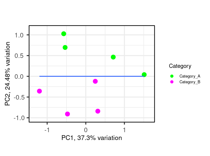
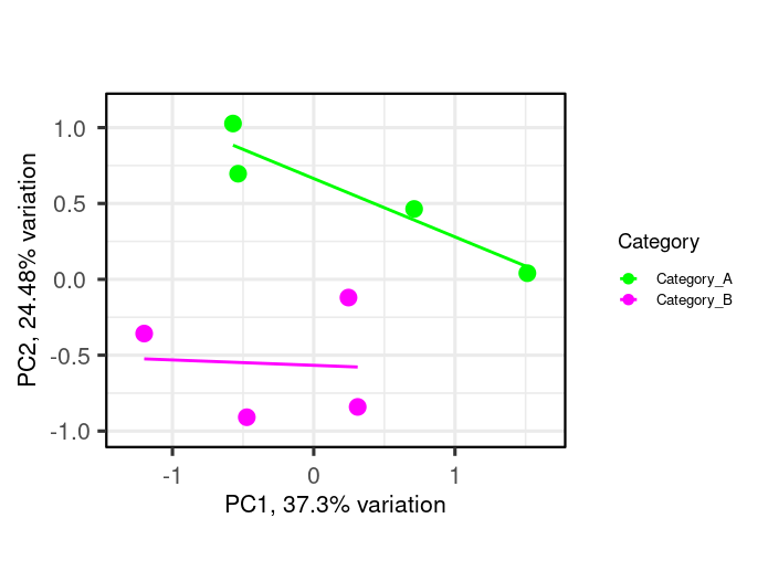
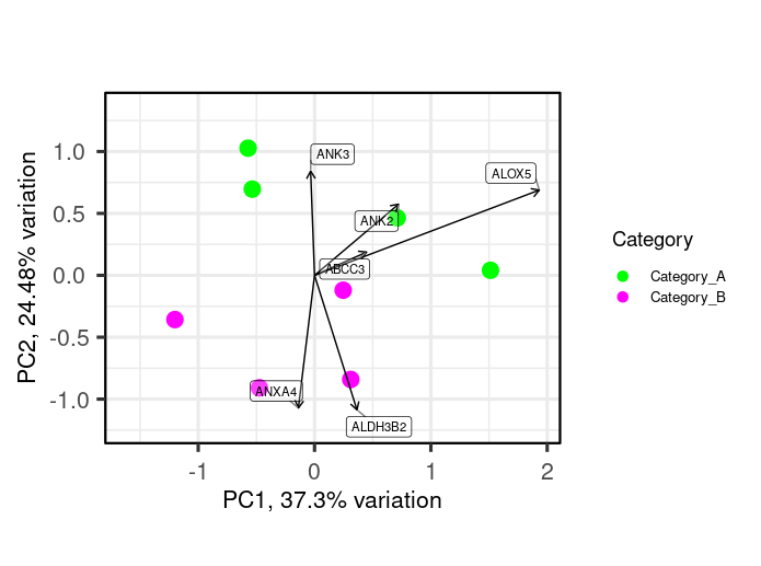
I am using R, I need some help on performing correlation analysis between 2 groups of samples (4 samples each) using a feature set of certain function. I want to create a scatter plot (XY plot) with regression line to visualize the correlation between the expression levels in Category_A vs. Category_B samples. I am working with the normalized intensity values, in order to study feature set of interest, I first subset my data by first mapping features of the feature set as rows (example below-Feature_set). Then, I plotted a pca plot using the below code (example-shown). Now I am interested to to draw regression line or a correlation over this pca plot.

Any other inputs and suggestions are also helpful.

Features as rows and samples as columns

(Feature_set)
                      Sample1                     Sample2                     Sample3
ABCC3                  0.277954465                -0.02603594                 0.19436366
ADAP1                  0.068464085                -0.01052524                -0.17524178
AGR2                   0.047788278                 0.21902961                 0.09946198
AKAP12                 0.486130569                 0.43430535                -1.24240970
ALDH3B2               -0.107000623                 0.51769269                -0.49248772
ALOX5                 -0.090541261                 1.22612820                 0.11739665
ANK2                  -0.004727671                -0.04950311                -0.49840381
ANK3                   0.493537146                 0.36254862                 0.29965816
ANXA4                 -0.302597041                 0.55604899                -0.15698546
ANXA9                 -0.304823541                -0.14176106                -0.79107686
                        Sample4                 Sample5                   Sample6
ABCC3                   -0.2376717              -0.01714223              -0.59277898
ADAP1                    0.2441125              -0.31058118               0.10628536
AGR2                    -0.1653739               0.82559878               0.54372150
AKAP12                  -0.5335566               0.71488848              -0.96889009
ALDH3B2                 -0.3321911              -0.06641259               0.03786791
ALOX5                   -0.5616105              -0.51128082              -1.02459752
ANK2                    -0.5445384              -0.71427818              -0.52205377
ANK3                     0.8385503              -0.14598519               0.21803427
ANXA4                    0.1398395               0.38658400               0.84453272
ANXA9                   -0.3257577              -0.16644371              -0.16230293
                    Sample7                     Sample8
ABCC3               -0.021885388                0.1928099
ADAP1                0.364137418               -0.2426156
AGR2                 1.021608904                1.4078763
AKAP12              -0.427832989               -0.6140915
ALDH3B2             -0.604677137                0.6591462
ALOX5                0.506235945               -0.3515797
ANK2                -0.123123814               -0.8291402
ANK3                 0.257584778                0.1990412
ANXA4                0.743738106                0.3672579
ANXA9               -0.005780198               -0.4071838

Sample metadata

 Sample_metadata
#>   Sample_ID   Category
#> 1   Sample1 Category_A
#> 2   Sample2 Category_A
#> 3   Sample3 Category_A
#> 4   Sample4 Category_A
#> 5   Sample5 Category_B
#> 6   Sample6 Category_B
#> 7   Sample7 Category_B
#> 8   Sample8 Category_B

R code to plot pca

library(PCAtools)
p <- pca(Feature_set, metadata = Sample_metadata, removeVar = 0.1)
biplot(p,
       lab = NULL,
       x = 'PC1', y = 'PC2',
       colby = 'Category', colkey = c('Category_A' = "green", "Category_B" = "magenta"),
       legendPosition = 'right', legendLabSize = 10, legendIconSize = 3.0,
       pointSize = 5)

Expected plot

Best Regards,
Toufiq

I haven't come across such a thing... is that common in your industry or area of research ? I'm curious to see where this concept comes up.

@nirgrahamuk thanks. The pca plot is common in biomedical research to inspect the gene expression data with patterns across differrent samples (how samples are grouped/how similar or dissimilar samples). But, I was just curious to check if the scatter plot (XY) with regression line is possible to see the relationship or correlation with one group (Category_A) vs. the other group (Category_B).

I wasnt questioning pca plots; they are common in many fields; its the idea of drawing what you called a regression line over the top of it ?

@nirgrahamuk I agree this would not be correct.

While I'm going to provide some R code, I'm not convinced it makes statistical sense to do this. This is purely for R code knowledge sharing and is not an endorsement of the statistical validity of the method.

I also have my concerns over the "why" of this method. I guess in theory, since a PCA is a linear transformation, a linear regression on a PCA is a linear transformation of a linear summary; so it is still linear, you're just looking at it from a different angle... and not a very useful angle. Because if you do a biplot between two principal components, the nature of the PCA means that the transformation puts as much of the variability in the first principle component direction, before then worrying about variability in the next direction (which will be orthogonal to the last PC), and so on.

So a linear regression through the points on your biplot is just going to look like this:

biplot(p,
       lab = NULL,
       x = 'PC1', y = 'PC2',
       colby = 'Category', colkey = c('Category_A' = "green", "Category_B" = "magenta"),
       legendPosition = 'right', legendLabSize = 10, legendIconSize = 3.0,
       pointSize = 5) +
  geom_smooth(aes(x = PC1, y = PC2), data = p$rotated, method = "lm", se = FALSE)

It should look the same between PC2 and PC3. And in the example mock-up you made (which I'll thank you for because that really helps demonstrate what your intention is)...

... I could envision the actual regression line between those points would absolutely be the y=0 line.

I'm not sure if this makes statistical sense. But again, as an interesting R code exercise, we can split the regression lines by Category, but we have to merge the Category names onto the PC data points first:

p_cat <- merge(p$rotated, Sample_metadata, by = 0)
biplot(p,
       lab = NULL,
       x = 'PC1', y = 'PC2',
       colby = 'Category', colkey = c('Category_A' = "green", "Category_B" = "magenta"),
       legendPosition = 'right', legendLabSize = 10, legendIconSize = 3.0,
       pointSize = 5) +
  geom_smooth(aes(x = PC1, y = PC2, colour = Category), data = p_cat, method = "lm", se = FALSE)

What I do sometimes find insightful is to show the loadings on the biplot (showLoadings = TRUE):

biplot(p,
       lab = NULL,
       x = 'PC1', y = 'PC2',
       showLoadings = TRUE,
       colby = 'Category', colkey = c('Category_A' = "green", "Category_B" = "magenta"),
       legendPosition = 'right', legendLabSize = 10, legendIconSize = 3.0,
       pointSize = 5)

Because there's a clear distinction between the Categories in their variable values for this example.

2 Likes

@keithn Thank you very much for the detailed response. I am exploring a few bioinformatics tool to see if this can be addressed by a different approach.