I have a dataframe called bigrams which has two columns. The column names are keyword and freq. The elements in this dataframe are the top 10 keywords (phrases) that were extracted from a larger dataframe called feedback. The keywords were taken from a column in the feedback dataframe that is called products. What I have been trying to do is filter the original dataframe based on the 10 bigrams. Each bigram should return about 100 or more rows each. Can someone please give me the syntax that would allow me to accomplish this? Ultimately what I want to do is to plot the rows from the original dataframe as a time series bar graph since the original dataframe has the date column in it. I was not able to include the date field with the keyword extraction portion of my program. Thanks.
Hello,
Can you provide some sample data with desired output ? It would also be awesome if you could ask this with a minimal REPRoducible EXample (reprex)? A reprex makes it much easier for others to understand your issue and figure out how to help.
Thank you.
I figured out a way to accomplish what I had wanted to do, so I am revising my original query and post. My solution works, but it is far from elegant or the most efficient way of solving the problem. What I would like to know now is a cleaner, shorter way that uses fewer lines of code to accomplish my desired tasks. The only thing that I can't figure out right now is how to get the date column in my ggplot to display more verbose information. My data has date stamps from 2014-2-2 through 2014-12-02. On my ggplot it only displays "Apr," "Jul," and "Oct." I would like the x-axis to have more dates on it. Here is my current approach along with a sample of the final dataframe:
``
selectedRows <- feedback[grep("top shelf", feedback$product), ]
selectedRows$keyword <- "top shelf"
selectedRows2 <- feedback[grep("silver haze", feedback$product), ]
selectedRows2$keyword <- "silver haze"
selectedRows3 <- feedback[grep("grade aaaa", feedback$product), ]
selectedRows3$keyword <- "grade aaaa"
selectedRows4 <- feedback[grep("top quality", feedback$product), ]
selectedRows4$keyword <- "top quality"
selectedRows5 <- feedback[grep("Purple Fruity", feedback$product), ]
selectedRows5$keyword <- "Purple Fruity"
selectedRows6 <- feedback[grep("highest grade", feedback$product), ]
selectedRows6$keyword <- "highest grade"
selectedRows7 <- feedback[grep("High quality", feedback$product), ]
selectedRows7$keyword <- "High quality"
selectedRows8 <- feedback[grep("free sample", feedback$product), ]
selectedRows8$keyword <- "free sample"
selectedRows9 <- feedback[grep("Exodus Cheese", feedback$product), ]
selectedRows9$keyword <- "Exodus Cheese"
selectedRows10 <- feedback[grep("limited time", feedback$product), ]
selectedRows10$keyword <- "limited time"
RAKE_keywords <- rbind(selectedRows,
selectedRows2,selectedRows3,selectedRows4,
                   selectedRows5,selectedRows6,selectedRows7,selectedRows8,
                   selectedRows9,selectedRows10)


RAKE_keywords$date <- as.Date(RAKE_keywords$date, format = "%m/%d/%Y")
Date = ts(RAKE_keywords$keyword,c(2014,02),c(2017,12),1)

ggplot(data=RAKE_keywords,
   aes(x=date,y=keyword,fill=keyword)) +
  geom_tile()

head(RAKE_keywords)

   date           vendor      keyword
2014-04-26 Charlie_Bartlett  top shelf
2014-09-22        KushDepot  top shelf
2014-05-06 Charlie_Bartlett  top shelf
2014-05-06 Charlie_Bartlett  top shelf
2014-10-06        KushDepot  top shelf
2014-02-02 Charlie_Bartlett  top shelf
looking at your code, it seems you can make a function to avoid repetition
subset_and_add_keyword <- function(tab, keyword) {
    selectedRows <- tab[grep(keyword, tab$product), ]
    selectedRows$keyword <- keyword
    selectedRows
}
I think you can also make a list of your original data.frame by product, apply your function and row bind together.
Using tidyverse, I think you can even do something like conditional addition of a column, using a (long) case_when inside mutate with all your recoding.
To add more dates on a ggplot2 graph you need to modify scales to add breaks. See ggplot2::scale_x_date() and scales::date_breaks().
Also, please, try to build a reprex so that we have some example data to help you. Without being able to run your code ourself, it is not efficient. thanks.
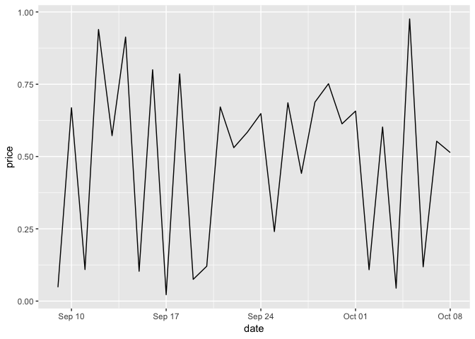
You have complete control over how your ggplot displays your date axis via scale_date.
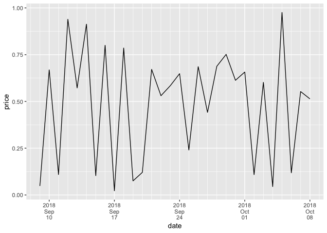
Note the date_minor_breaks and date_breaks arguments for controls over grid lines and how many dates are labeled on the x-axis.
And note the date_labels for how those dates (and time) label are formatted (more date and time formatting notes on Date-time Conversion Functions to and from Character / strptime).
library(ggplot2)
last_month <- Sys.Date() - 0:29
df <- data.frame(
  date = last_month,
  price = runif(30)
)
base <- ggplot(df, aes(date, price)) +
  geom_line()


base + scale_x_date(date_labels = "%b %d")

base + scale_x_date(
  date_breaks = "1 week",
  date_minor_breaks = "1 day",
  date_labels = "%Y\n%b\n%d")

Created on 2018-10-08 by the reprex package (v0.2.1)