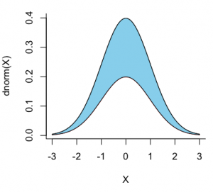
I have a dataframe like DF below, where I want to plot "date" as the x-axis, and value as the y-axis. Because there are several y values correspond to one x value, I want to plot shaded areas between max and min y values on each day using all ids. How to do this? I use the geom_ribbon but it does not work. Thanks.
times = seq(as.Date("2017-01-01"), as.Date("2017-12-31"), "1 day") %>% format("%b-%d")
df1 = data.frame(date = times, id = rep(1,365),value = rnorm(n=365))
df2 = data.frame(date = times, id = rep(2,365),value = rnorm(n=365))
df3 = data.frame(date = times, id = rep(3,365),value = rnorm(n=365))
df4 = data.frame(date = times, id = rep(4,365),value = rnorm(n=365))
df5 = data.frame(date = times, id = rep(5,365),value = rnorm(n=365))
df6 = data.frame(date = times, id = rep(6,365),value = rnorm(n=365))
So here I am not able to replicate the exact plot as shown in the data but have been able to do what has been said in the text. Reason exact plot has not been replicated is that the data does not support it. Please find the code below
Could you please turn this into a self-contained reprex (short for reproducible example)? It will help us help you if we can be sure we're all working with/looking at the same stuff.
There's also a nice FAQ on how to do a minimal reprex for beginners, below:
What to do if you run into clipboard problems
If you run into problems with access to your clipboard, you can specify an outfile for the reprex, and then copy and paste the contents into the forum.
Thanks, I did a search and found the problem with reprex. But when I was running reprex() in my Rstudio console, I got this error, what is the problem?
reprex()
Rendering reprex...
Error in curl::curl_fetch_memory(url, handle = handle) :
Timeout was reached: Connection timed out after 10000 milliseconds
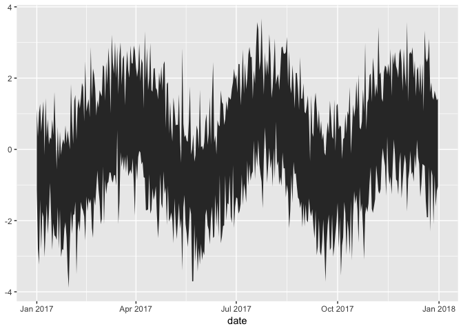
Thanks for your help here. The plot is exactly what I am trying to achieve. However I found a problem in the result. When creating "test", the dates order has been changed, for example, Apr 1 to Apr 30, then Aug 1 to Aug 31, then Dec 1 to Dec 31, Then Feb, etc, according to alphabetical order. How to change the dates order in "test", or the x-axis order to Jan 1 first, until Dec 31?
The data has no problem, but the dates order changed after using the %>% function.
Thanks.
You don't want to call format, because it will convert your dates to character strings, which have no particular order aside from alphabetical. It's also a lot easier to aggregate your data into the format you need before you plot, because the max and min calls in aes will find the max and min of the whole variable, not just for that day. So something like
library(tidyverse)

# some fake data
df <- tibble(
    # repeat each date 10x
    date = rep(seq(as.Date("2017-01-01"), as.Date("2017-12-31"), "1 day"), 10),
    # add a little shape to the values
    value = sin(as.numeric(date) / 20) + rnorm(3650)
)

df
#> # A tibble: 3,650 x 2
#>    date        value
#>    <date>      <dbl>
#>  1 2017-01-01 -0.291
#>  2 2017-01-02 -1.03
#>  3 2017-01-03 -2.59
#>  4 2017-01-04  0.911
#>  5 2017-01-05 -0.388
#>  6 2017-01-06 -1.64
#>  7 2017-01-07 -0.607
#>  8 2017-01-08 -0.653
#>  9 2017-01-09 -0.875
#> 10 2017-01-10 -0.777
#> # … with 3,640 more rows
As already has been mentioned, it was an oversight on my part as I didn't see the date being converted into a character string. An easy turnaround way is to convert the date into a POSIXct object initially and then create the plot. The only change in the code would be introduction of as.POSIXct command and small changes in the ggplot portion
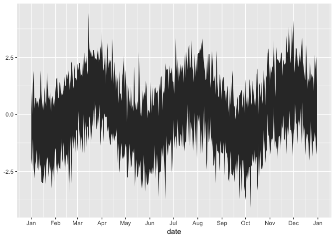
Thanks. When displaying the x-axis label, how to display just "Jan", "Feb", "Mar", etc. without the year?
And reorder the x-axis, so that the order is like "Oct", "Nov", "Dec", "Jan", ..., "Sept? Thanks very much.
See ?scale_x_date, which lets you set date_breaks (for which points to label) and date_labels (for what to label those points, using ?strptime-style tokens). With the previous example,
I'm not sure what this means—you can't reorder time. If you're looping multiple years on top of each other on a plot and want to shift from Jan–Jan to Oct–Oct, it's possible, but a bit of work. It'd probably be easiest to work with Julian dates, subtract some shift, and then manually label them with scale_x_continuous(breaks = ..., labels = ...).