fileInput upload data can't be used at renderplot

Hi,
I'm new to shiny, I created a dashboard that allows me upload dataset from my computer, it works. Now, I'm trying to plot using the dataset, but I can't find the data. so, the plot is just a point at the middle of the picture, it anyone know how to figure it out. it might because I use a wrong name, but I can't know that.I tried to use access the data by calling a new assignment dataset <- input$file.... but it still doesn't work.

#here is the layout of first sidebar where contains all upload data operation.
 tabItem(tabName = "Data",
              fluidRow(
                box(title="Game New Version Update Analysis",width = 13, status="success",
                    solidHeader = TRUE,collapsible=TRUE,
                    fileInput("file","Upload the Game New Version Update Evalution File", multiple = TRUE),
                    helpText("Default max. file size is 100MB"),
                    helpText("Select the read.table parameters below"),
                    checkboxInput(inputId = 'header', label = 'Header', value = TRUE),
                    checkboxInput(inputId = "stringAsFactors", "stringAsFactors", FALSE),
                    radioButtons(inputId = 'sep', label = 'Separator', choices = c(Comma=',',Semicolon=';',Tab='\t', Space=''), 
                                 selected = ','),
                    uiOutput("selectfile")),
                tableOutput("file"),
                mainPanel(
                  uiOutput("tb")
                )
              )),
# this is how I try to access the dataset upload before.
  # data_set<-read.table(input$inputFile$datapath,sep=";",header = FALSE)
  dataset <- reactive({
    get(input$file, "package:datasets")
  })
  
  # line chart
  output$myplot<- renderPlot({
    # data <- data_set()
    # x <- data[,1]
    # plot((1:5), res = 96)
    plot(time(14),data=dataset,
         col=rainbow(6),outline = input$outliers)
  })

hi @shinyissohard

if your fileInput has inputId "file" you can access it in read.table via
input$file$datapath

By the way, If you are calling a reactive, you should add round parentheses after the name of the reactive, so in your case dataset()

do you mean dataset() <- reactive({
get(input$file, "package:datasets")
}) like this?
if possible, can you specify it? still very confused.

No, I mean in your plot function when you are using the reactive.
Something similar is done in this post

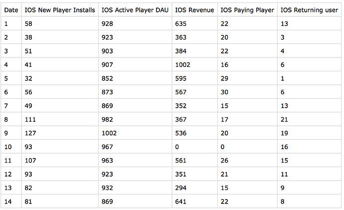
thanks, it's helpful. but the dataset shows in the format looks weird. I want it shows as it should be. it shows like the image below.

To help us help you, could you please prepare a repr oducible ex ample (reprex) of the problem? Please have a look at this guide, to see how to create one:

now, I want to plot line chart given the data I provided above. than an error pop out. I don't know the problem. what I want to do is to plot 5 line charts in a graph. it works in other workspace, but not here shiny.

  output$myplot <- renderPlot({
    # y <- select(dataset(), IOS.New.Player.Installs, IOS.Active.Player.DAU, IOS.Revenue, IOS.Paying.Player, IOS.Returning.user)
    # plot.ts(dataset())
    ggplot(dataset(), aes(x=Date, y = IOS.New.Player.Installs)) +
      geom_line(dataset(), aes(x=Date,y = IOS.Revenue), color = "blue") +
      geom_line(dataset(), aes(x=Date,y = IOS.Active.Player.DAU), color = "red") +
      geom_line(dataset(), aes(x=Date,y = IOS.Paying.Player), color="pink") +
      geom_line(dataset(), aes(x=Date,y = IOS.Returning.user), color = "purple") + 
      xlab('Date') +
      ylab('Numbers')+
      geom_vline(xintercept = 7)
  })

In case the data is demanded, here is the data.

Thanks!

@shinyissohard this is not a reprex, we can't run your code like this since it's just a part of a shiny app. A reprex makes it much easier for us to help you!

library(shiny)
library(shinydashboard)
#> 
#> Attaching package: 'shinydashboard'
#> The following object is masked from 'package:graphics':
#> 
#>     box
library(corrplot)
#> corrplot 0.84 loaded
library(ggplot2)
# library(reprex)

ui <- dashboardPage(
  dashboardHeader(title = "F2P Mobile Game Publishing Analysis"),
  dashboardSidebar(
    sidebarMenu(
      menuItem("Game Data Collection", tabName = "data", icon = icon("table")),
      menuItem("Compartive Analysis", tabName = "chart", icon = icon("line-chart")),
      menuItem("Correlation Analysis", tabName = "correlation", icon = icon("bar-chart-o"))
    )),
  dashboardBody(
    tabItems(
      # 第一个标签内容
      tabItem(tabName = "data",
              fluidRow(
                box(title="iris数据集",status="success",
                    solidHeader = TRUE,collapsible=TRUE,
                    tableOutput("mytable")),
                box(title="Game New Version Update Analysis",width = 13,status="success",
                    solidHeader = TRUE, collapsible=TRUE,
                    fileInput("file","Upload the Game New Version Update Evalution File", multiple = TRUE)),
                mainPanel(
                  tableOutput("contents")
                )

                # box(title="滑动条",status="primary",solidHeader = TRUE,
                #     collapsible=TRUE,background="purple",
                #     numericInput("n","请选择要查看的数据行",value = 6))
              )),
      # 第二个标签内容
      tabItem(tabName = "chart",
              column(8,plotOutput("myplot"))),
      # 第 3 个标签内容
      tabItem(tabName = "correlation",
              column(8,plotOutput("mycorrelationplot")))
      )
    
  )
)

server <- shinyServer(function(input,output){
  dataset <- reactive({
    req(input$file)
    read.csv(file = input$file$datapath,
             na.strings = ".", 
             sep = ";",
             header = TRUE)               
  })
  
  output$contents <- renderTable({
    req(dataset())
    head(dataset())
  })
  
  # 向用户界面输出iris数据表,根据input$n输出行数
  output$mytable <- renderTable({
    head(iris,input$n)
  })
  # 向用户界面输出箱线图,并根据input$outliers是否输出异常点
  output$myplot <- renderPlot({
    # y <- select(dataset(), IOS.New.Player.Installs, IOS.Active.Player.DAU, IOS.Revenue, IOS.Paying.Player, IOS.Returning.user)
    plot.ts(dataset())
    # ggplot(dataset(), aes(x=Date, y = IOS.New.Player.Installs)) +
    #   geom_line(dataset(), aes(x=Date,y = IOS.Revenue), color = "blue") +
    #   geom_line(dataset(), aes(x=Date,y = IOS.Active.Player.DAU), color = "red") +
    #   geom_line(dataset(), aes(x=Date,y = IOS.Paying.Player), color="pink") +
    #   geom_line(dataset(), aes(x=Date,y = IOS.Returning.user), color = "purple") + 
    #   xlab('Date') +
    #   ylab('Numbers')+
    #   geom_vline(xintercept = 7)
  })
  
  # correlation plot
  output$mycorrelationplot <- renderPlot({
    datas <- as.numeric((dataset()))
    M <- cor(datas)
    corrplot.mixed(M, lower = "ellipse", upper = "number",tl.pos="lt",diag="u")
  })
})
shinyApp(ui, server)
#> PhantomJS not found. You can install it with webshot::install_phantomjs(). If it is installed, please make sure the phantomjs executable can be found via the PATH variable.

Shiny applications not supported in static R Markdown documents


# M <- cor(as.numeric(iris[,c(1,2,3,4)]))
# corrplot(M, method="circle")
# 
# 

Created on 2021-02-21 by the reprex package (v0.3.0)

I think this is reprex format that you want.

my question is I want to plot 5 line chart using dataset() in this case over a graph, but it doesn't work for me. I think it's because something wrong at params.

Maybe it's the format of your data. Is it separated by ";" like you have specified in read.csv?

This data format combined with the updated plot below, is giving you the graph you are looking for I think. Hope this helps.

Date;IOS_New_PLayer_Installs;IOS_Active_Player_DAU;IOS_Revenue;IOS_Paying_Player;IOS_Returning_User
1;58;928;635;22;13
2;38;928;635;22;13
3;51;928;635;22;13
  output$myplot <- renderPlot({
    ggplot(dataset(), aes(x=Date)) +
      geom_line(aes(y = IOS_New_PLayer_Installs)) +
      geom_line(aes(y = IOS_Revenue), color = "blue") +
      geom_line(aes(y = IOS_Active_Player_DAU), color = "red") +
      geom_line(aes(y = IOS_Paying_Player), color="pink") +
      geom_line(aes(y = IOS_Returning_User), color = "purple") +
      xlab('Date') +
      ylab('Numbers')+
      geom_vline(xintercept = 7)
  })

it supposed to work, but it gives me an error

object 'IOS.New.PLayer.Installs' not found

it's very tricky.

An input file with spaces in the column names can be tricky. I would advice you to replace the space by another character like an underscore and update your ggplot accordingly

but it looks only have '.' is this also illegal characters?

it works, finally. thanks, it's character problems.

it will show the plot with 5 line charts, do you have any idea to separate them to 5 plots. I tried separated , but only one plot display.

if I want to exclude in this case, how can I slice it that exclude Data.

This topic was automatically closed 7 days after the last reply. New replies are no longer allowed.

If you have a query related to it or one of the replies, start a new topic and refer back with a link.