You're very welcome! I'm glad if it helped a bit  This is a list of really (not just theoretically) used tools, coming from a real practice in a fully R-based CRO, where I work.
The frailty models (joint) and Multi-State models are absolute must-have, as they handle both repetitions and competitions at once. Fine-Gray and Andersen-Gill are definitely nice to have, but in more advanced trials we often have both multiple competing events (SAEs, deaths for different reason, PI's decision about patient's withdrawal, etc.) and often find recurrences (recurrent fractures, changes in therapy, change in the stage of a disease (e.g. cancer), surgeries, etc) except "progression-free survival" or "overall survival" , where we search for the first occurrence; for death - the first and only.
AFT are nice for non-proportional hazards and if we're interested truly in the time to event to be modelled. Time-varying covariates, weighting and piece-wise Cox is invaluable in non-PH and non-constant risks over time. Non-constatnt effects can be handled via strata(), but it's already done, as you pointed out. Clustering helps for natural clusters like in mixed-models, when we have additional sources of within-subject (co)variance.
Regarding the survival curves - I'm not sure why this issue happened. There are several ways to generate proper survival curves. You can start with SurvMiner::ggsurvplot, which does everything for you (for doesn't allows for >2 faceting, which is quite common) or ggquickeda with a set of "geom_" functions: geom_step, geom_kmticks for censored observations + geom_kmband for the CIs.
It's also simple to generate the proper survival curves in ggplot2 without any 3rd party package, just with geom_step. This is my preferred way. I don't use any external packages for drawing survival curves, as the packages are usually too limited for my needs (and often too bloated, with tons of unresolved issues, introducing too much risk to my analysis), so I prefer to draw it on my own to control everything I need. Luckily, it's not that complicated 
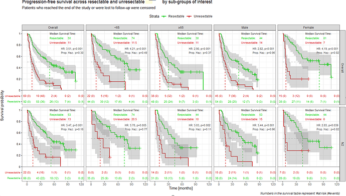
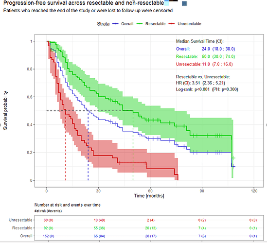
Let me show you two examples from my real analyses (data changed a bit).
The first one is made with the geom_xxx from the ggquickeda package. With a small trick (geom-text placed at some bottom area filled with white rectangle) I was able to add the simple table with patients at risk and events - practically always mandatory in publications. It supports faceting (facet_wrap / grid) and I was able to add the simple table with number of events at each panel.
I can share the code with you, if you wish, so maybe you can add it (or take some ideas?) to your toolbox?
And the second one is made manually, using only the ggplot2
geom_step + patchwork to combine the curves with the survival table (cowplot is still a worth alternative, as patchwork has some issues):
/ sorry, the forum doesn't allow me to put 2 screens  I'll add it in a 2nd comment below /
The key moments in the code are as follows (this is from another graph, where I compare the naive KM estimator and 1-CIF for the curve adjusted for competing risk).
Note: I could create appropriate data.frames with all stuff pre-calculated, so I don't need to put stuff into ggplot2 calls, but I'm in a hurry a bit  I hope it's still readable
  The bind_rows just adds a missing 0-timepoint, nothing more.
Confidence intervals are easy to add via geom_ribbon (the CIs are already in the fit object)
# classic survival
fit <- survfit( Surv(time_last, event) ~ 1, data = result_all, conf.type = "log-log")

# with competing risks via Multi-State model

fit_comp <- survfit( Surv(time_last, event, type="mstate") ~ 1, data = result_com, conf.type = "log-log")

ggplot() +

  # steps
  geom_step(data=with(fit, rbind(c(time=0, surv=1), data.frame(time, surv))),
            aes(x=time, y=surv, linetype = "Date of discontinuation", col="All events combined"), width=1)  +

  # censoring ticks
    geom_linerange(data=with(fit, rbind(c(time=0, surv=1, n.censor=0), data.frame(time, surv, n.censor))) %>% filter(n.censor>0),
                 aes(x=time, y=surv, ymin=surv-tick_size, ymax=surv+tick_size, col = "All events combined"), show.legend = FALSE) +

   # 1-CIF for the "Decision" curve adjusted for competing risks. Can be ignored, but wanted to show you it's easy too.

    geom_step(data=with(fit_disc_com, rbind(c(time=0, surv=1, n.censor=0), data.frame(time, surv=1-pstate[,2]))),
              aes(x=time, y=surv, linetype = "Date of discontinuation", col="1-CIF for PI's decision adjusted for death & SAE"), width=1)
Curves that have non-vertical steps aren't survival curves, making no statistical sense. If published, would be questioned and rejected. The probability drops instantly when an event occurs. There is no any intermediate probabilities making "sloped/skewed" steps, this has no interpretation.
I hope this helps a bit. I'll be happy to discuss it in greater details if you need.
Would you consider correcting the blog post to reflect the above, and obtain the proper survival curves? I can offer some support. We can contact also via email or schedule a TC, if you wish 
 Fine-Gray sub-distribution hazards for competing risks + Aalen-Johansen estimator of the CIF

