Hi,
I have a data Dropbox - sample_data_trasport.csv - Simplify your life
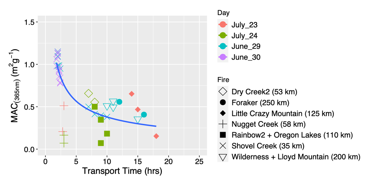
I used the code
  shapes <- c(5, 16, 18, 3, 15, 4, 6, 8, 17, 13, 2)

  trasport_time %>%
    filter(PM2.5 > 25) %>%
    ggplot(aes(x = Transport_time_hrs, y = mac_365, shape=(Fire_Name),
               color=(day))) +
    geom_point( alpha=1, size = 4)+  scale_shape_manual(values = shapes)+
    xlim(0,25)+
    ylim(0,1.5) + geom_smooth(aes(group = 1),method=lm,  se=F)+
    #scale_y_continuous(breaks=c(0,0.16,0.31,0.5,0.63,1.03,1.28))+
    #scale_color_gradientn(colours = rainbow(5), limits=c(1,30), breaks = c(2,10,20,30), name= expression(Photobleaching~time(hrs)))+
    #scale_color_brewer(palette="Dark2")+
    #geom_smooth(aes(color = Photpbleaching_lifetime_hrs), size = 0.5, se = T, )+
    theme(legend.text=element_text(size=12)) +
    theme(axis.title = element_text(face="plain",size=14,color="black"),
          axis.text=element_text(size=12,face="plain", color="black"),
          plot.title = element_text(size=15)) +
    #theme(panel.grid.major.y = element_line(color = "black",
    #                                        size = 0.05,
    #                                        linetype = 1))+
    #theme(panel.background = element_rect(colour = "black", size=1)) +
    #theme(panel.background = element_rect(fill = "white")) +
    ylab(bquote("MAC"[(365*nm)]~ '('*m^2*g^-1*')')) +
    xlab(bquote('Transport Time ('*hrs*')')) +
    labs(title = "")+ labs(shape="Fire", color="Day")
from this I made
The query is that I want to change the linear trend line to the power fit trend line and its equation.
Could anyone please help me on this matter?
Thanks