Error in xy.coords(x, y, setLab = FALSE) : 'x' is a list, but does not have components 'x' and 'y'

Hello,

Back with yet another challenge that I can't seem to figure out. Again, I'm very new to all of this, so I'm not sure if I'm even explaining my problem clearly below, but I'll try.

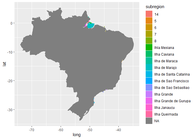
I want to plot points on a world map (particularly Brazil) using ggplot2. The points represent zip codes across Brazil. I followed a YouTube video to get the code I think I need; however, I'm getting the following error:
Error in xy.coords(x, y, setLab = FALSE) :
'x' is a list, but does not have components 'x' and 'y'

Here is the df I'm working with:

I created a df called brazilregions using map_data
(brazilregions<-map_data("world")

I then joined my original df with this new df:
(brazilregions<-left_join(brazilregions,customer_count_by_zipcode,by="regions)

I added a filter to view only the info relevant to me. However, my list still contains ALL of the map_data info as before. It's just that now, SOME of my Brazil info (states in Brazil) are populated, but not all. There are still a ton of NAs.
brazilregions1<-brazilregions %>% filter(!is.na(brazilregions$region))

Using the code as explained in the YouTube video, I constructed this:
brazil_map1<-ggplot(brazilregions1, aes( x= long, y= lat, group=group))+geo=polygon(aes(fill=region), color="purple")

But got this message:
Error in xy.coords(x, y, setLab = FALSE) : 'x' is a list, but does not have components 'x' and 'y'

I don't know if this is enough information for anyone to go on to offer any feedback on what I should do but this is what I have. If there is something in particular I'm leaving out that would help you help me, please let me know. Any suggestion is greatly appreciated.

PS: Here is the link to the YT video I used as reference: https://www.youtube.com/watch?v=AgWgPSZ7Gp0

Hi @Beach_Life,
I'm not sure if this is just a cut-and-paste error on your part but this bit of code is corrected as:

brazil_map1<-ggplot(brazilregions1,
  aes( x= long, y= lat, group=group)) +
  geom_polygon(aes(fill=region), color="purple")```
1 Like

Ahhh, I guess it WOULD help if I looked over my code more clearly! Thanks for this! This resolved the error. HOWEVER, now this is what I get (and not an actual map):

Any thoughts?

I'm thinking my error may be in my join. I went back to my original df and saw that City information WAS actually in that df BEFORE I did the join to create brazilregion1. So the join that I coded didn't actually do anything. In addition, I can see that The Bahamas ALSO has city information, which wasn't a part of my selection at all, so not sure what I've done wrong. May start all over again. But at the very least, your code correction worked. Thanks for the help. It was greatly appreciated.

I'm back. Hoping you can help me again. Just as a reminder: I'm trying to plot points on a map of Brazil, by City (subregion)
Here is my code:

#using ggplot2 to visualize city (subregion) data using Google Maps
brazilregions<-map_data("world")
view(brazilregions)

#notice new df brazilregions, which contains long and lat data for entire world. I need to combine brazilregions with customer_count_by_zipcode
brazilregions<-left_join(brazilregions,customer_count_by_zipcode,by="subregion")
view brazilregions

#to view only info relevant to me
brazilregions1<-brazilregions %>% filter(!is.na(brazilregions$subregion))
view(brazilregions1)

brazil_map1<-ggplot(brazilregions1, aes( x= long, y= lat, group=group))+geom_polygon(aes(fill=subregion), color="black")
View(brazil_map1)

When I run this, I get no errors, no visual but the following:

Also, I don't really see any difference when I do the left_join. Should I notice something in particular? I'm not getting any error msg, so I'm "assuming" it's joining but again, I'm not getting a map or any visual. It's just blank. Any suggestions?

Hi @Beach_Life
You don't need to use View() to see your plots. Just enter the plot object name and the plot will appear in the Plots pane.

OK, I ran just the plot object name. A small red stop sign popped up (which had never happened before, so I was very optimistic) and it sat there for about a minute. Then the following error message popped up.

Warning messages:
1: In doTryCatch(return(expr), name, parentenv, handler) :
cannot pop the top-level viewport ('grid' and 'graphics' output mixed?)
2: In doTryCatch(return(expr), name, parentenv, handler) :
cannot pop the top-level viewport ('grid' and 'graphics' output mixed?)

BUT THEN, something actually showed up in the plots area:

Now, as far as what it is, I have no clue. But the fact that something actually showed up is a vast improvement (and I'll take it as a win...for now). It's obviously not a map, so I don't know what I've done wrong. It also looks like it is showing ALL the information from map_data ("World").
I also noticed that my "RAM meter" at the top of my page went to full red (I'm using the FREE version of RStudio, so I'm going to assume I only get so much memory and this has maxed it out).

If you have any ideas or have seen this type of error before and don't mind sharing some more knowledge, I would greatly appreciate the help.

Hi @Beach_Life
This example has become very complicated. So, I went back to first principles to plot a simple map of the subregions of Brazil. It turns out that the data supplied only includes outlines for some of the subregions (as the following example shows) and so may not be suitable for merging and plotting with your other data.

suppressPackageStartupMessages(library(tidyverse))
world_map <- map_data("world")

world_map %>% 
  filter(region == "Brazil") -> brazilregions

brazilregions %>% 
  group_by(group, .drop=FALSE) %>% 
  summarise(num = n())
#> # A tibble: 17 × 2
#>    group   num
#>    <dbl> <int>
#>  1   222    10
#>  2   223     8
#>  3   224    11
#>  4   225    11
#>  5   226     9
#>  6   227     9
#>  7   228    10
#>  8   229     9
#>  9   230    14
#> 10   231    75
#> 11   232    12
#> 12   233    11
#> 13   234    13
#> 14   235    14
#> 15   236    11
#> 16   237    10
#> 17   238  1648

ggplot(data=brazilregions) + 
  aes(x=long, y=lat, fill=subregion, colour=subregion) +
  geom_polygon()

Created on 2022-12-02 with reprex v2.0.2

1 Like

Thanks for this. I'm not sure exactly what this is doing, though. Would you briefly let me know what is being represented here and how you got it? The reason I ask is because I noticed the code didn't have any sort of merge or join between the world map and the data from my original df. So, I'm curious how you were able to still plot things. Also, is it only plotting some things from my df and not everything, or is everything showing? And lastly, is there a way to remove the NAs? I tried rm.na=TRUE, but nothing happened (not even an error msg).
Again, thank you so much. You have been a tremendous help to me and I greatly appreciate it.

I sent you a response to your code, and in that response, I asked if all of the plots for Brazil were being "plotted" on the map. I was able to answer my own question by going back and looking at the data. I'm still fascinated by how you were able to do this with such a few lines of code.

This topic was automatically closed 7 days after the last reply. New replies are no longer allowed.

If you have a query related to it or one of the replies, start a new topic and refer back with a link.