Borrowing an example from ?prcomp,
library(ggplot2)
pca <- prcomp(USArrests, scale = TRUE)
pca_df <- broom::tidy(pca, 'd') # extract PVE
pca_df
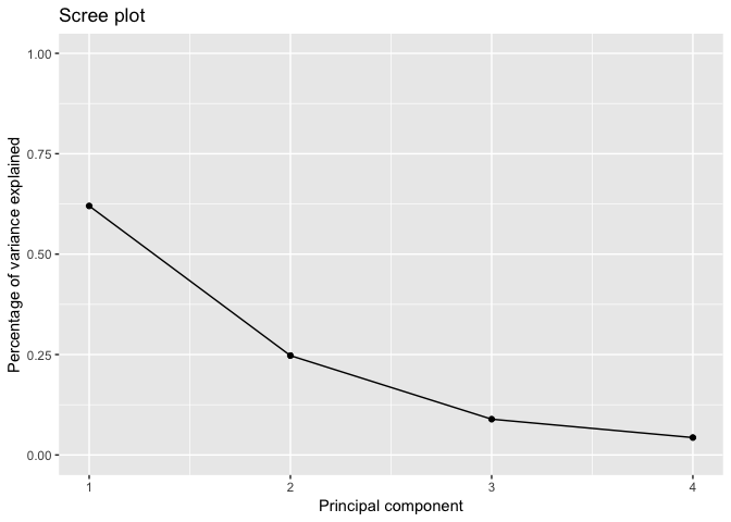
#> PC std.dev percent cumulative
#> 1 1 1.5748783 0.62006 0.62006
#> 2 2 0.9948694 0.24744 0.86750
#> 3 3 0.5971291 0.08914 0.95664
#> 4 4 0.4164494 0.04336 1.00000
Plotting with ggplot, you supply the data frame first, then specify which variable to plot via which "aesthetic" (x, y, color, etc.) in the "mapping" created with aes:
ggplot(pca_df, aes(x = PC, y = percent)) +
    geom_point() +
    geom_line() +
    ylim(0, 1) +
    labs(title = 'Scree plot',
         x = 'Principal component',
         y = 'Percentage of variance explained')
quickplot (or qplot) behaves more like base R's plot, not requiring aes or a data frame, and able to plot vectors directly. You can reproduce the above plot with
quickplot(x = pca_df$PC, y = pca_df$percent,
          main = 'Scree plot', xlab = 'Principal component', ylab = 'Percentage of variance explained',
          ylim = c(0, 1)) +
    geom_line()
Note that you never tell it to plot points here; that's a decision it makes for you. You could actually do everything in the quickplot call if you specified the "geometries" to plot with geom = c('point', 'line').
Ultimately, though, the ggplot framing is a lot more powerful, so if quickplot doesn't make sense to you, just ignore it. It's intuitive for people coming from base R plotting, but it's a little out of keeping with the rest of ggplot.