Enhancing plot text

Hi there,
I want to create a plot with bars corresponding to the numeric variable “perc” (along with confidence intervals) by “food”. The data set also contains a variable “R”, with exactly the same value as perc. However, this “R” variable is a character one, and in some cases the values contains a number along with a letter (e.g. 17.7E). This letter means the coefficient of variation is > 16.6, so I want to use the values from “R” in geom_text to include them in the plot.

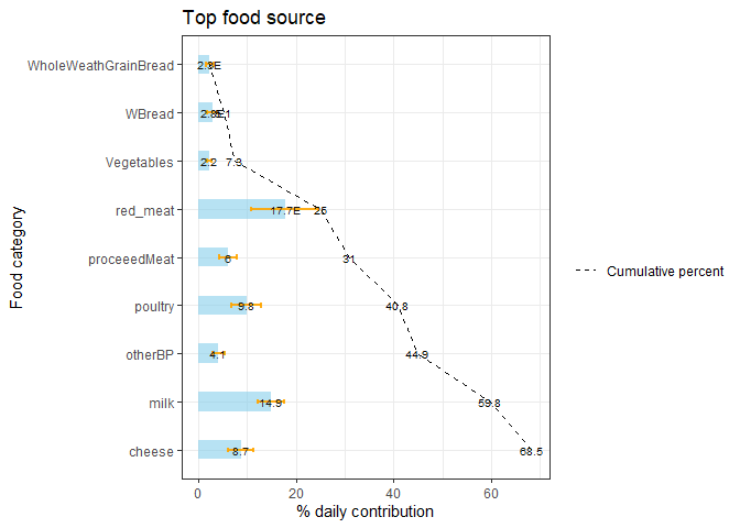
When the first value of “R” has the letter E (like in the example data set), the value displayed at the top of the bar looks messy. This is because “two different values” are been included in the plot. Once from “R” (e.g. 17.7E) and the other one from the result of applying cumsum (e.g. 17.7). I would like to be able to remove the label from cumsum for the first value, so that the only value that is displayed in at the top of the first bar comes from “R”. Can you please advise?
Please, see below my code as well as an example data set.

library(dplyr)
library(forcats)
library(ggplot2)
library(formattable)

plot = Dat %>%

mutate(food = fct_reorder(food,perc)) %>%
arrange(desc(food)) %>%
mutate(CumSum = cumsum(perc)) %>%

ggplot( aes(x=food, y=perc)) +

geom_bar(stat="identity", fill="skyblue", alpha=.6, width=.4) +

geom_errorbar( aes(x=food, ymin=perc-1.96SE_p, ymax=perc+1.96SE_p),
width=0.1, colour="orange", alpha=0.9, size=1.0) +

coord_flip() +

ggtitle("Top food source",) +

xlab("Food category") +

ylab("% daily contribution") +

geom_text(aes(label=R), size = 2.75, col = "gray9") +

theme_bw()+

geom_line(aes(x=food, y=cumsum(perc),group=1, linetype = "Cumulative percent"), col="black") +

geom_text(aes(y = formattable(CumSum, format = "f", digits = 1),label = CumSum),
size = 2.75, check_overlap = TRUE) +

scale_linetype_manual(values = c("Cumulative percent" = "dashed")) + labs(linetype = "")

My data file:

food R perc SE_p cv_p
red meat 17.7E 17.7 3.5 19.7
milk 14.9 14.9 1.4 9.6
poultry 9.8 9.8 1.6 16.4
cheese 8.7 8.7 1.3 14.8
processed meat 6 6 0.9 14.5
other bread products 4.1 4.1 0.6 15.9
white bread 2.8E 2.8 0.5 18.7
whole wheat grain bread 2.3E 2.3 0.4 17.2
vegetables 2.2 2.2 0.2 10

Thanks a lot,
A.G.

Additional relevant information.
OS: Windows 10 (64-bit)
R version: 3.6.2
R studio version: 3.5
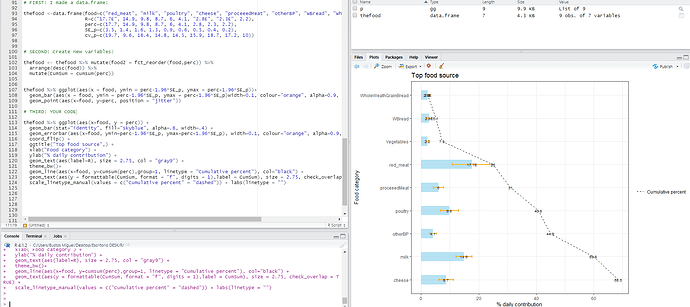
What do you mean with remove the label? What´s the label name that you want to remove?

FIRST: I made a data.frame:

thefood <-data.frame(food=c("red_meat", "milk", "poultry", "cheese", "proceeedMeat", "otherBP", "WBread", "WholeWeathGrainBread", "Vegetables"),
R=c("17.7E", 14.9, 9.8, 8.7, 6, 4.1, "2.8E", "2.3E", 2.2),
perc=c(17.7, 14.9, 9.8, 8.7, 6, 4.1, 2.8, 2.3, 2.2),
SE_p=c(3.5, 1.4, 1.6, 1.3, 0.9, 0.6, 0.5, 0.4, 0.2),
cv_p=c(19.7, 9.6, 16.4, 14.8, 14.5, 15.9, 18.7, 17.2, 10))

SECOND: Create new variables:

thefood <- thefood %>% mutate(food2 = fct_reorder(food,perc)) %>%
arrange(desc(food)) %>%
mutate(CumSum = cumsum(perc))

THIRD: YOUR CODE

thefood %>% ggplot(aes(x=food, y = perc)) +
geom_bar(stat="identity", fill="skyblue", alpha=.6, width=.4) +
geom_errorbar(aes(x=food, ymin=perc-1.96SE_p, ymax=perc+1.96SE_p), width=0.1, colour="orange", alpha=0.9, size=1.0)+
coord_flip() +
ggtitle("Top food source",) +
xlab("Food category") +
ylab("% daily contribution") +
geom_text(aes(label=R), size = 2.75, col = "gray9") +
theme_bw()+
geom_line(aes(x=food, y=cumsum(perc),group=1, linetype = "Cumulative percent"), col="black") +
geom_text(aes(y = formattable(CumSum, format = "f", digits = 1),label = CumSum), size = 2.75, check_overlap = TRUE) +
scale_linetype_manual(values = c("Cumulative percent" = "dashed")) + labs(linetype = "")

Hi @bustosmiguel,
Thanks for taking the time and to try find a solution to my problem. The output you get and mine have the same issue. The only difference is that you did not sorted from highest to lowest values of "perc".
If you look at text at the top of you bar for "WholeWheatGrainBread", you'll notice the 2.3E is not clear. That happens because for the first food item from top to bottom, the value of the variable "R" (2.3E) and the cumulative one (2.3) overlap. Since they are not identical (which is ok), the overlapping is messy.
I would like to be able to remove from the plot the first cumulative value (2.3 in your plot ), so that the 2.3E is displayed clearly. Then for the rest I want to have both, the "R" values and the cumulative ones. Since they will never overlap for the rest, that'd be fine.
I tried to create the cumulative variable outside the code of the plot, and set the first value to missing. However, the broken line did not start until the second value. Clearly, that is not what I want.
Hope this is more clear for you.
Thanks a lot,
A.G.

In that case, a simple workaround: create a copy of the CumSum column where you replace the label to remove, continue using the CumSum column for the line (or recompute it as in your above code).

library(tidyverse)
library(formattable)

thefood <-data.frame(food=c("red_meat", "milk", "poultry", "cheese", "proceeedMeat", "otherBP", "WBread", "WholeWeathGrainBread", "Vegetables"),
                     R=c("17.7E", 14.9, 9.8, 8.7, 6, 4.1, "2.8E", "2.3E", 2.2),
                     perc=c(17.7, 14.9, 9.8, 8.7, 6, 4.1, 2.8, 2.3, 2.2),
                     SE_p=c(3.5, 1.4, 1.6, 1.3, 0.9, 0.6, 0.5, 0.4, 0.2),
                     cv_p=c(19.7, 9.6, 16.4, 14.8, 14.5, 15.9, 18.7, 17.2, 10))

thefood <- thefood %>% mutate(food2 = fct_reorder(food,perc)) %>%
  arrange(desc(food)) %>%
  mutate(CumSum = cumsum(perc))

thefood$CumSum_label <- thefood$CumSum
thefood$CumSum_label[1] <- NA

thefood %>%
  ggplot(aes(x=food, y = perc)) +
  geom_bar(stat="identity", fill="skyblue", alpha=.6, width=.4) +
  geom_errorbar(aes(x=food, ymin=perc-1.96*SE_p, ymax=perc+1.96*SE_p),
                width=0.1, colour="orange", alpha=0.9, size=1.0) +
  coord_flip() +
  ggtitle("Top food source",) +
  xlab("Food category") +
  ylab("% daily contribution") +
  geom_text(aes(label=R), size = 2.75, col = "gray9") +
  theme_bw()+
  geom_line(aes(x=food, y=cumsum(perc),group=1, linetype = "Cumulative percent"),
            col="black") +
  geom_text(aes(y = formattable(CumSum_label, format = "f", digits = 1),
                label = CumSum), size = 2.75, check_overlap = TRUE) +
  scale_linetype_manual(values = c("Cumulative percent" = "dashed")) +
  labs(linetype = "")
#> Warning: Removed 1 rows containing missing values (geom_text).

Created on 2021-12-19 by the reprex package (v2.0.1)

In that case the broken line doesn't have any missing value, since it's not relying on CumSum_label to be drawn.

This topic was automatically closed 21 days after the last reply. New replies are no longer allowed.

If you have a query related to it or one of the replies, start a new topic and refer back with a link.