empty plot when transformed to log scale

Hi,

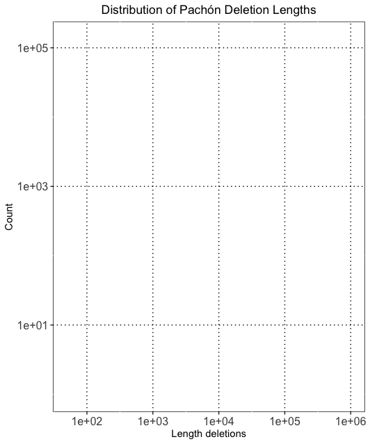
My name is Maggs. I'm trying to plot a simple histogram using ggplot. It plots fine when I don't transform the x-axis to log-scale. However, when I transform the x-axis to log scale it plots an empty grid. I'm not sure how to solve it. Any help would be greatly appreciated! Below is my code, the plot of the empty grid, and the histogram plotted prior to transforming the x-axis.

Thanks!

l <- pachon_del %>%
ggplot(aes(x=V1)) +
geom_histogram(binwidth=1000, fill="aquamarine2", color="aquamarine2") +
#scale_y_log10() +
ggtitle("Distribution of Pachón Deletion Lengths") +
ylab("Count") +
xlab("Length deletions") +
scale_x_continuous(limits=c(50,1000000), trans="log10") + #set x-axis limits
scale_y_continuous(trans="log10") + #set y-axis
theme(axis.text = element_text(size = 12)) + #size of axis text
theme(plot.title = element_text(hjust = 0.5)) + #center the title of the plot
theme(panel.background = element_rect(fill = 'white', color = 'black'), #back background white and outline of plot black
panel.grid.major = element_line(color = 'black', linetype = 'dotted')) #make grid dotted lines

l
dev.off()

Hi, can you share an example of the pachon_del dataset?

Hi William,

Unfortunately it doesn't let me attach a .txt file and it's over 130,000 lines. Do you have any work arounds?

Maggs
they/them

You could try this. 100 random lines without duplicates from the original:

3991
907
5767
4193
2903
5230
2281
1312
7878
6153
1660
866
4346
5447
1406
8209
50304
4511
5962
13041
30296
263
5054
2188
9467
6011
1709
1392
2504
13514
29633
3165
14694
2359
2521
11326
3278
2481
4222
9488
306
9454
1779
3104
916
245
69886
6635
6356
3206
6372
13825
2553
2832
108
5503
61035
6083
7226
2632
1084
1348
3296
491
19140
6007
9089
8724
3479
6982
8740
6419
5143
7023
254
190
881
10785
3758
767
1520
4976
439
668
6275
1195
2349
13644
8698
5396
2130
3690
2950
3484
13176
1609
3540
1683
19865
7484

Hi Maggs, we don't need your full file. Just a reproducible sample.

Something like this.

# reproducible example
pachon_del <- tibble::tibble(V1 = sample(1L:1000000L, 10000))

I had a quick look. No answer yet. Someone else might figure it out though.

I think its best to do data transformations up font.
For example

library(tidyverse)

 # for_some_example_data
pachon_del <- data.frame(V1=runif(n=10^6,
                                  min=50,
                                  max=1000000))
#calculate the x axis log10 values up front , as data
pachon_del$log10_v1 <- log10(pachon_del$V1)
l <- pachon_del %>%
  ggplot(aes(x=log10_v1)) +
  geom_histogram(fill="aquamarine2", color="aquamarine2") +
  #scale_y_log10() +
  ggtitle("Distribution of Pachón Deletion Lengths") +
  ylab("Count") +
  xlab("Length deletions") +
  scale_y_continuous(trans="log10") + #set y-axis
  theme(axis.text = element_text(size = 12)) + #size of axis text
  theme(plot.title = element_text(hjust = 0.5)) + #center the title of the plot
  theme(panel.background = element_rect(fill = 'white', color = 'black'), #back background white and outline of plot black
        panel.grid.major = element_line(color = 'black', linetype = 'dotted')) #make grid dotted lines

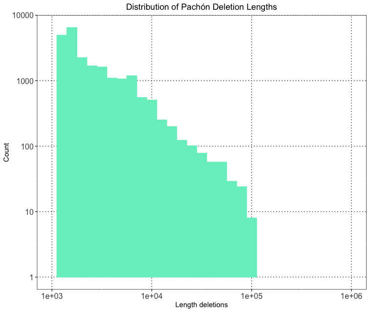
I agree, however the reason is the "binwidth = 1000" argument, as this is also based on the log data, removing this and do the peak-width definition automatically and everything works.

pachon_del = tibble(V1 = c(rnorm(10000, 100000, 20000), # some signal
                           runif(3000, 100, 1000000) ))  # some background
pachon_del %>% 
ggplot(aes(x=V1)) +
  geom_histogram(#binwidth = 0.1, # this works, binwidth = 1000 doesn't work!
                 fill="aquamarine2", color="aquamarine2") +
  labs(title = "Distribution of Pachón Deletion Lengths",
       y = "Count", x = "Length deletions") +
  scale_x_continuous(limits=c(1000,1000000), trans="log10") + #set x-axis limits
  scale_y_continuous(trans="log10") + #set y-axis
  theme(axis.text = element_text(size = 12),      #size of axis text
        plot.title = element_text(hjust = 0.5),   #center the title of the plot
        panel.background = element_rect(fill = 'white', color = 'black'),  #back background white and outline of plot black
        panel.grid.major = element_line(color = 'black', linetype = 'dotted') #make grid dotted lines
        )

Thank you! Both of these solutions plot the data. I have another maybe silly question. Can you explain why the plot shows 9 deletions 10^5 length, even though the longest deletions are slightly below 100,000? Below is a snapshot of the longest deletions in the dataset. And attached is the png of the histogram.

99220
98969
96403
96384
96373
93768
90756
90181
88005
86918
86063
83438
81741
80240
80090
79910
79617
79210
79067
78852
78247
78033
77967
77763
76187
75355
73880
72344
72011
71922

Whoops, never mind.

Maggs

This topic was automatically closed 21 days after the last reply. New replies are no longer allowed.

If you have a query related to it or one of the replies, start a new topic and refer back with a link.