EdOptimize - Digital Curriculum Analytics
Authors: Tirth Shah, Nirmal Patel, Aditya Sharma
Abstract: This application can help curriculum designers identify various learning patterns in their digital curriculum products. Using this dashboard, we can locate content that needs change and see classroom pacing analytics. We can also look at assessment data, item analysis, and standards performance of the curriculum users.
Full Description: This dashboard is aimed at understanding how a group of educational products (e.g. Math Grades 3-5) are being used at large on an EdTech platform. The data in this dashboard can provide valuable insights to the curriculum teams that want to improve various aspects of the digital program. The analytics in this dashboard always focus on a specific school year.
Here are the descriptions of each of the sections in this dashboard:
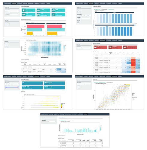
- Overall Usage: In this section, you can see the high-level usage summary of a group of related products. You can see the number of users and sessions within each product. We can also see the activity level of students and teachers in this view.
- Usage Over Time: Here, you can see several usage over time views for both the overall group of products and for individual products. The individual view will allow you to compare how different products within the product group compare to each other. You can see new versus returning users over time, average session duration over time, and average events per user over time in this view. You can also see leaving and bouncing users over time in this view, and the data can be seen at the level of the day, week, or month for the selected time frame.
- Content Usage: This section will show you how different types of content items and the specific content items themselves are being utilized by the online learners. You can pick an individual product or look at the data at the product group level. You can see the distribution of the % content utilization, which type of content was used by how many users, and usage over time for the different types of content items (e.g. Videos, Quizzes, Tests, Documents, etc.) Finally, you can also see a table that shows the usage of individual content items along with how much time was spent on them.
- Assessment Analysis: In this part, you can see data analysis of every assessment present in the individual products. You can see how many students took each assessment, what was their average score, and also the Cronbach's Alpha of the assessment which is a measure of the overall reliability of the assessment. You can pick an individual assessment and see the score distribution of that assessment, along with item-level data that tell us how many students responded to each of the items, what was their average % correct, and the point biserial measure of the item which tell us how predictive the individual item is of the overall assessment. If you find assessments with low Cronbach's Alpha and items with low point biserial, they should be inspected further for their validity.
- Skill Performance: In this section, you can see the average student performance on each skill that is part of a product. You can also see how different skills were assessed over time during the school year.
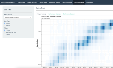
- Curriculum Pacing: Curriculum Pacing charts are award-winning data visualizations that show how students go through a curriculum over time. Click here to read our research on Curriculum Pacing. In this section, you can pick a specific product from the curriculum and look at the pacing patterns of the students. You can see the pacing patterns for students or teachers. You can choose between a heatmap or dot plot representation of the pacing visualization. Several metrics can be plotted on these visualizations.
- Leaderboard: In this part of the dashboard, you can see which school districts are the top users of the products within this product group. You can select an individual district by clicking on its name in the leaderboard table and see the district's product usage over time.
Keywords: education,edtech,educational data,learning analytics,k-12
Shiny app: https://playpowerlabs.shinyapps.io/edopt_curriculum_analytics/
Repo: GitHub - PlaypowerLabs/EdOptimize: EdOptimize is an open-source learning analytics platform for K-12 digital learning systems.
RStudio Cloud: Posit Cloud
Thumbnail:

Full image:
