Hi,
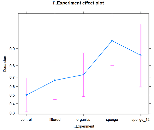
I'm having some trouble visualising the predicted probabilities for my binomial GLMM across different experiments. My graph puts the Y-axis on a different scale:
Here is the code I used for the graph:
no_decision_df <- read.csv("no_decision_dataset.csv")
str(no_decision_df)
head(no_decision_df)
no_decision_df$ï..Experiment <- as.factor(no_decision_df$ï..Experiment)
str(no_decision_df)
Fit a mixed model##############
glm5 <- glmer(Descision ~ ï..Experiment + (1 | Nudibranch), family = binomial, data = no_decision_df)
summary(glm5)
install.packages("effects")
plot(allEffects(glm5))
Does anyone know how to change the scale of the y-axis on my graph? I also want to be able to adjust the labels but am finding it difficult to edit the allEffects plots. If anyone has any advice dealing with these types of plots it would be greatly appreciated.
