Editing ggstatsplot graph

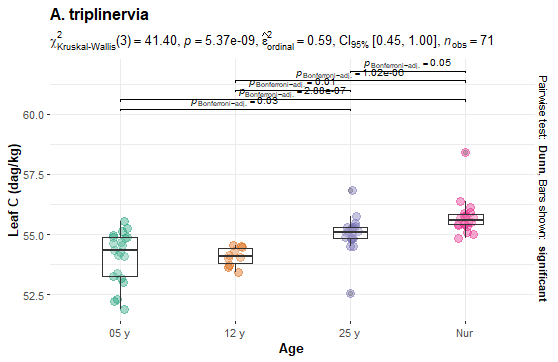
Hello, I kindly need help in ggbetweenstats package. I got the following plot, but I really need more space between p-adjust labels, since we can't read them well. Also, I can't find an italic script for the title. Anyone can help? Thank you in advance.

image

This can probably be adjusted, but not without [a reprex (see the FAQ])(FAQ: How to do a minimal reproducible example ( reprex ) for beginners).

Thanks, my friend, but it's still not clear for me. I'm a begginner in R, so I couldn't find a proper script for my question in the FAQ. If you can still help me with that, I'll appreciate it.

The FAQ does not have answers to your question, but it does have information on creating a reprex. The reprex will include a representative sample of your data and the code you have used. This will make it MUCH easier for others to help you.

I created an example reprex using the first 20 observations in the mtcars data set and the code for a simple ggplot. I used dput(head(mtcars, 20)) and assigned the result to mydata:

mydata <- structure(list(mpg = c(21, 21, 22.8, 21.4, 18.7, 18.1, 14.3, 
24.4, 22.8, 19.2, 17.8, 16.4, 17.3, 15.2, 10.4, 10.4, 14.7, 32.4, 
30.4, 33.9), cyl = c(6, 6, 4, 6, 8, 6, 8, 4, 4, 6, 6, 8, 8, 8, 
8, 8, 8, 4, 4, 4), disp = c(160, 160, 108, 258, 360, 225, 360, 
146.7, 140.8, 167.6, 167.6, 275.8, 275.8, 275.8, 472, 460, 440, 
78.7, 75.7, 71.1), hp = c(110, 110, 93, 110, 175, 105, 245, 62, 
95, 123, 123, 180, 180, 180, 205, 215, 230, 66, 52, 65), drat = c(3.9, 
3.9, 3.85, 3.08, 3.15, 2.76, 3.21, 3.69, 3.92, 3.92, 3.92, 3.07, 
3.07, 3.07, 2.93, 3, 3.23, 4.08, 4.93, 4.22), wt = c(2.62, 2.875, 
2.32, 3.215, 3.44, 3.46, 3.57, 3.19, 3.15, 3.44, 3.44, 4.07, 
3.73, 3.78, 5.25, 5.424, 5.345, 2.2, 1.615, 1.835), qsec = c(16.46, 
17.02, 18.61, 19.44, 17.02, 20.22, 15.84, 20, 22.9, 18.3, 18.9, 
17.4, 17.6, 18, 17.98, 17.82, 17.42, 19.47, 18.52, 19.9), vs = c(0, 
0, 1, 1, 0, 1, 0, 1, 1, 1, 1, 0, 0, 0, 0, 0, 0, 1, 1, 1), am = c(1, 
1, 1, 0, 0, 0, 0, 0, 0, 0, 0, 0, 0, 0, 0, 0, 0, 1, 1, 1), gear = c(4, 
4, 4, 3, 3, 3, 3, 4, 4, 4, 4, 3, 3, 3, 3, 3, 3, 4, 4, 4), carb = c(4, 
4, 1, 1, 2, 1, 4, 2, 2, 4, 4, 3, 3, 3, 4, 4, 4, 1, 2, 1)), row.names = c("Mazda RX4", 
"Mazda RX4 Wag", "Datsun 710", "Hornet 4 Drive", "Hornet Sportabout", 
"Valiant", "Duster 360", "Merc 240D", "Merc 230", "Merc 280", 
"Merc 280C", "Merc 450SE", "Merc 450SL", "Merc 450SLC", "Cadillac Fleetwood", 
"Lincoln Continental", "Chrysler Imperial", "Fiat 128", "Honda Civic", 
"Toyota Corolla"), class = "data.frame")

library(tidyverse)

mydata |> 
  mutate(cyl = as_factor(cyl)) |> 
  ggplot(aes(wt, mpg, color = cyl)) + geom_point()

Created on 2023-06-19 with reprex v2.0.2

1 Like

This topic was automatically closed 21 days after the last reply. New replies are no longer allowed.

If you have a query related to it or one of the replies, start a new topic and refer back with a link.