Hi, dears
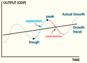
I want to plot the curve of economic cycles as shown below. I'm looking for an R or Python code that does this.
Best

There are probably a half-dozen or more ways to do this. Can you supply us with whatever code you have and some sample data?
Have a look at
for some suggestions.
Thank you @jrkrideau for your reply.
In fact, there is no data. It's just an educational illustration.
I only need an economic cycle with its stages. Perhaps a sinusoidal function is sufficient for this.
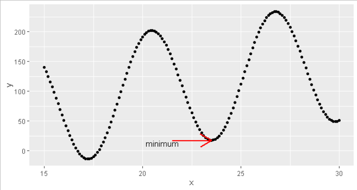
myfunc <- function(x) sin(x)*100+5*x

(df <- data.frame(x=150:300/10,
                 y=myfunc(150:300/10)))

min2 <- optimise(myfunc,c(20,25))


ggplot(df) +
  aes(x=x,
      y=y) +
  geom_point() +
  annotate("segment",
           x = min2$minimum - 2,
           xend = min2$minimum,
           y = min2$objective-1,
           yend = min2$objective,
           colour = "red",
           size=1,
           arrow=arrow())    +
    geom_text(data=data.frame(x=min2$minimum - 2.5,
                              y=min2$objective - 5),
               label = "minimum")
Thanks @nirgrahamuk
This is enough for me
This topic was automatically closed 7 days after the last reply. New replies are no longer allowed.
If you have a query related to it or one of the replies, start a new topic and refer back with a link.
