I calculated the microbial community assembly file through IEG Statistical Analysis Pipeline, and now I want to visualize this data file.
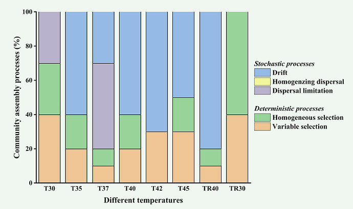
I want to convert my data into the form of FIG 1
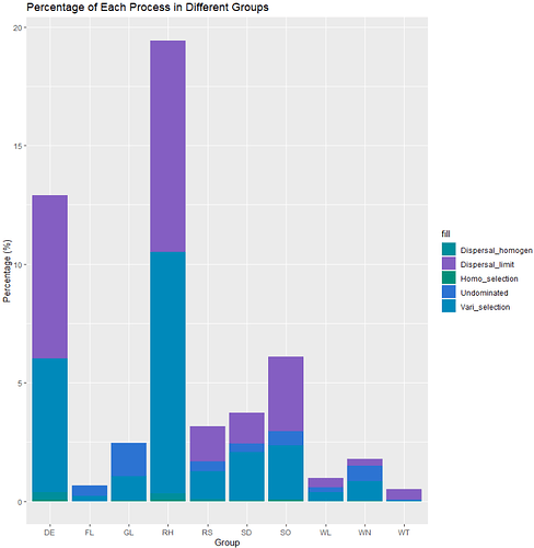
I did a data visualization in R and this is the result I got FIG 2
This is obviously a big difference, and the percentages for each group do not add up to 100%.
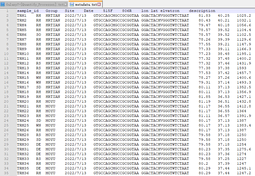
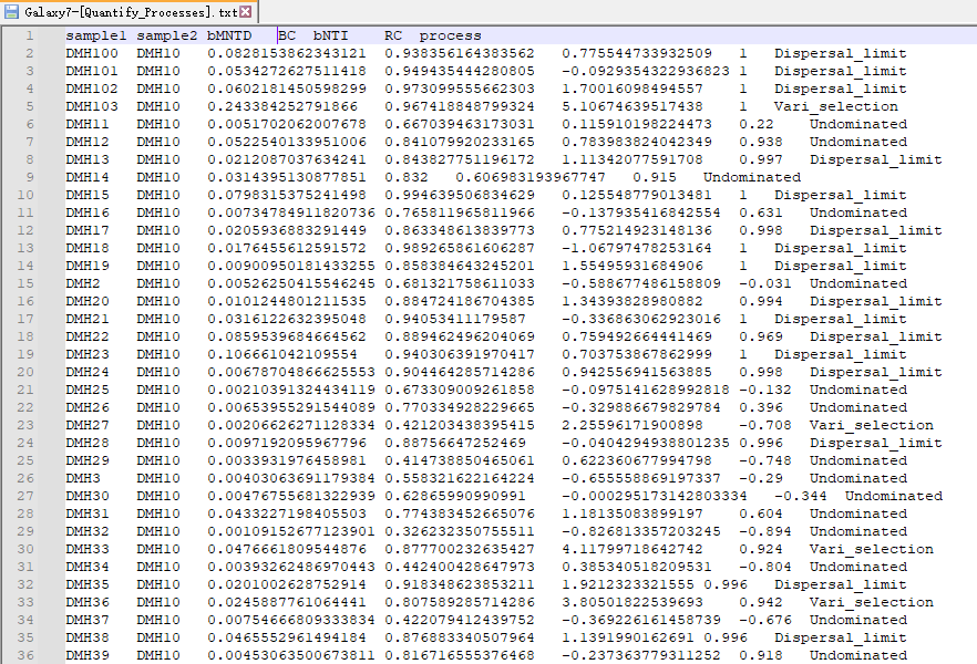
My metadata file(FIG 3) and process file(FIG 4) are as follows, how can I write R code to achieve the effect of FIG 1


