Hola/Hello,
I am currently working with a dataset composed of a series of two experiments of dna extraction : a first one and a second one optimized and I would like to represent it in 3D and interactively
I found the package Echart4R which seems veyr interesting even if they're still few people working with it
Then, I decided to plot my data with the example given for Bar 3D trying to apply it to my dataset.
Here's my code :
# PACKAGES

library(echarts4r)

# Plot preparation

    trans <- list(opacity = 0.4) # transparency
    emphasis <- list(itemStyle = list(color = "#313695"))

# Making the plot

plot1<-dna_extraction_comparison |>
  e_charts(Code) |>                                                                  # indique qu'on fait un plot echart en spécifiant l'abcisse X à utiliser
  e_title("Optimization of dna extraction protocol comparison","Wilcowon paired test : p-value = 1.476e-05 **") |> # title
  e_bar_3d(Species, round.1, stack = "stack", name = " (1) Raw extraction ", itemStyle = trans, emphasis = emphasis) |>
  e_bar_3d(Species, Round.2, stack = "stack", name = " (2) Optimized extraction", itemStyle = trans, emphasis = emphasis) |> # Stack pour spécifier l'empilement des données
  e_legend()
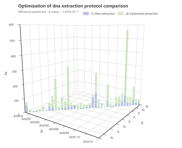
Here's my current result :
The plot correspond to each specimen included in the experiments two times, axis X and Y display the same information, each specimen having a taxinomix name and a sampling code
My interrogation is about the axis label :
(1)
I already searched but I do not find any solution for renaming my axis plot, it does not seems to be implemented for this kind of visualisation
isn't it ?
(2)
Is that possible to control what appears in the axis label, if I want to let appears more than 8 species written in the axis for example ?
Thanks in advance and wishing you a good day !
