dustribution curve plot

Hi,

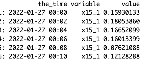
I have the data, which can be found Dropbox

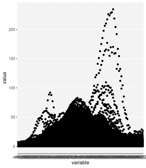
I need to plot something like

So, the data header is given 15.1 to 661 which is the x-axis and the rest are the y-axis points.

So, I want to make a distribution curve like the above figure.

Could you please let me know how to make it?

I tried with julius.ai and from that I got this kind of plot

import pandas as pd
import matplotlib.pyplot as plt

# Load the data with corrected headers
headers = [15.1, 15.7, 16.3, 16.8, 17.5, 18.1, 18.8, 19.5, 20.2, 20.9, 21.7, 22.5, 23.3, 24.1, 25, 25.9, 26.9, 27.9, 28.9, 30, 31.1, 32.2, 33.4, 34.6, 35.9, 37.2, 38.5, 40, 41.4, 42.9, 44.5, 46.1, 47.8, 49.6, 51.4, 53.3, 55.2, 57.3, 59.4, 61.5, 63.8, 66.1, 68.5, 71, 73.7, 76.4, 79.1, 82, 85.1, 88.2, 91.4, 94.7, 98.2, 101.8, 105.5, 109.4, 113.4, 117.6, 121.9, 126.3, 131, 135.8, 140.7, 145.9, 151.2, 156.8, 162.5, 168.5, 174.7, 181.1, 187.7, 194.6, 201.7, 209.1, 216.7, 224.7, 232.9, 241.4, 250.3, 259.5, 269, 278.8, 289, 299.6, 310.6, 322, 333.8, 346, 358.7, 371.8, 385.4, 399.5, 414.2, 429.4, 445.1, 461.4, 478.3, 495.8, 514, 532.8, 552.3, 572.5, 593.5, 615.3, 637.8, 661.2]
df = pd.read_csv('DATA_Sample_SurArea_Dist.csv', names=headers, skiprows=1, encoding='UTF-8-SIG')

# Filter the data for particle diameters from 0 to 1000 nm
filtered_df = df.loc[:, df.columns <= 1000]

# Plotting
plt.figure(figsize=(10, 6), facecolor='white')
plt.plot(filtered_df.columns, filtered_df.iloc[0], marker='o', linestyle='-')
plt.title('Surface Area Distribution for Particle Diameters 0-1000 nm')
plt.xlabel('Diameter (nm)')
plt.ylabel('Surface Area')
plt.grid(True)
plt.show()

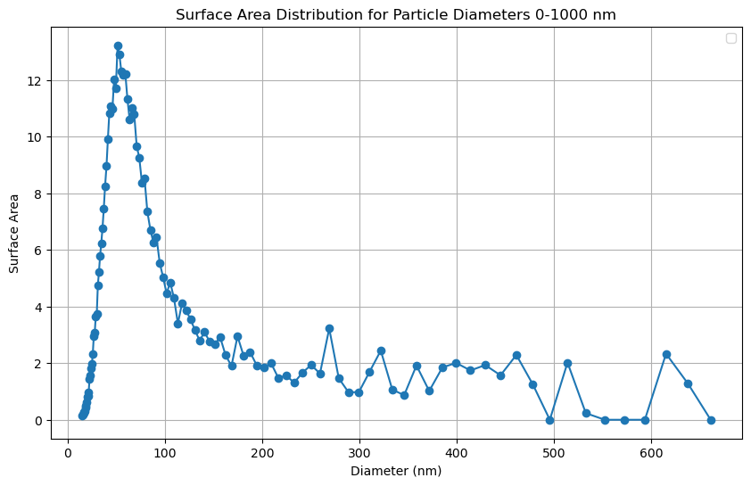
I want to make it something like a plot but with R.

please help out.

Thanks.

Hi,
The main package for plotting in R is ggplot2 which is much more intuitive than matplotlib.
Start by creating a dataframe with your columns and call it df.

library(ggplot2)
ggplot(data = df) +
geom_smooth(aes(x = col1, y = col2))

replace col1, col2 with your column names.
After you produce your basic plot, you can start tweak it with labs, xlabs, ylabs...
There are pretty good cheat sheets on Google for ggplot2, try using them.

Hi,

Thanks for your time

If the data were in 2 columns, it would be simple for me too. However, when you look at the dataset (Dropbox link), there are 106 columns, and all the headers serve as my x-axis values. Alternatively, I want to use the header value as the x-axis and the rest are y-axis values.

I am not completely clear on what you want but try this:

suppressMessages(library(data.table)) 
suppressMessages(library(tidyverse))
suppressMessages(library(janitor))


DT <-  fread("DATA_SurArea_Dist.csv", header = TRUE)  %>%  clean_names()

DT_M <- melt(DT, id.var = "the_time")

ggplot(DT_M, aes(x = variable, y = value)) + geom_point()  # variable is a factor

## Or 
DT_M[ , variable := as.character(variable)]  # variable is character

ggplot(DT_M, aes(x = variable, y = value)) + geom_point()

Note that DT_M has 2,828,504 rows. On a lightweight laptop such as I am using, it is worth making yourself a cup of coffee or tea while waiting for ggplot2. It took ~ 4 minutes to draw this plot.

There must be a better way but I don't see it at the moment.

Can you share the plot too?

Plotted with

ggplot(DT_M, aes(x = variable, y = value)) + geom_point()  # variable is a factor

Thanks for your time.

But the x-axis values have now become the character format.
I mean 15.1 value now becomes x15_1, which I do not want to do that.
Screenshot 2024-05-04 at 7.15.51 PM

I am trying to fix my x-axis as 0 to 700 (these values are given as header)

I am trying to plot the figure just like the figure shared here.
A smooth fitting curve, not all the points.

I don't see any connection between the plot with the logarithmic x axis and the plot with the blue dots. To make the latter, it seems we need to plot the first row and the second row of the data you posted.

library(tidyverse)
#> Warning: package 'ggplot2' was built under R version 4.3.3
DF <- read.table("~/R/Play/DATA_SurArea_Dist.csv", sep = ",", header = FALSE, skip = 1)
DFx <- read.table("~/R/Play/DATA_SurArea_Dist.csv", sep = ",", header = FALSE, nrows = 1)
Xs <- unlist(DFx[1,2:107])
Ys <- unlist(DF[1,2:107])
DFplot <- data.frame(Xvals = Xs, Yvals = Ys)
ggplot(DFplot, aes(x = Xvals, y = Yvals)) +
  geom_point() + geom_line() +
  labs(x = "Diameter", y = "Surface Area") + theme_bw()

Created on 2024-05-04 with reprex v2.0.2

Hi, @FJCC! Thanks for pointing that out. I realized it was the wrong plot. However, I’m still interested in creating a similar plot, but including all the columns and fitting curves—perhaps using a log-normal distribution, as I mentioned in my previous comment. So, that i can get a smooth distribution curve.

Thanks for your time.

It is not at all clear to me what you want to plot from your data. Here is a density plot, with a log x scale, of all the values excluding the first row (the "headers") and the first column. That is about 2.8M values.

library(tidyverse)
#> Warning: package 'ggplot2' was built under R version 4.3.3
DF <- read.table("~/R/Play/DATA_SurArea_Dist.csv", sep = ",", header = FALSE, skip = 1)
AllVals <- unlist(DF[,2:107])
DF_all <- data.frame(Val = AllVals)
ggplot(DF_all, aes(Val)) + geom_density() +
  scale_x_log10()
#> Warning in scale_x_log10(): log-10 transformation introduced infinite values.
#> Warning: Removed 138409 rows containing non-finite outside the scale range
#> (`stat_density()`).

Created on 2024-05-04 with reprex v2.0.2

Hi

I apologize for not explaining my query correctly.

In my dataset, the header corresponds to particle diameter values ranging from 15.1 to 661. The remaining columns contain surface area distribution values. For example, the first column represents particle diameters (with a header value of 15.1), and each corresponding value in that column reflects the surface area distribution at different time intervals.

Plot Requirements: Now, I aim to create a plot with the following specifications:

  • The x-axis should represent particle diameter (header value), spanning either the range from 15.1 to 661 or a scaled range from 10 to 1000.
  • The y-axis will display the surface area distribution values from all the columns.
  • Importantly, I want to include only a fitting line on the plot because Including all data points would clutter the visualization.

I hope I am clear this time.

This code produces plots of the mean surface area for each of the particle diameters. One plot uses a linear x axis and the other uses a logarithmic axis.

library(tidyverse)
DF <- read.table("~/R/Play/DATA_SurArea_Dist.csv", sep = ",", header = FALSE, skip = 1)
DFx <- read.table("~/R/Play/DATA_SurArea_Dist.csv", sep = ",", header = FALSE, nrows = 1)
Xs <- unlist(DFx[1,2:107])
meanSurf <- colMeans(DF[,2:107])
DFplot <- data.frame(Xvals = Xs, Yvals = meanSurf)
ggplot(DFplot, aes(x = Xvals, y = Yvals)) +
  geom_point() + geom_line() +
  labs(x = "Diameter", y = "Surface Area") + theme_bw()

ggplot(DFplot, aes(x = Xvals, y = Yvals)) +
  geom_point() + geom_line() +
  labs(x = "Diameter", y = "Surface Area") + theme_bw()+
  scale_x_log10()

It would be helpful to folks if you could post the output of dput(your_table) (or dput(head(your_table, 100)) if you have many rows) rather than share a file, for both the convenience of folks who would like to help you, and to avoid the risks associated with file-sharing.

"DATA_Sample_SurArea_Dist.csv", the dropbox file, is 26,684 X 107. I don't think it can be posted here.

In which case the OP should go with second option:

(whatever the max number of rows works is).