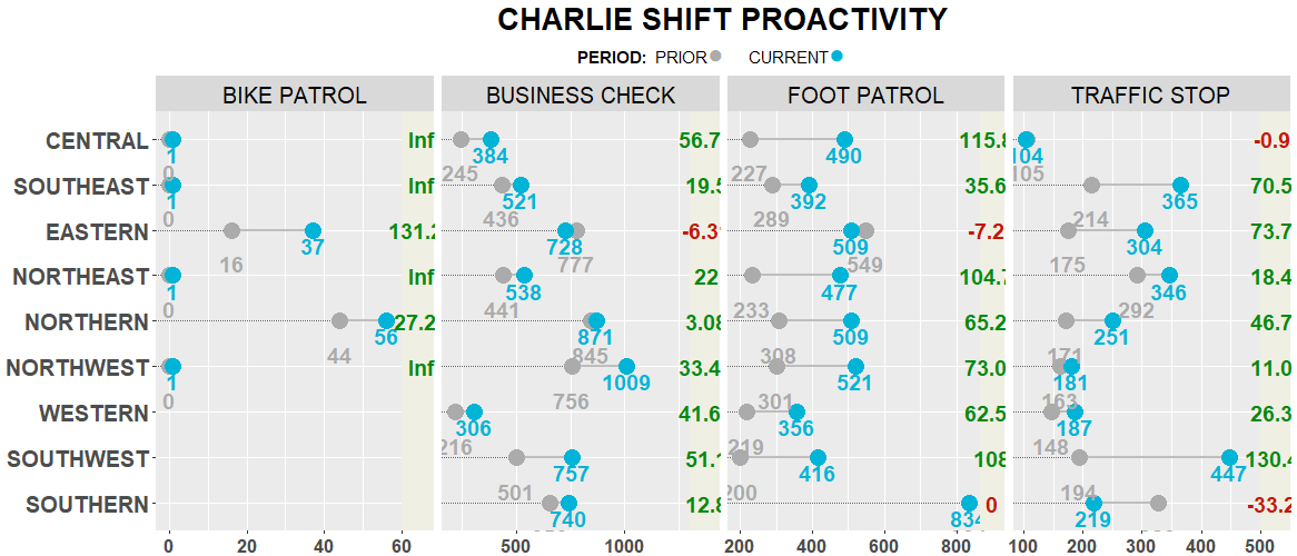
I am looking to add a Legend to my dumbbell plot. I would like it at the top preferably under the Plot title with the following specifics
Legend Title PERIOD
#ababab" PRIOR
#00B4D8 CURRENT
The hex #s are the dumbbell part of my plot. I would also like the legend in a straight line
PERIOD dot PRIOR dot CURRENT
Below is a data sample
structure(list(DISTRICT = c("CENTRAL", "CENTRAL", "CENTRAL",
"CENTRAL", "EASTERN", "EASTERN", "EASTERN", "EASTERN", "NORTHEAST",
"NORTHEAST", "NORTHEAST", "NORTHEAST", "NORTHERN", "NORTHERN",
"NORTHERN", "NORTHERN", "NORTHWEST", "NORTHWEST", "NORTHWEST",
"NORTHWEST", "SOUTHEAST", "SOUTHEAST", "SOUTHEAST", "SOUTHEAST",
"SOUTHERN", "SOUTHERN", "SOUTHERN", "SOUTHWEST", "SOUTHWEST",
"SOUTHWEST", "WESTERN", "WESTERN", "WESTERN"), CALL_TYPE_ORIG_D = c("BIKE PATROL",
"BUSINESS CHECK", "FOOT PATROL", "TRAFFIC STOP", "BIKE PATROL",
"BUSINESS CHECK", "FOOT PATROL", "TRAFFIC STOP", "BIKE PATROL",
"BUSINESS CHECK", "FOOT PATROL", "TRAFFIC STOP", "BIKE PATROL",
"BUSINESS CHECK", "FOOT PATROL", "TRAFFIC STOP", "BIKE PATROL",
"BUSINESS CHECK", "FOOT PATROL", "TRAFFIC STOP", "BIKE PATROL",
"BUSINESS CHECK", "FOOT PATROL", "TRAFFIC STOP", "BUSINESS CHECK",
"FOOT PATROL", "TRAFFIC STOP", "BUSINESS CHECK", "FOOT PATROL",
"TRAFFIC STOP", "BUSINESS CHECK", "FOOT PATROL", "TRAFFIC STOP"
), SHIFT = c("C", "C", "C", "C", "C", "C", "C", "C", "C", "C",
"C", "C", "C", "C", "C", "C", "C", "C", "C", "C", "C", "C", "C",
"C", "C", "C", "C", "C", "C", "C", "C", "C", "C"), DIST_NUM = c(1,
1, 1, 1, 3, 3, 3, 3, 4, 4, 4, 4, 5, 5, 5, 5, 6, 6, 6, 6, 2, 2,
2, 2, 9, 9, 9, 8, 8, 8, 7, 7, 7), CURRENT = c(1, 384, 490, 104,
37, 728, 509, 304, 1, 538, 477, 346, 56, 871, 509, 251, 1, 1009,
521, 181, 1, 521, 392, 365, 740, 834, 219, 757, 416, 447, 306,
356, 187), PRIOR = c(0, 245, 227, 105, 16, 777, 549, 175, 0,
441, 233, 292, 44, 845, 308, 171, 0, 756, 301, 163, 0, 436, 289,
214, 656, 834, 328, 501, 200, 194, 216, 219, 148), PCT_CHANGE = c("Inf",
"56.73", "115.86", "-0.95", "131.25", "-6.31", "-7.29", "73.71",
"Inf", "22.00", "104.72", "18.49", "27.27", "3.08", "65.26",
"46.78", "Inf", "33.47", "73.09", "11.04", "Inf", "19.50", "35.64",
"70.56", "12.80", "0.00", "-33.23", "51.10", "108.00", "130.41",
"41.67", "62.56", "26.35")), class = c("grouped_df", "tbl_df",
"tbl", "data.frame"), row.names = c(NA, -33L), groups = structure(list(
    DISTRICT = c("CENTRAL", "CENTRAL", "CENTRAL", "CENTRAL",
    "EASTERN", "EASTERN", "EASTERN", "EASTERN", "NORTHEAST",
    "NORTHEAST", "NORTHEAST", "NORTHEAST", "NORTHERN", "NORTHERN",
    "NORTHERN", "NORTHERN", "NORTHWEST", "NORTHWEST", "NORTHWEST",
    "NORTHWEST", "SOUTHEAST", "SOUTHEAST", "SOUTHEAST", "SOUTHEAST",
    "SOUTHERN", "SOUTHERN", "SOUTHERN", "SOUTHWEST", "SOUTHWEST",
    "SOUTHWEST", "WESTERN", "WESTERN", "WESTERN"), CALL_TYPE_ORIG_D = c("BIKE PATROL",
    "BUSINESS CHECK", "FOOT PATROL", "TRAFFIC STOP", "BIKE PATROL",
    "BUSINESS CHECK", "FOOT PATROL", "TRAFFIC STOP", "BIKE PATROL",
    "BUSINESS CHECK", "FOOT PATROL", "TRAFFIC STOP", "BIKE PATROL",
    "BUSINESS CHECK", "FOOT PATROL", "TRAFFIC STOP", "BIKE PATROL",
    "BUSINESS CHECK", "FOOT PATROL", "TRAFFIC STOP", "BIKE PATROL",
    "BUSINESS CHECK", "FOOT PATROL", "TRAFFIC STOP", "BUSINESS CHECK",
    "FOOT PATROL", "TRAFFIC STOP", "BUSINESS CHECK", "FOOT PATROL",
    "TRAFFIC STOP", "BUSINESS CHECK", "FOOT PATROL", "TRAFFIC STOP"
    ), SHIFT = c("C", "C", "C", "C", "C", "C", "C", "C", "C",
    "C", "C", "C", "C", "C", "C", "C", "C", "C", "C", "C", "C",
    "C", "C", "C", "C", "C", "C", "C", "C", "C", "C", "C", "C"
    ), .rows = structure(list(1L, 2L, 3L, 4L, 5L, 6L, 7L, 8L,
        9L, 10L, 11L, 12L, 13L, 14L, 15L, 16L, 17L, 18L, 19L,
        20L, 21L, 22L, 23L, 24L, 25L, 26L, 27L, 28L, 29L, 30L,
        31L, 32L, 33L), ptype = integer(0), class = c("vctrs_list_of",
    "vctrs_vctr", "list"))), row.names = c(NA, -33L), .drop = TRUE, class = c("tbl_df",
"tbl", "data.frame")))
Here is my current script including the completed plot without the legend.
repowdC <- repowd %>%
  filter(SHIFT =="C")
Curr_colC <- c("#00B4D8")
Pri_colC <- c("#ababab")


repowdC %>%
  group_by(CALL_TYPE_ORIG_D) %>%
  dplyr::summarize(max = max(CURRENT))
rect<-data.frame(CALL_TYPE_ORIG_D = c("BUSINESS CHECK", "FOOT PATROL", "TRAFFIC STOP", "BIKE PATROL"),
  xmin = c(1300, 865, 500,60),
                 xmax = c(Inf, Inf, Inf, Inf),
                 ymin = c(-Inf, -Inf, -Inf, -Inf),
                 ymax = c(Inf, Inf, Inf, Inf))

diffC<-repowdC %>%
  group_by(CALL_TYPE_ORIG_D, DISTRICT) %>%
  dplyr::summarize((CURRENT - PRIOR)/PRIOR *100)

diffC$x <- ifelse(diffC$CALL_TYPE_ORIG_D == "BUSINESS CHECK", 1380,
                 ifelse(diffC$CALL_TYPE_ORIG_D == "FOOT PATROL", 900,
                        ifelse(diffC$CALL_TYPE_ORIG_D == "TRAFFIC STOP", 530,
                        ifelse(diffC$CALL_TYPE_ORIG_D == "BIKE PATROL", 65, 0))))
diffC$percC<-round(diffC$`(CURRENT - PRIOR)/PRIOR * 100`, 2)

pct_col<-ifelse(diffC$percC > 0, "#028A0F", "#C21807")

ggplot() +
  geom_dumbbell(data=repowdC, aes(y=reorder(DISTRICT, -DIST_NUM), x=PRIOR, xend=CURRENT),
                size = 1.0,
                color="gray",
                size_x = 5,
                size_xend = 5,
                colour_x = Pri_colC,
                colour_xend = Curr_colC) +
  facet_grid(~ CALL_TYPE_ORIG_D, scales = "free") +
  labs(title = "CHARLIE SHIFT PROACTIVITY")+
  theme(strip.text.x = element_text(size = 15, colour = "black"), #Call Type#
        axis.text.y = element_text(size = 15, face = "bold"),#y axis#
        axis.text.x = element_text(size = 13, face = "bold"),
        axis.title = element_blank(),
        plot.title = element_text(size = 20, face = "bold", hjust = 0.5)) +

  geom_text(data=repowdC, aes(x=PRIOR, y=DISTRICT, label=PRIOR),
           color= "#ababab", fontface="bold", size=5, vjust=2.5, nudge_y = 0) +
  geom_text(data=repowdC, color="#00B4D8", fontface="bold", size=5, vjust=2.5, nudge_y = 0.4,
           aes(x=CURRENT, y=DISTRICT, label=CURRENT)) +

  geom_rect(aes(xmin=xmin, xmax=xmax, ymin=ymin, ymax=ymax), fill="#efefe3",
          data = transform(rect, ID = as.character(1:4)),
          inherit.aes = FALSE) +
  geom_text(data=diffC, aes(label=percC, x =x, y=DISTRICT), fontface="bold", size=5, color = pct_col) +
  geom_text(data=filter(diffC, DISTRICT=="CENTRAL"), aes(x=x, y=DISTRICT, label="DIFF"),
            color="blue", size=5, vjust=-2, fontface="bold") +


ggsave("Charlie Shift Proactivity.pdf", width = 28, height = 13, units = "in")