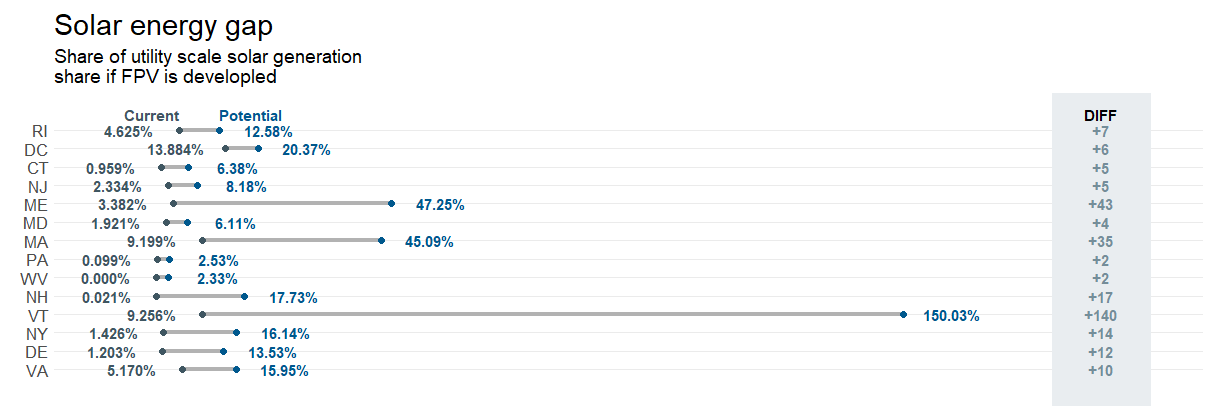
I am looking to generate a dumbbell graph showing the percent increase between current solar energy and theoretical solar energy for states in the Northeast. I have what I am looking for, there are just some minor adjustments that need to be made. For example, converting the decimals to percent values. Any suggestions are greatly appreciated.
Northeast_df <- read.csv("C:/Users/ag2546/Documents/Postdoc/Projects/Floating_Solar/Materials/Tables/FPV_Northeast_Dumbbell.csv")

Northeast_df$diff_cc <- sprintf("+%d", as.integer((Northeast_df$Climate_Crisis_pct-Northeast_df$Solar_pct_2022)*100))

Northeast_df <- arrange(Northeast_df, desc(diff_cc))
Northeast_df %>% mutate(STATE_ABBR = factor(STATE_ABBR, levels = STATE_ABBR))
Northeast_df %>%

Northeast_df %>% filter(STATE_ABBR == "RI") -> RI_df

h <- 0.8
h1 <- 1.55
h2 <- h1 + 1
h3 <- 1

xColor <- "#3F5661"
xendColor <- "#00588D"

Northeast_df %>%
  ggplot(aes(y = STATE_ABBR))+
  geom_dumbbell(aes(x = Solar_pct_2022, xend = Climate_Crisis_pct), size = 1.5, color = "#b2b2b2",
                colour_x = xColor, colour_xend = xendColor, size_x = 2, size_xend = 2)+
  geom_text(aes(x = Solar_pct_2022 - h, label = Solar_pct_2022), color = xColor, family="sans", fontface ="bold")+
  geom_text(aes(x = Climate_Crisis_pct + h, label = Climate_Crisis_pct), color = xendColor, family = "sans", fontface = "bold")+
  geom_rect(aes(xmin = h1, xmax = h2, ymin = -Inf, ymax = Inf), fill = "#E9EDF0")+
  scale_y_discrete(expand = c(0.075, 0))+
  geom_text(data = RI_df, aes(label = "DIFF", x = (h1 + h2) / 2, y = "STATE_ABBR"),
            fontface = "bold", family = "sans", vjust = h3)+
  geom_text(data = RI_df, aes(label = "Current", x = Solar_pct_2022, y = STATE_ABBR), size = 4,
            fontface = "bold", family = "sans", vjust = h3, color = xColor)+
  geom_text(data = RI_df, aes(label = "Potential", x = Climate_Crisis_pct, y = STATE_ABBR), size = 4,
            fontface = "bold", family = "sans", vjust = h3, color = xendColor)+
  geom_text(aes(label = diff_cc, x = (h1 + h2) / 2, y = STATE_ABBR),
            fontface = "bold", family = "sans", color = "#758D99")+
  theme_minimal(base_family = "sans")+
  theme(panel.grid.minor = element_blank())+
  theme(axis.title = element_blank()) +
  theme(axis.text.x = element_blank()) +
  theme(panel.grid.major.x = element_blank())+
  theme(plot.margin = unit(c(1.3, 1.3, 1.3, 1.3), "cm"))+
  theme(axis.text.y = element_text(size = 13, family = "sans"))+
  theme(plot.title = element_text(size = 22, family = "sans", color = "black")) +
  theme(plot.subtitle = element_text(size = 14, color = "black")) +
  labs(x = NULL, y = NULL,
       title = "Solar energy gap",
       subtitle = "Share of utility scale solar generation\nshare if FPV is developled")