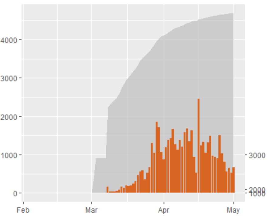
I'm trying to obtain 2 plots on the same chart, with y dual axis, one with linear scale and the other one with logarithmic scale. (I know, it's not good practice in general...) First data range from 0 to 2500, these are the ones I want to see as linear. Second data range from 0 to 50.000, these ones should be represented with logarithmic scale. The plot looks ok but I'm not actually sure as I don't manage to handle properly the ticks of the second axis. I would like to see on my second axis an easy logarithmic scale like (100,1000, 10000), how could i do that? I tried to play with the breaks but no success so far.
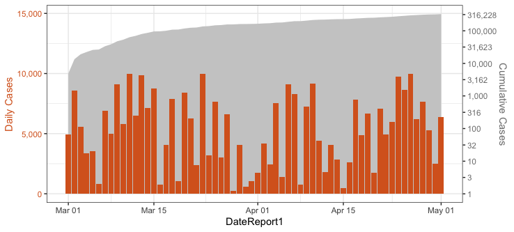
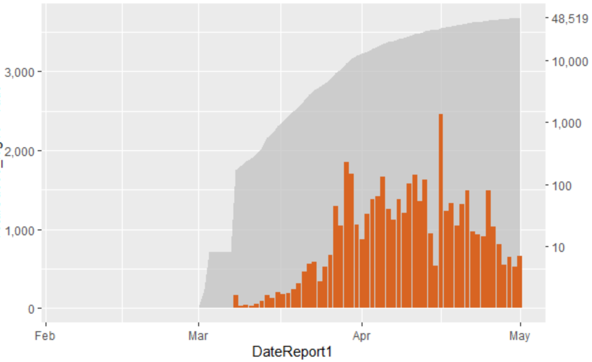
You haven't provided data, so I've assumed in the fake data below that TotalCases_log10 is already on the log scale.
The general idea is to multiply the plotted second-axis values by a ratio that will put them on the desired vertical scale relative to the first-axis data. Then, in sec_axis invert that transformation (divide instead of multiply) to get the original values back for the axis scale. In this case, we also transform the axis labels from logarithms back to their actual values.
library(tidyverse)
theme_set(theme_bw())

# Fake data
set.seed(2)
CountryData = tibble(
  DateReport1 = seq(as.Date("2020-03-01"), as.Date("2020-05-01"), "1 day"),
  NewCases = sample(100:10000, length(DateReport1)),
  TotalCases_log10 = log10(cumsum(NewCases))
  )

# Ratio of largest NewCases value to largest TotalCases_log10 value
# Also multiplied by 1.5 to make the grey area plot extend above the bars
ratio = 1.5 * with(CountryData, max(NewCases)/max(TotalCases_log10))

ggplot(CountryData) +
  geom_area(aes(x=DateReport1,y=TotalCases_log10*ratio), fill="grey80") +
  geom_col(aes(x=DateReport1,y=NewCases), fill="#D86422",size=0.6) +
  scale_y_continuous(labels=comma, name="Daily Cases",
                     sec.axis = sec_axis(~ ./ratio,
                                         labels=function(x) comma(round(10^x), accuracy=1),
                                         breaks=c(0:5, 0:5+0.5),
                                         name="Cumulative Cases")) +
  theme(axis.text.y=element_text(colour="#D86422"),
        axis.text.y.right=element_text(colour="grey50"),
        axis.title.y=element_text(colour="#D86422"),
        axis.title.y.right=element_text(colour="grey50"))