Hello, I am starting to work with R, but some problems came up, perhaps someone with more experience could help me with the following problem...
I am working on a project that should plot a heat map from a database that I've created, but I am not able to make the joinCountryData2Map work as expected.
In my project, I have to aggregate some columns and apply some functions to find a coefficient, when I have it, I create a table with a meaningful column for the project plus the coefficient that I have found.
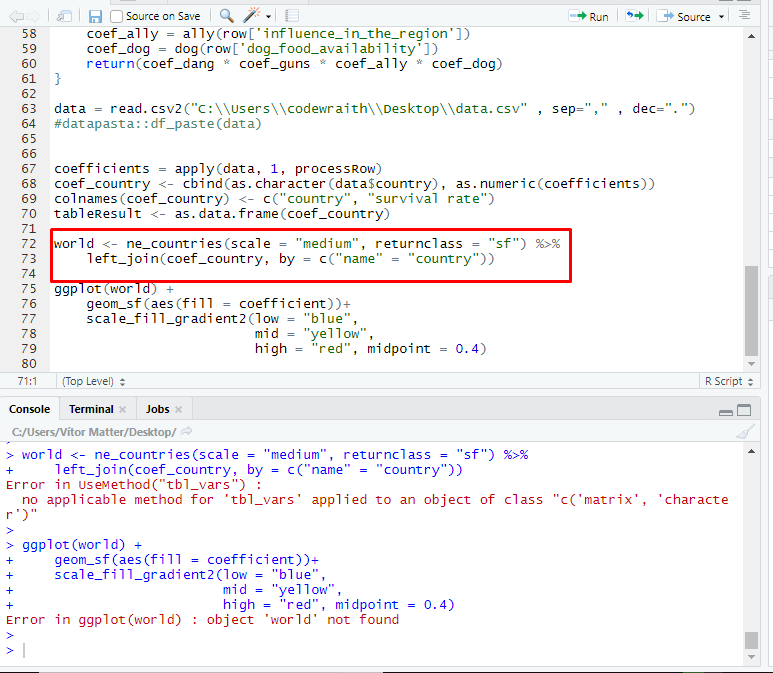
Once I have the resulting table I try to use it in the joinCountryData2Map function, but the following error appears:
Error in joinCountryData2Map(tableResult, nameJoinColumn = "coefficient",  :
  your chosen nameJoinColumn :'coefficient' seems not to exist in your data, columns =
I don't know why it said that coefficient' seems not to exist in my data, because it is in the table...
My code:
dados = read.csv2("C:\\Users\\codewraith\\Desktop\\data.csv" , sep="," , dec=".")
coefficients = apply(dados, 1, processRow)
coef_country <- cbind(as.character(dados$country), as.numeric(coefficients))
colnames(coef_country) <- c("country", "coefficient")
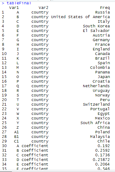
tableResult <- as.table(coef_country)
tableResult
# MAP part
df<-head(tableResult)
kable(df) %>%
kable_styling(bootstrap_options = "striped", font_size= 10, full_width = F)
#join data to a map
print(colnames(tableResult))
class(tableResult)
# The problem is right here (parameter tableResult)
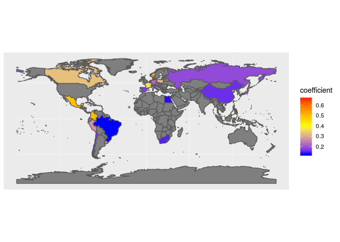
WorldMapSurvivalRate <- joinCountryData2Map( tableResult,
nameJoinColumn="coefficient",
joinCode="NAME" )
#Set the color palette with RColorBrewer:
colourPalette <- RColorBrewer::brewer.pal(10,'Spectral') #'Purples'
#plot the map
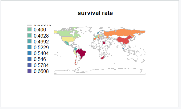
mapCountryData( WorldMapSurvivalRate,
nameColumnToPlot='Survival Rate',
catMethod='fixedWidth',
colourPalette=colourPalette, #'diverging', 'heat'
numCats=100) #10
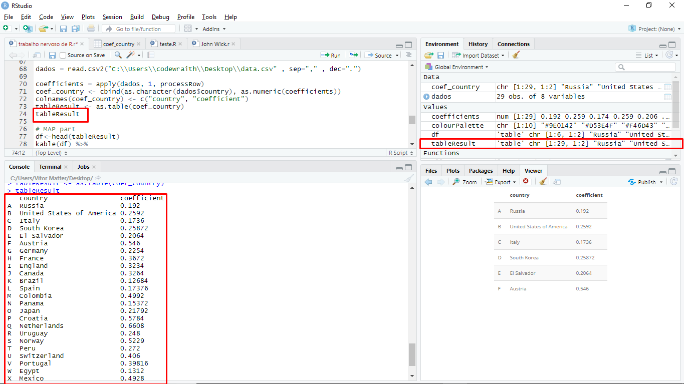
This is the print of the table:
Can't I use a table as a parameter in the function joinCountryData2Map?
How can I solve this problem?
I would really appreciate if someone could help me with this problem.
Thank you!