double for loops in R for histograms

Hi, I have the following table and I am trying to run a double for loop in R to get a histogram of the distribution of responses for every month of the survey (I will then fit a distribution to it). I am currently running the following code, but cannot seem to get anywhere. Any suggestions?

for (i in 2008:2021) { for (j in 1:12) { dfn <- df(df$Year=i, df$Month=j) hist(dfn) }}

This is the error I get:

Error: unexpected '=' in:
" for (j in 1:12) {
df(df$Year="

Month Year -3 0 2 4 5.5 8 12.5 15
1 2008 3 2 28 41 17 3 5 1
2 2008 5 3 26 40 15 4 6 1
3 2008 6 4 27 39 13 4 6 1
4 2008 9 4 18 28 28 5 7 1
5 2008 6 5 15 29 29 6 9 1
6 2008 8 3 17 28 26 6 10 2
7 2008 9 5 16 28 28 4 9 1
8 2008 5 5 19 29 26 5 9 2
9 2008 7 5 22 39 15 4 7 1
10 2008 8 6 20 40 15 4 7 0

This is not a valid way to filter the data. Try one of these

dfn <- df[df$Year == i & df$Month == j, ]
dfn <- filter(df, Year == i, Month == j) # assume tidyverse is loaded

2 Likes

Thanks Arthur, this now works. I get however the following error: Error in hist.default(dfn) : 'x' must be numeric. This is surprising to me as all columns seemed numerical. I have read that I could do a barplot instead, although I am not so sure given that I am interested in those histograms to fit a distribution to them, so as to later obtain their second and third moments.

Try hist(dfn$var) where var is the name of the column you want to plot.

Thanks. So the issue is that I am not trying to plot a specific variable, but rather a sort of frequency table for all variables. Let me specify that the numbers under each column are the % of the respondents that falls into that category. In essence, I am trying to get the distribution of responses for every point in time, where I have the distribution on the y axis and those numerical variables on the x axis (with their respective mass). For example, for Jan 2008, I would like to get a histogram (this will serve me later to get a proper distribution) that maps the mass of answers to different values. This is what I get when I try to check the class of the dataset:

class(df)
[1] "data.frame"

sapply(df, class)
Month Year -3 0 2 4 5.5 8 12.5 15
"numeric" "numeric" "numeric" "numeric" "numeric" "numeric" "numeric" "numeric" "numeric" "numeric"

Hi!

To help us help you, could you please prepare a reproducible example (reprex) illustrating your issue? Please have a look at this guide, to see how to create one:

You might have to draw a picture of what you're looking for. I'm confused about what variable you want a histogram for.

1 Like

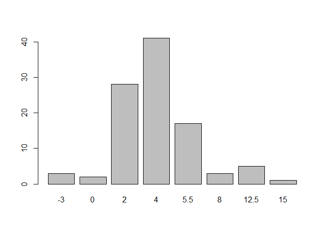
If you want to graph each row of your data set, that is done most easily by reshaping the data. I read your data into a csv file and the code below shows the processing of a single row. You could build a for loop around the selection of one row and graphing it. I made both a histogram and a bar plot because I suspect you are envisioning a bar plot. I do not understand what you plan to do with all of those plots, regardless of the graph type.

library(tidyr)
DF <- read.csv("~/R/Play/Dummy.csv",check.names = FALSE)
tmp <- DF[DF$Month==1,DF$Year==2008,]
tmp <- pivot_longer(tmp,cols = 3:10)
tmp
#> # A tibble: 8 x 4
#>   Month  Year name  value
#>   <int> <int> <chr> <int>
#> 1     1  2008 -3        3
#> 2     1  2008 0         2
#> 3     1  2008 2        28
#> 4     1  2008 4        41
#> 5     1  2008 5.5      17
#> 6     1  2008 8         3
#> 7     1  2008 12.5      5
#> 8     1  2008 15        1
barplot(height = tmp$value,names.arg = tmp$name)

hist(tmp$value)

Created on 2022-02-22 by the reprex package (v2.0.1)

As an alternative, I would be inclined to reshape the entire data set and analyze the data from that starting point. But since I don't understand what you are after, I'm not certain that is the best place to start.

1 Like

Here is that data from the csv file in dput format, in case that helps anyone else.

structure(list(Month = 1:10, Year = c(2008L, 2008L, 2008L, 2008L, 
2008L, 2008L, 2008L, 2008L, 2008L, 2008L), `-3` = c(3L, 5L, 6L, 
9L, 6L, 8L, 9L, 5L, 7L, 8L), `0` = c(2L, 3L, 4L, 4L, 5L, 3L, 
5L, 5L, 5L, 6L), `2` = c(28L, 26L, 27L, 18L, 15L, 17L, 16L, 19L, 
22L, 20L), `4` = c(41L, 40L, 39L, 28L, 29L, 28L, 28L, 29L, 39L, 
40L), `5.5` = c(17L, 15L, 13L, 28L, 29L, 26L, 28L, 26L, 15L, 
15L), `8` = c(3L, 4L, 4L, 5L, 6L, 6L, 4L, 5L, 4L, 4L), `12.5` = c(5L, 
6L, 6L, 7L, 9L, 10L, 9L, 9L, 7L, 7L), `15` = c(1L, 1L, 1L, 1L, 
1L, 2L, 1L, 2L, 1L, 0L)), class = "data.frame", row.names = c(NA, 
-10L))

Thank you for your answer. The idea is that these variables correspond to different answers of the same survey, and I am after the changes in time of the second and third moments of the distributions among answers . My understanding is to get those barplots in order to fit distributions to them, and hence be able to find second and third moments from there. Does it make sense to you?

a barplots among different variables. as FJCC has done below.

Making the plots does not help getting the second and third moments (variance and skewness). Those should be calculated from the raw data. It seems that the data have been binned. That is what I understand is the meaning of the column headings -3, 0, 2, 4, 5.5, 8, 12.5, 15. Is that correct?
Do you have the original, unbinned, data?

Doesn't estimating a distribution from the plots help that? Unfortunately the survey answers were in bins, hence raw, unbinned data is not available. Following Juster and Comment (1978), I have taken the midpoint of these bins to try to construct a distribution.

I do not see how one can usefully estimate a distribution from a plot. You can estimate the distribution from the data used to make a plot, which is what we're doing here.
The approach I would take is to expand the data so that if in a given month the original data have -3 listed as occurring five times, the expanded data show -3 five times. I found a function that does that in the splitstackshape package. There may be such a function in the tidyverse but I found the other one first. I assumed you listed bins indicate the midpoint. If that is not true, you will have to relabel the columns. This code just shows the calculation of the variance.

library(tidyverse)
#> Warning: package 'tibble' was built under R version 4.1.2
DF <- structure(list(Month = 1:10, 
                     Year = c(2008L, 2008L, 2008L, 2008L, 
                              2008L, 2008L, 2008L, 2008L, 2008L, 2008L), 
                     `-3` = c(3L, 5L, 6L, 
                              9L, 6L, 8L, 9L, 5L, 7L, 8L), 
                     `0` = c(2L, 3L, 4L, 4L, 5L, 3L, 
                             5L, 5L, 5L, 6L), 
                     `2` = c(28L, 26L, 27L, 18L, 15L, 17L, 16L, 19L, 
                             22L, 20L), 
                     `4` = c(41L, 40L, 39L, 28L, 29L, 28L, 28L, 29L, 39L, 
                             40L), 
                     `5.5` = c(17L, 15L, 13L, 28L, 29L, 26L, 28L, 26L, 15L, 
                               15L), 
                     `8` = c(3L, 4L, 4L, 5L, 6L, 6L, 4L, 5L, 4L, 4L), 
                     `12.5` = c(5L, 
                                6L, 6L, 7L, 9L, 10L, 9L, 9L, 7L, 7L), 
                     `15` = c(1L, 1L, 1L, 1L, 
                              1L, 2L, 1L, 2L, 1L, 0L)), 
                class = "data.frame", row.names = c(NA, -10L))
DFlong <- pivot_longer(DF, cols = 3:10,names_to = "BIN")
DFlong
#> # A tibble: 80 x 4
#>    Month  Year BIN   value
#>    <int> <int> <chr> <int>
#>  1     1  2008 -3        3
#>  2     1  2008 0         2
#>  3     1  2008 2        28
#>  4     1  2008 4        41
#>  5     1  2008 5.5      17
#>  6     1  2008 8         3
#>  7     1  2008 12.5      5
#>  8     1  2008 15        1
#>  9     2  2008 -3        5
#> 10     2  2008 0         3
#> # ... with 70 more rows
library(splitstackshape)
#> Warning: package 'splitstackshape' was built under R version 4.1.2
Expanded <- expandRows(DFlong, count = "value")
#> The following rows have been dropped from the input: 
#> 
#> 80 #dropped because it has value = 0, i.e. 0 counts.
Expanded$BIN <- as.numeric(Expanded$BIN)
head(Expanded)
#> # A tibble: 6 x 3
#>   Month  Year   BIN
#>   <int> <int> <dbl>
#> 1     1  2008    -3
#> 2     1  2008    -3
#> 3     1  2008    -3
#> 4     1  2008     0
#> 5     1  2008     0
#> 6     1  2008     2
STATS <- Expanded |> group_by(Month,Year) |> 
  summarize(VAR=var(BIN))
#> `summarise()` has grouped output by 'Month'. You can override using the `.groups` argument.
STATS
#> # A tibble: 10 x 3
#> # Groups:   Month [10]
#>    Month  Year   VAR
#>    <int> <int> <dbl>
#>  1     1  2008  8.68
#>  2     2  2008 10.6 
#>  3     3  2008 11.2 
#>  4     4  2008 13.6 
#>  5     5  2008 13.4 
#>  6     6  2008 16.0 
#>  7     7  2008 14.9 
#>  8     8  2008 14.0 
#>  9     9  2008 12.5 
#> 10    10  2008 11.8

Created on 2022-02-22 by the reprex package (v2.0.1)
What I'm confused about:

You want a separate histogram for each year + month combination. You have several columns which represent different variables. So, if I take this all at face value and reference your data table, there appears to be only one value to plot for each variable within each year + month. A histogram for a single value doesn't make sense.

Do you want to plot a histogram across different variables? I don't think this makes sense either.

1 Like

Honestly, I am too. A picture is worth a thousand words.

This topic was automatically closed 21 days after the last reply. New replies are no longer allowed.

If you have a query related to it or one of the replies, start a new topic and refer back with a link.