I have some questions about making dotplots with {ggplot2}.
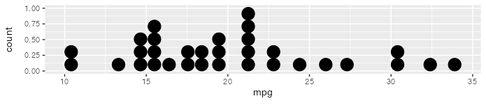
Is it possible to remove the dead space in a dotplot? Here's the very first example from the geom_dotplot() documentation.
ggplot(mtcars, aes(x = mpg)) +
    geom_dotplot()
Removing the part above the 0.50 point on the y-axis would improve the readability of the plot. Is this issue due to the "technical limitations" mentioned in the documentation?
The documentation also says "You can ... manually scale [the y-axis] to match the number of dots." How would this be done?
@laviolet Hi, probably technical limitations. I tried this but the dead space fails to disappear. Please raise an issue to ggplot2. Thanks for sharing this.
The limitation is that the dot plot shows stacked circles, each circle having the same width and height, equal to its diameter. In your example, the plot is 30 diameters wide (default binning in geom_dotplot()) and only 5 diameters tall, so the aspect ratio is about 30:5 or 6:1. In a typical plot with aspect ratio of 4:3, this forces the empty space above the dots. Otherwise the circles would be streched into ellipses. You can always change the aspect ratio of the plot:
I agree that a dot plot isn't the first choice of graph, but this is for instruction and dot plots make a simple introduction leading to histograms. Thanks for the tip about aspect ratio.