2 Likes
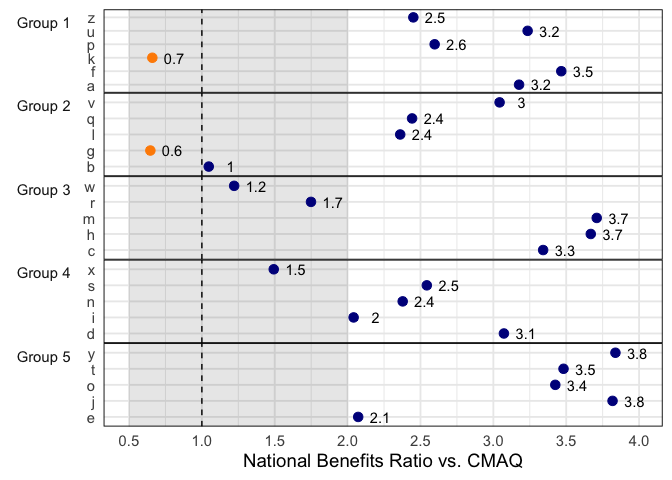
I used some fake data, but I think this gets you most of the way there:
library(tidyverse)

tibble(
  y = letters,
  x = runif(length(letters), 0, 4),
  gp = rep(paste0('Group ', 1:5), length.out = length(letters))
) %>%
  ggplot(aes(x, y)) +
  annotate('rect', xmin = 0.5, xmax = 2, ymin = -Inf, ymax = Inf,
           fill = 'black', alpha = 0.1) +
  geom_vline(xintercept = 1, lty = 2) +
  geom_point(aes(color = x > 1), size = 3) +
  geom_text(aes(label = round(x, 1)), nudge_x = 0.15) +
  scale_x_continuous(
    breaks = seq(0, 4, by = 0.5)
  ) +
  scale_color_manual(values = c('darkorange', 'darkblue')) +
  labs(y = NULL, x = 'National Benefits Ratio vs. CMAQ') +
  facet_grid(rows = vars(gp), switch = 'y', scales = 'free') +
  theme_minimal(14) +
  theme(
    legend.position = 'none',
    strip.placement = 'outside',
    panel.spacing = unit(0, 'in'),
    strip.text.y.left = element_text(angle = 0, vjust = 1),
    panel.border = element_rect(fill = 'transparent')
  )

5 Likes
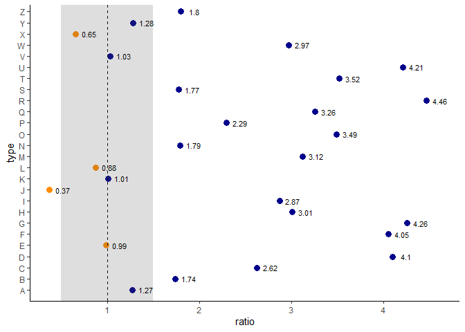
For the categories on the left, while I think it's possible it's not as easy [edit: Oh, mattwarkentin got it right, using faceting is a great idea!]. For the rest, this is relatively standard ggplot2. This should come close:
library(tidyverse)

set.seed(1)
data <- tibble(type = LETTERS,
               ratio = runif(26, min = .1, max = 4.5))


data |>
  mutate(sign = ratio > 1) |>
  ggplot(aes(x = type, y = ratio)) +
  theme_classic() +
  geom_point(aes(colour = sign), size = 3) +
  geom_hline(aes(yintercept = 1), linetype = "dashed") +
  annotate("rect", ymin = .5, ymax = 1.5, xmin = 0, xmax = Inf, alpha = .2) +
  geom_text(aes(label = round(ratio, 2)), nudge_y = .15, size = 3) +
  coord_flip() +
  scale_colour_manual(values = c("darkorange","darkblue"),
                      guide = "none")

Created on 2022-05-28 by the reprex package (v2.0.1)
3 Likes
This topic was automatically closed 7 days after the last reply. New replies are no longer allowed.
If you have a query related to it or one of the replies, start a new topic and refer back with a link.
