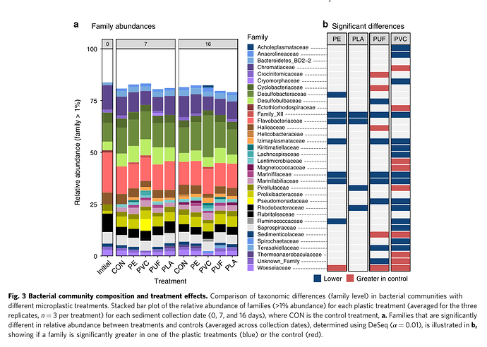
Species abundance map from a nature communication article, I would like to learn how to draw the Significant differences that correspond to the latter, and I hope the gods will teach me more.
This seems to be paneled flipped barplot separately at each PE, PLA, PUF, and PVC.
Simply use barplot to arrive at that type of plot for each individual group, then panel it.
Alternatively, you can use a heatmap to generate such kind of plot.
If having 3D variable, then you can easily use heatmap. Else, if you have 2D variables you can use
barplot.
1 Like
This topic was automatically closed 21 days after the last reply. New replies are no longer allowed.
If you have a query related to it or one of the replies, start a new topic and refer back with a link.
