Dodging in geom_col with varying column widths

This question is in relation to a topic I opened about a month ago (Aligning labels under geom_col with varying widths). The community was great about trying to help me, but I didn't really get where I was trying to go, and more importantly, haven't figured out how to do this right in the future.

I'm trying to learn how to accomplish the following in a geom_col plot:

  1. Make the column widths proportional to the value of a variable in the dataset;
  2. Dodge the columns to eliminate overlap due to the new varying widths;
  3. Make the x-axis labels re-position with the new center of the respective data.

The plot I dropped below has my attempt to add position = "dodge2" to the geom. Without it, the widths seem to track, but the columns stay in place and overlap.

suppressPackageStartupMessages(library(tidyverse))
ggplot(data = mtcars) + 
  geom_col(aes(x = row.names(mtcars), 
               y = mpg, 
               fill = as.factor(cyl)), 
           color = "black",
           width = mtcars$wt, 
           position = "dodge2") + 
  
  labs(x = NULL) +
  theme(axis.text.x = element_text(angle = 90, size = 7, hjust = 1))
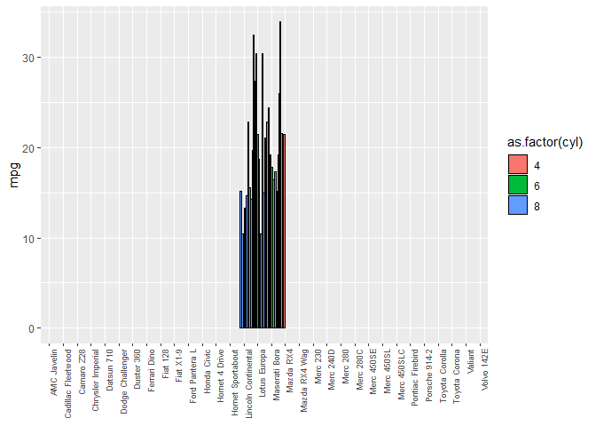
Created on 2020-04-07 by the reprex package (v0.3.0)

The closest off the top of my head

suppressPackageStartupMessages(library(tidyverse))
ggplot(data = mtcars) + 
  geom_col(aes(x = row.names(mtcars), 
               y = mpg, 
               fill = as.factor(cyl)), 
           color = "black",
           width =  length(mtcars) * mtcars$wt, 
           position = "dodge2") + 
  
  labs(x = NULL) +
  theme(axis.text.x = element_text(angle = 90, size = 7, hjust = 1))

Created on 2020-04-07 by the reprex package (v0.3.0)
Can you say more about what you're trying to accomplish in your real problem? Is it the same as in your previous question? I have a feeling that geom_rect might be the way to resolve your problem, but it would help to have a data frame and example code to go with it that genuinely encodes the key features of your real problem.

1 Like

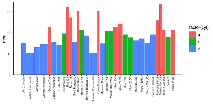
Let me know if this is what you were hoping for. In the code below we set up the data with the x-axis midpoint location for each bar. Then we use geom_tile to place bars of the correct width in the correct positions. geom_tile is similar to geom_rect but it seemed easier to me to use the center/width/height parametrization of geom_tile rather than specifying the coordinates of the four vertices, as required by geom_rect. Also, note how we set x-axis labels in the correct positions within scale_x_continuous. I've ordered the data alphabetically by model as in your example.

library(tidyverse)

# Set up data to get correct x positions for bars
pdat = mtcars %>% 
  rownames_to_column() %>%
  arrange(rowname) %>% 
  mutate(x = cumsum(wt) - 0.5*wt) 

pdat %>% 
  ggplot() + 
   geom_tile(aes(x, 0.5*mpg, width=wt, height=mpg, fill=factor(cyl)), 
             colour="white") +
   scale_x_continuous(breaks=pdat$x, labels=pdat$rowname) +
   scale_y_continuous(expand=expansion(c(0,0.02))) +
   theme_classic() +
   theme(axis.text.x = element_text(angle=90, size=7, hjust=1, vjust=0.5)) +
   labs(x="", y="mpg")

2 Likes

First, thanks very much for taking time to dive into this. I realize that's the whole point of the community, but I'm still always blown away by the eagerness in the R community to reach out and help.

IRL, I'm working on a graphic to tell the story of energy efficiency in our organization's campus. Ultimately, the intent is to plot all ~ 120 buildings in order of construction year + building name, with the height of the column indicating the energy index value (numeric), the color of the column to indicate building category (academic, office, lab, etc.), and the width of the column to indicate gross square footage. Essentially, the viewer should get a visual idea of total energy consumed per building by the area of the building on the plot. Order by construction year on the x-axis is important, because we want to show how the campus developed over the years. I brought the problem using mtcars just b/c the data is readily available and well known.

I think the solution will work. I'm going to sit with this later (read: without wife + 3 kids hovering), to digest what's going on here, and try to implement it with my dataset. Thanks very much - here's to staying healthy!

2 Likes

There's a recent post along the same lines.

1 Like

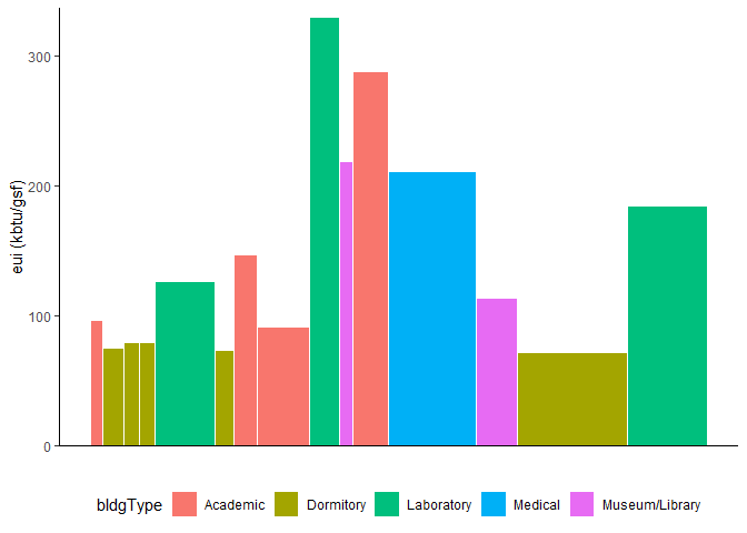
I tried using the solution on my own dataset, and the only problem I seem to have is the x-axis labels missing. See below:

suppressPackageStartupMessages(library(tidyverse))

eui <- data.frame(
  stringsAsFactors = FALSE,
                            bName = c("COMMUNICATION","COCHISE HALL",
                                      "MARICOPA HALL","MARICOPA HALL",
                                      "STEWARD OBSERVATORY","YAVAPAI HALL","MATHEMATICS",
                                      "LAW COLLEGE/ADD","MARVEL LABS",
                                      "FLANDRAU PLANETARIUM","PHARMACY COLLEGE",
                                      "LEVY-SALMON AZCC","MEDICAL LIBRARY",
                                      "ARBOL DE LA VIDA","BIO SCIENCE RESEARCH LAB"),
                         fiscalYr = c("2019","2019","2019","2019","2019",
                                      "2019","2019","2019","2019","2019",
                                      "2019","2019","2019","2019","2019"),
                             kbtu = c(2567516.9,3295687.9,2649863.4,2649863.4,
                                      16291685.8,2992037.5,7232153.4,
                                      10239796.6,20831685.8,6476952.6,21323481.4,
                                      39732314.6,9882377.4,16837254.6,
                                      31826177.8),
                          constYr = c(1909,1921,1921,1921,1921,1942,1968,
                                      1969,1973,1975,1980,1986,1991,2009,
                                      2017),
                              gsf = c(26629,43714,33410,33410,129107,40453,
                                      49102,111720,63108,29598,74166,188071,
                                      86816,234455,172623),
                         bldgType = c("Academic","Dormitory","Dormitory",
                                      "Dormitory","Laboratory","Dormitory",
                                      "Academic","Academic","Laboratory",
                                      "Museum/Library","Academic","Medical",
                                      "Museum/Library","Dormitory","Laboratory"),
                              eui = c(96.4,75.4,79.3,79.3,126.2,74,147.3,
                                      91.7,330.1,218.8,287.5,211.3,113.8,
                                      71.8,184.4),
                           cumEUI = c(96.4,83.4,82.1,81.4,103.1,99.3,105.9,
                                      102.5,129.6,134.3,152.2,165.7,160.7,
                                      142.5,148)
               )

eui %>% 
  mutate(x = cumsum(gsf) - 0.5*gsf) %>%
  ggplot() + 
  geom_tile(aes(x, 0.5*eui, 
                width = gsf, 
                height = eui, 
                fill = bldgType), 
            colour="white") +
  scale_x_continuous(breaks = eui$x, labels = eui$x) +
  scale_y_continuous(expand=expansion(c(0,0.02))) +
  theme_classic() +
  theme(axis.text.x = element_text(angle=90, size=7, hjust=1, vjust=0.5), 
        legend.position = "bottom") +
  labs(x="", y="eui (kbtu/gsf)")

Created on 2020-04-08 by the reprex package (v0.3.0)

1 Like

Are you sure you want cumsum(gsf) - 0.5*gsf? for the x-axis? That would make the bars progressively higher. Perhaps do a companion graph underneath to show the contribution of each building type (and maybe name) to the total). Easy to arrange with the patchwork library, just plot1/plot2

Two changes are necessary to get axis labels:

First, scale_x_continuous doesn't have internal access to the data frame passed to ggplot. If you want to get breaks and labels from the data frame used for the plot, you need to access the data frame in the global environment outside of ggplot, as in breaks=eui$x. But for that to work, the data frame in the global environment needs to have column x with the break locations. In your code, you create x on the fly in the data frame piped into ggplot. Instead you need to add x to the data frame stored in the global environment before passing it to ggplot (which is what I did in my answer). In other words:

eui = eui %>% 
  mutate(x = cumsum(gsf) - 0.5*gsf)

eui %>%
  ggplot() %>%
  ...rest of code...

Second, in scale_x_continuous, change labels=eui$x to eui$bName.

In reference to @technocrat's comment, cumsum(gsf) - 0.5*gsf sets the x-axis locations, so I don't think it causes any problems for the y values.

1 Like

I think that did it. Now I just have to go sit down and really learn what I just did. Thanks very much!!

1 Like

This topic was automatically closed 7 days after the last reply. New replies are no longer allowed.