hi
I'm plotting a bubble chart with 55 points in ggplot but the usual palettes are very short and color repeated everywhere is not a good looking chart.
does anyone know any palette or trick to get 50 different divergent colors?
hi
I'm plotting a bubble chart with 55 points in ggplot but the usual palettes are very short and color repeated everywhere is not a good looking chart.
does anyone know any palette or trick to get 50 different divergent colors?
That's an awful lot of colors to distinguish, but here's one quick way. I'm not exactly sure how you want to assign the colors, so the example below is artificial:
library(ggplot2)

pal = c(hcl(0,100, seq(20,100, length.out=25)), hcl(240,100, seq(100,20, length.out=25)))

dat = data.frame(x=1:50, y=1, color=pal)

ggplot(dat, aes(x, y, colour=pal)) +
  geom_point(size=5) +
  scale_colour_identity()
Maybe the example below is closer to your use case. Here we use colorRampPalette to generate the diverging palette by interpolating between the colors we want to use:
set.seed(2)
dat = data.frame(x=1:100, y=cumsum(rnorm(100)))

# Create a palette-generating function
pal = colorRampPalette(c(hcl(0,100, c(20,100)), hcl(240,100,c(100,20))))

ggplot(dat, aes(x, y, colour=y)) +
  geom_line() +
  geom_point(size=5) +
  scale_colour_gradientn(colors=pal(50))
Very impressive answer but I need divergent. A gradient of colors not allowed
Can you provide a reproducible example so that we can see your actual use case and what you're trying to achieve?
Imagine a Bubble chart of basketball teams. Every bubble is a team in two dimensions: score and an average of players skill.
You can imagine I need very different colors (real data is confidential)
What determines the color of each bubble? Code would be much more helpful than a narrative description. You can create fake data if your real data are confidential.
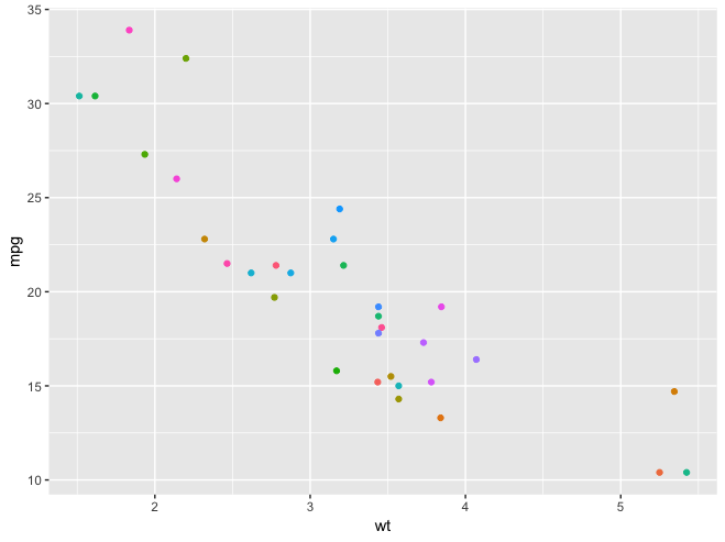
In fact I don’t care which colour is assigned to which team while they are different enough. Used some other palettes ( viridis, weanderson...) but they tend to recycle colours when limit is reached, so many colours are repeated
as you can see in the example, colours are not very different.
library(ggplot2)
mtcars$car <- rownames(mtcars)
p <- ggplot(mtcars, aes(wt, mpg, label = car,color = car) )+
  geom_point() +
  theme(legend.position="none")
p
You could look at gapminder::country_colors() for inspiration.
In a recent project I had success with creating a diverging palette for a heatmap by using the scale_fill_gradient2() and tweaking the value of the midpoint argument.
It enabled me to make a traffic light kind of divergence - green = nice, yellow = still okay-ish, red = bad - with rather continuous gradient.
ggplot(...) +
scale_fill_gradient2(midpoint = 35,
                     low = 'green2',
                     mid = 'yellow',
                     high = 'red3',
                     na.value = 'gray95')
This answer might have the info that you're looking for
not really, they are gradient colors depending on continent
With 55 colors, it's probably going to be hard to avoid having some colors that are difficult to distinguish. The best I can come up with is using the qualpalr package to generate the colors. The qualpal function tries to select colors so as to maximize the smallest pairwise perceptual color distance among a group of n colors.
library(tidyverse)
library(qualpalr)

# Fake data
set.seed(2)
dat = data.frame(team=replicate(55, paste(sample(LETTERS, 4), collapse="")),
                 score=rnorm(55, 90, 10),
                 skill=runif(55, 1, 10))

# Generate color palette
pal = qualpal(55, colorspace=list(h=c(0,360), s=c(0.3,1), l=c(0.2,0.8)))

ggplot(dat, aes(score, skill, colour=team)) +
  geom_point(size=5) +
  scale_color_manual(values=pal$hex) +
  theme_classic() +
  guides(color=FALSE)
Here's a view of the color palette:
library(scales)

# Sort by Hue and plot
pal$HSL %>% as.data.frame() %>%
  rownames_to_column(var = "color") %>%
  arrange(Hue) %>%
  pull(color) %>%
  show_col(labels=FALSE)
I don't know if I want hue can do what you need?
I did recently create a short colour palette tutorial - but for gradients - that explains one way to make and use palettes.
Hope that's helpful.
The Magical Number Five, Plus or Minus Two classic is a good place to start. As a classic rule of thumb, any object with 50 distinctions is going to result in the viewer's focus on the most prevalent 2-4.
In visualization, this is a classic trap with continuous variables. By default, in most packages, you end up with 50 Shades of Blue. Even if you are not among the tiny proportion of the population who is blue color blind, the visual is worse than useless.
Instead of looking for a divergent color palette, consider transforming the underlying data. Whatever quantitative variable it is, there is a mean and standard deviation, reducing the individuals to similar groups better suited to visual presentation.
My dated post (sf has overtaken sp) shows the difference between scaling on how thematic maps of the US population look https://rpubs.com/technocrat/thematic-walkthrough