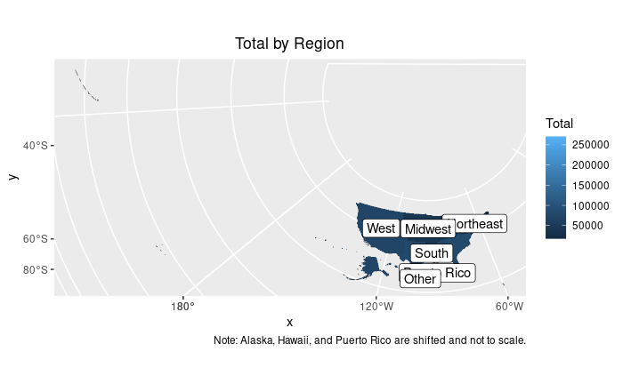
@williaml , thanks for continuing to help me with this plot! Apologies, I obviously have a lot of basics to learn here...
I've applied your code to the data going into the map and and removed #coord_sf(crs = st_crs(2163),xlim = c(-2500000, 2500000), ylim = c(-2300000, 730000))+ from the plot to show everything.
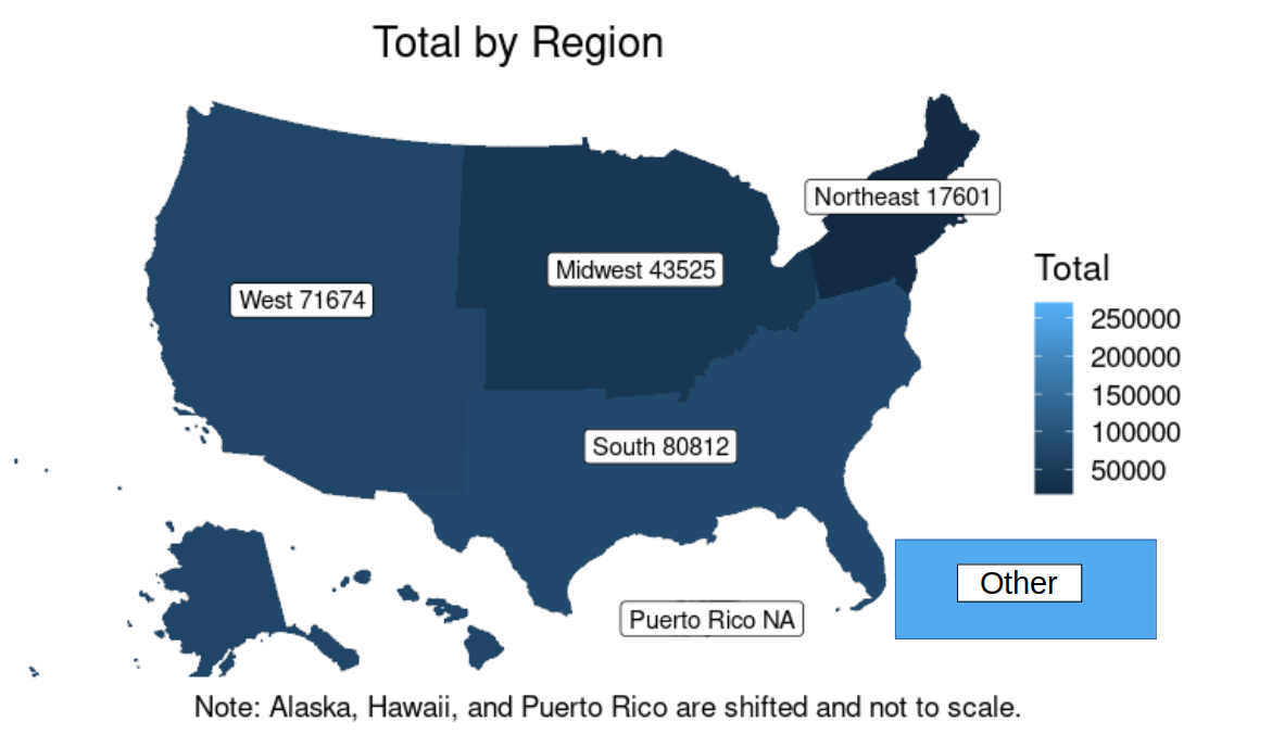
The label for "Other" now shows on the map.
However, I was hoping the label will show in a color-filled rectangle to indicate the total outside of the USA. Like in this manual edit: