saurabh
February 21, 2022, 12:08pm
1
Hello Everyone, below is my dataframe.
data.frame(
  stringsAsFactors = FALSE,
           Status1 = c("No Phonecall", "Phonecall"),
               yes = c(110, 24),
                no = c(444, 176),
         uncertain = c(68, 11))

tata1 <- data.frame(Status1, no, yes, uncertain)
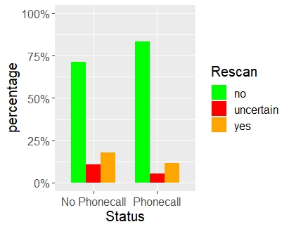
ggplot2, dplyr and tidyr packages are then loaded from library. I get a plot when I enter the code below. Image attached.
tata1 %>% gather(key = "Rescan", value = value, -Status1) %>% group_by(Status1) %>% mutate(value = value/sum(value)*100) %>% ggplot(aes(y = value, x = Status1, fill = Rescan)) + geom_bar(position = "dodge", width=0.7, stat = "identity") + labs(y = "percentage", x = "Status") + scale_fill_manual(values = c("green", "red", "orange1")) + theme(text=element_text(size=15)) + scale_y_continuous(labels = scales::label_percent(scale = 1, accuracy = 1), limits = c(0,100))
what I want with this plot are a few things:
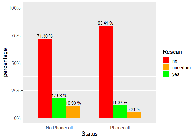
the actual percentage value displayed on top of each of the 6 bars in black
The order of the bars changed - its currently 'no' ,' uncertain' and then 'yes'. I want it changed to 'no', ' yes' and then uncertain.
I've tried the Geom_text and also the geom_label but failed to achieve '1'. I've tried 'reorder' for '2' but even that doesnt seem to work.
Any solution for the above please. Many thanks.
library(ggplot2)
library(dplyr)
#>
#> Attaching package: 'dplyr'
#> The following objects are masked from 'package:stats':
#>
#>     filter, lag
#> The following objects are masked from 'package:base':
#>
#>     intersect, setdiff, setequal, union
library(tidyr)

tata1 = data.frame(
  stringsAsFactors = FALSE,
  Status1 = c("No Phonecall", "Phonecall"),
  yes = c(110, 24),
  no = c(444, 176),
  uncertain = c(68, 11)
)

tata1 %>%
  pivot_longer(yes:uncertain, names_to = "Rescan") %>%
  group_by(Status1) %>%
  mutate(value = value / sum(value) * 100,
         Rescan = factor(Rescan, c("no", "yes", "uncertain"))) %>%
  ggplot(aes(y = value, x = Status1, fill = Rescan)) +
  geom_col(width = .7,
           position = position_dodge(width = .7, preserve = "total")) +
  geom_text(aes(
    label = paste(round(value, 2), "%"),
    y = value + 3,
    group = Rescan
  ),
  position = position_dodge(width = .7, preserve = "total")) +
  labs(y = "percentage", x = "Status") +
  scale_fill_manual(
    values = c(
      "no" = "red",
      "uncertain" = "orange1",
      "yes" = "green"
    ),
    aesthetics = c("color", "fill")
  ) +
  theme(text = element_text(size = 15)) +
  scale_y_continuous(labels = scales::label_percent(scale = 1, accuracy = 1),
                     limits = c(0, 100))
Created on 2022-02-21 by the reprex package (v2.0.1)
saurabh
February 21, 2022, 10:20pm
3
Many thanks.
Solution worked really well. Quite complex coding (at least for me). Not sure what the 'paste' command in a section of the code below actually does?
geom_text(aes(
    label = paste(round(value, 2), "%")
Also, what exactly does the "preserve = total" do?
The paste() is all about creating the label for your plot. paste() combines multiple elements together into a string - so it is combining the "value" with the "%" symbol to create "value %" (where value is a number from your data). round() just rounds the number to something sensible.
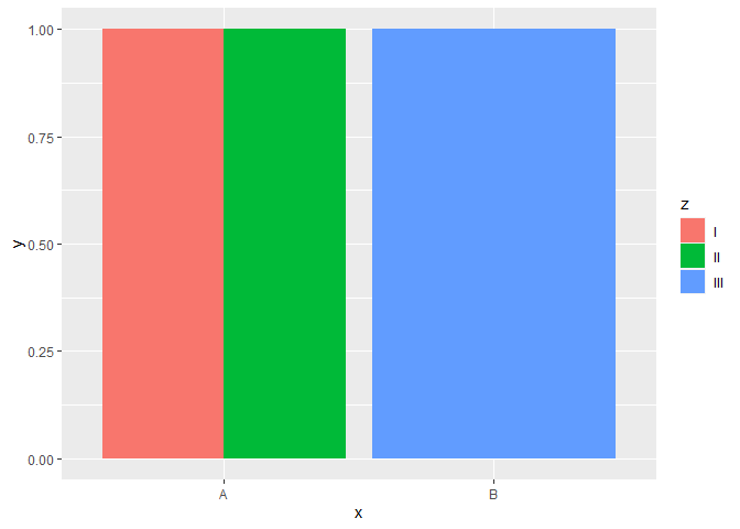
The preserve argument actually probably isn't super necessary here. Consider the difference between these examples:
library(tidyverse)

dat = tibble(x = c("A", "A", "B"),
       y = c(1, 1, 1),
       z = c("I", "II", "III"))

plt = dat %>% ggplot(aes(x = x, y = y, fill = z))

plt + geom_col(position = position_dodge(preserve = "single"))
plt + geom_col(position = position_dodge(preserve = "total"))
saurabh
February 26, 2022, 1:30pm
5
Many thanks. Much appreciated
system
March 5, 2022, 1:30pm
6
This topic was automatically closed 7 days after the last reply. New replies are no longer allowed.


