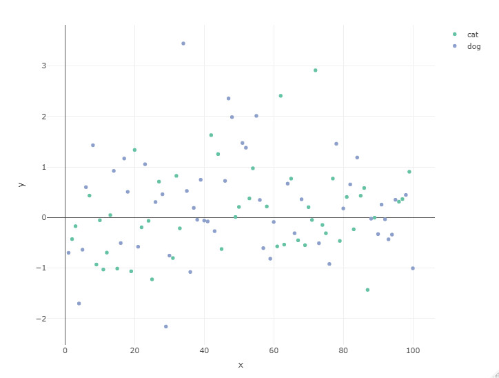
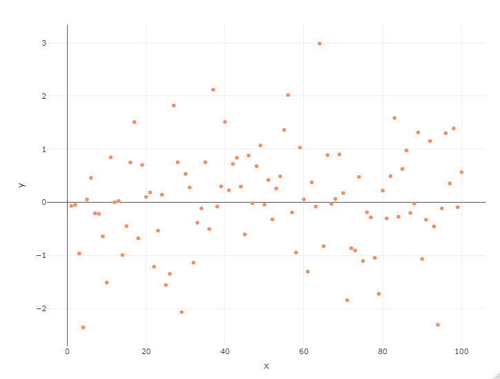
I just found out that if a variable is mapped to the color argument in plotly, the legend is automatically displayed only if the variable has more than one category. This is illustrated below. df1 has two categories and they are displayed in the legend . df2, on the other hand, has only one category and no legend is displayed. My goal is to display the legend in the df2 plot.
library(plotly)

df1 <- data.frame(
  x = 1:100,
  y = rnorm(100),
  category = sample(c("cat", "dog"), 100, replace = TRUE)
)

plot_ly(
  type = "scatter",
  mode = "markers",
  data = df1,
  x = ~x,
  y = ~y,
  color = ~category
)
f2 <- data.frame(
   x = 1:100,
   y = rnorm(100),
   category = "dog"
)

plot_ly(
  type = "scatter",
  mode = "markers",
  data = df2,
  x = ~x,
  y = ~y,
  color = ~category
)
I have a preference to first build the plot with ggplot2 and then make use of plotly, like so:
library(tidyverse)
library(plotly)

df2 <- tibble(
  x = 1:100,
  y = rnorm(100),
  category = "dog"
  )

g <- df2 %>%
  ggplot(aes(x, y, color = category)) +
  geom_point() +
  theme_minimal()

## show graph
g

## show same graph with interactivity
g %>% ggplotly()
Note: you may notice that I change data.frame to tibble, but that is not really essential for adding the legend
Thank you very much for your response. I am actually quite familiar with the ggplotly() function; however, what I am actually working on is more complex than the simple reproducible example I provided here. Of course, ggplot2is a powerhouse that can deal with almost anything data visualization related, but I need to do it straight from plotly because of the ability to edit/manipulate the popups. Having said that, I was able to find a solution: https://stackoverflow.com/questions/66395408/display-color-legend-when-data-has-only-one-category/66396619#66396619. It turns out that I just needed to add: layout(showlegend = TRUE).
library(plotly)

df2 <- data.frame(
   x = 1:100,
   y = rnorm(100),
   category = "dog"
)

plot_ly(
  type = "scatter",
  mode = "markers",
  data = df2,
  x = ~x,
  y = ~y,
  color = ~category
) %>% layout(showlegend = TRUE)