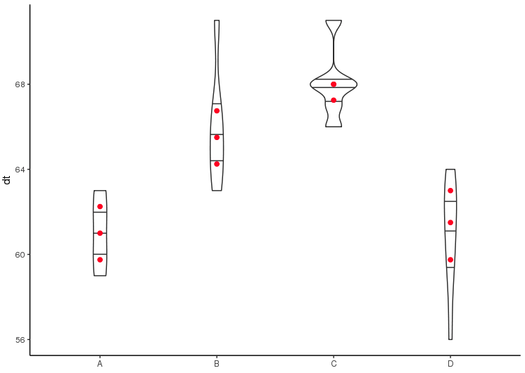
I am attempting to plot a simple violin plot with the added quantiles (0.25,0.5,0.75). I use two methods here, draw_quantiles within geom_violin (straight line) and stat_summary (red points). Is there a reason why the line and points appear to be offset?
Thanks in advance!
data <- c(62, 60, 63, 59, 63, 67, 71, 64, 65, 66, 68, 66,
      71, 67, 68, 68, 56, 62, 60, 61, 63, 64, 63, 59)
grp <- factor(rep(LETTERS[1:4], c(4,6,6,8)))
df <- data.frame(group=grp, dt=data)

ggplot(df,
   aes(x=group,y=dt))+
  geom_violin(width=0.4,draw_quantiles = c(0.25, 0.5, 0.75))+
  stat_summary(fun.y= function(x) quantile(x,0.75), geom="point", size=2, color="red")+
  stat_summary(fun.y= function(x) quantile(x,0.25), geom="point", size=2, color="red")+
  stat_summary(fun.y= function(x) quantile(x,0.5), geom="point", size=2, color="red")+
  theme_classic()+
  theme(
     axis.title.x = element_blank())+
  guides(fill=FALSE)