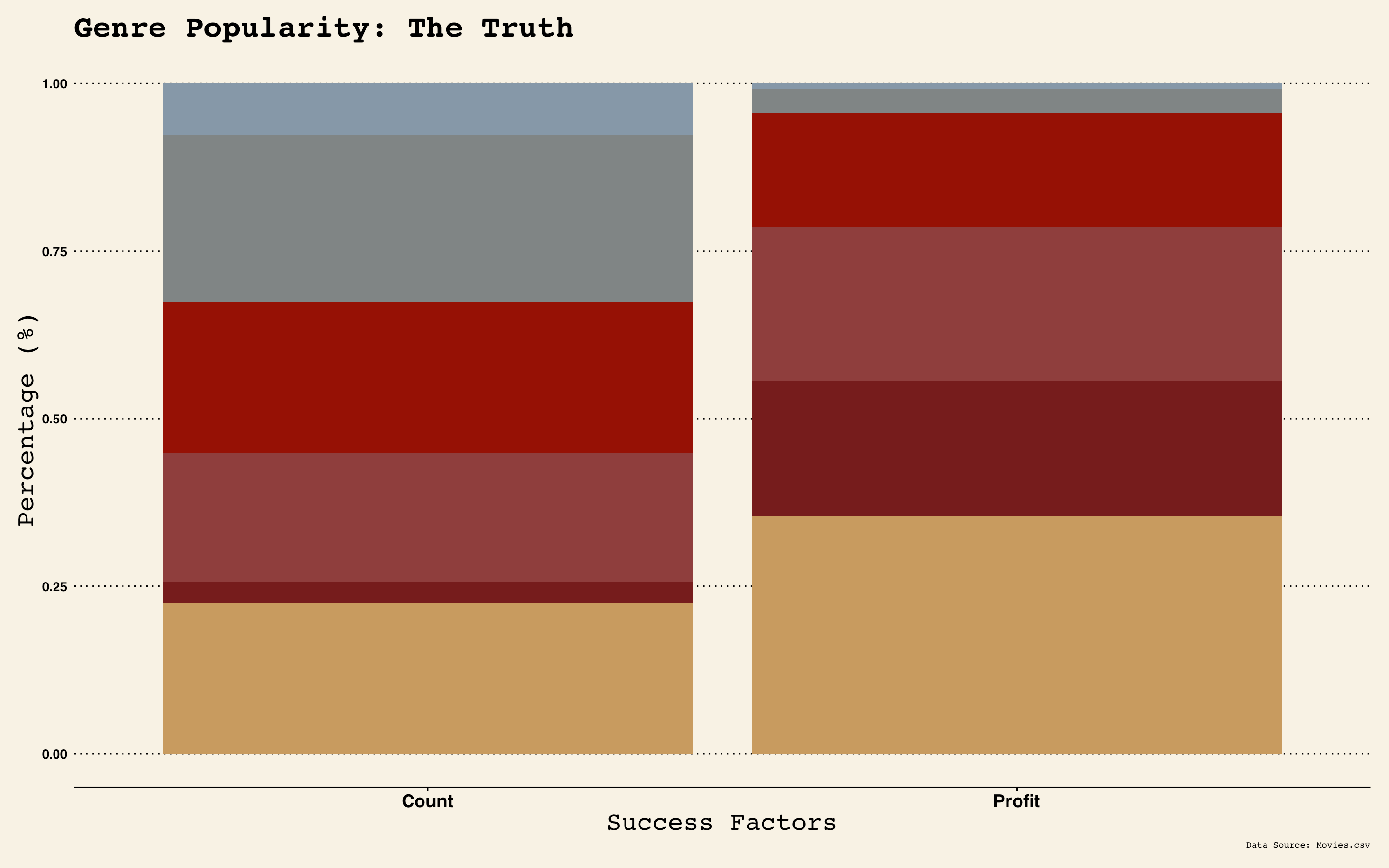
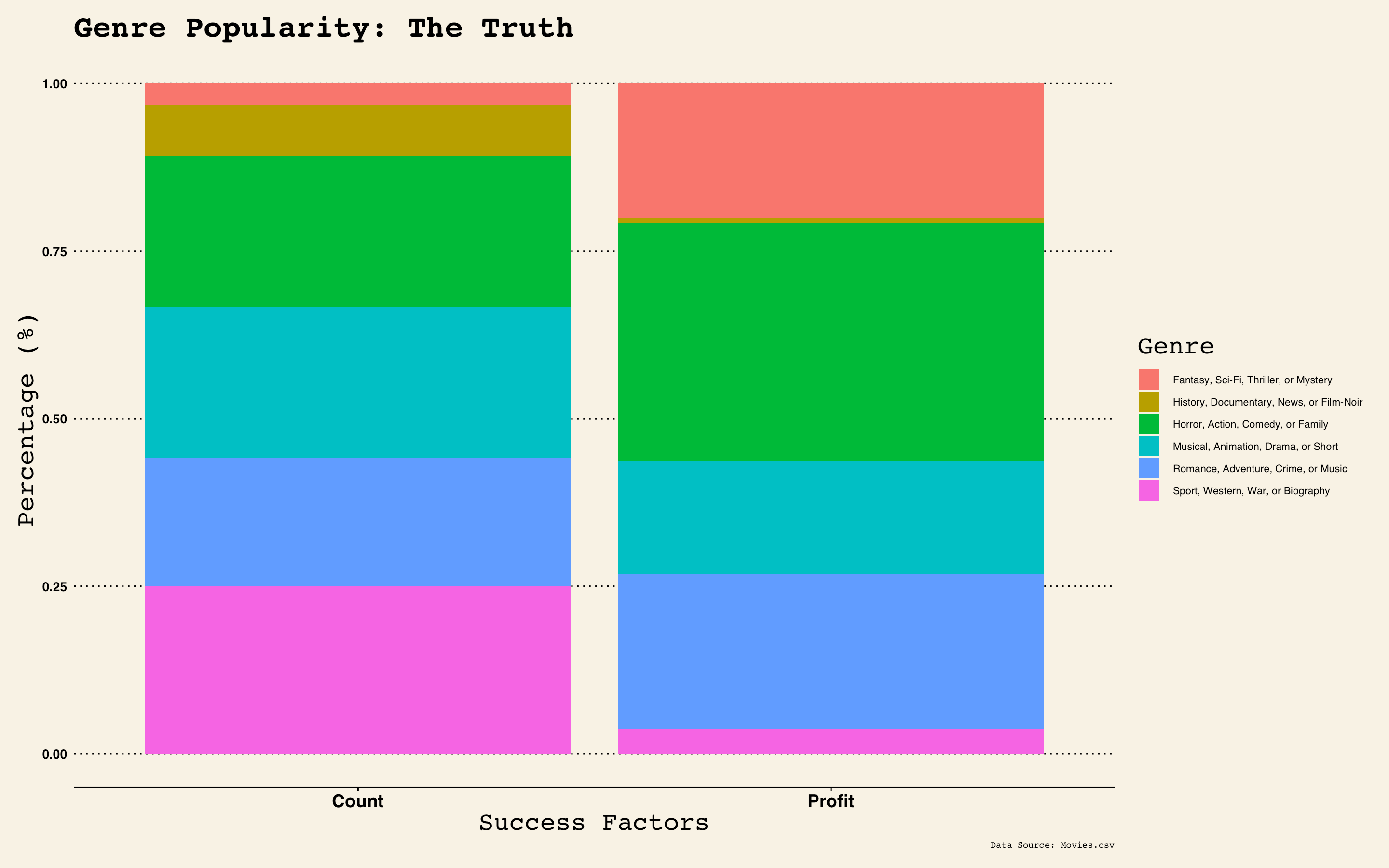
So I'm trying to plot a stacked bar chart, with the y-axis in % and so far, I have this:
*ggplot(BC, aes(fill=Genre, y=Numbers, x=PorC),show.legend=TRUE) + *
geom_bar(position="fill", stat="identity",fill=col2) +
theme_wsj() +
scale_color_wsj("colors6") +
theme(legend.position="right",legend.direction="vertical") +
labs(title="Genre Popularity: The Truth", x="Success Factors",y="Percentage (%)",caption="Data Source: Movies.csv")+
theme(text = element_text(size=10), axis.text.x = element_text(size=14),plot.caption=element_text(size=7),axis.title=element_text(size=20))
*'BC' in line 1 is just the name of my dataframe, which has the 3 column variables as stated in line 1. col2 in line2 is my own colour palette.
Even though I wrote 'show.legend=TRUE', the legend won't show.
However, if I remove 'fill=col2' in line 2, my legend appears, but of course with the default colour palette.
Is there a particular reason for this - why the legend won't appear for my own palette?