I have a dataset here.
data.frame(
ID = c(1,2,3,4,5,6,7,8,9,10,11,12,13,
14,15,16,17,18,19,20,21,22),
data.frame(
stringsAsFactors = FALSE,
ID = c(1,2,3,4,5,6,7,8,9,10,
11,12,13,14,15,16,17,18,19,20,21,22),
Rescan1 = c("No","No","No","No","No",
"No","No","No","No","Yes","No","No","No","No",
"No","No","No","No","No","No","No","Yes")
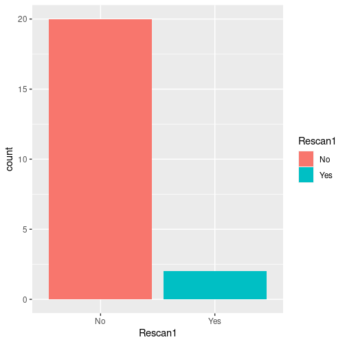
I'm trying to use ggplot to get two different colours for each bar chart that appears. I enter the following code
ggplot(prostate_cleaned, aes(Rescan1)) + geom_bar()
ID - Patient ID, Rescan1- whether or not patient needed rescanned (a discrete variable)
this gives me two gray bar chats (which I presume is the default). .
I want the 'Yes' to be in Green and 'No' to be in red.
I tried this:
ggplot(prostate_cleaned, aes(Rescan1)) + geom_bar() + scale_fill_manual(values = c("Red", "Green"))
but it doesnt change a think...Can someone help please?