Hello,
I am working on a project which is based on an exploratory data analysis, where we have a lot of data sets coming from a e-commerce company.
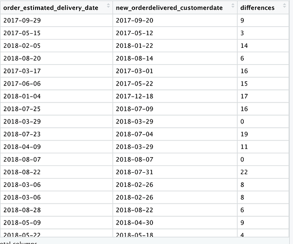
I am interested in studying the delivery performance : I have created a table with the following columns : order_id, customer_state, product category_name_english, order_delivered_customer_date (without the hours dimension) and order_estimated_delivery_date. Then, I calculated the differences between the estimated delivery date and the actual delivery date to check whether it was in advance, delayed or on time. Then I have added a column called "differences" obtained as such :
differences <- difftime(newdeliveryperformance$order_estimated_delivery_date, newdeliveryperformance$new_orderdelivered_customerdate, units ="days")
this is the end result :
So, if the number is positive it means the delivery had an advance, if the number is negative the delivery had a delay, if the number is equal to zero, it means the delivery was on time.
My question is, how can I create another column that relates the number to a DELAY, ADVANCE OR ON TIME.
I cannot find a way to do it, my idea is to then create a chart with ggplot which relates the delivery performance to the order id, product category, region...
Thank you in advance
