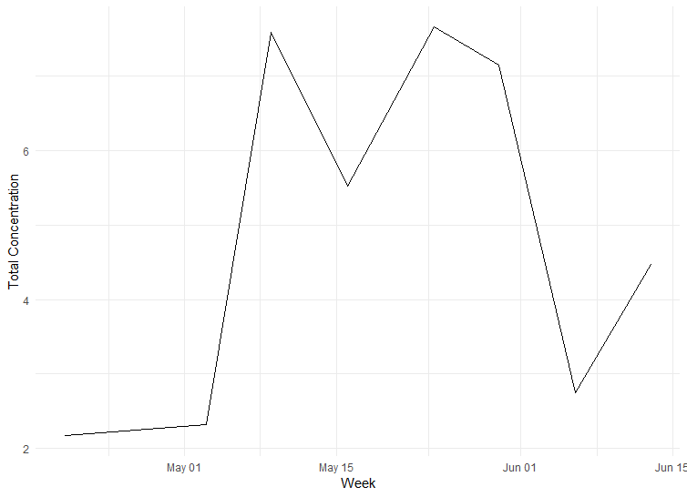
I have an excel sheet with measurements I have taken throughout several week. I have one measurement per week and would like to plot a line graph to visualize the development. In Excel i have one column for the exact date the measurements were taken and one with the numbers. The dates are in dd.mm.yyyy format and it seems like R recognizes it as dates.
Now, whenever i try to plot it the dates on the x-axis are not the ones i have in my excel sheet. When I change the dates into strings i get this comment:
geom_line()`: Each group consists of only one observation.
i Do you need to adjust the group aesthetic?
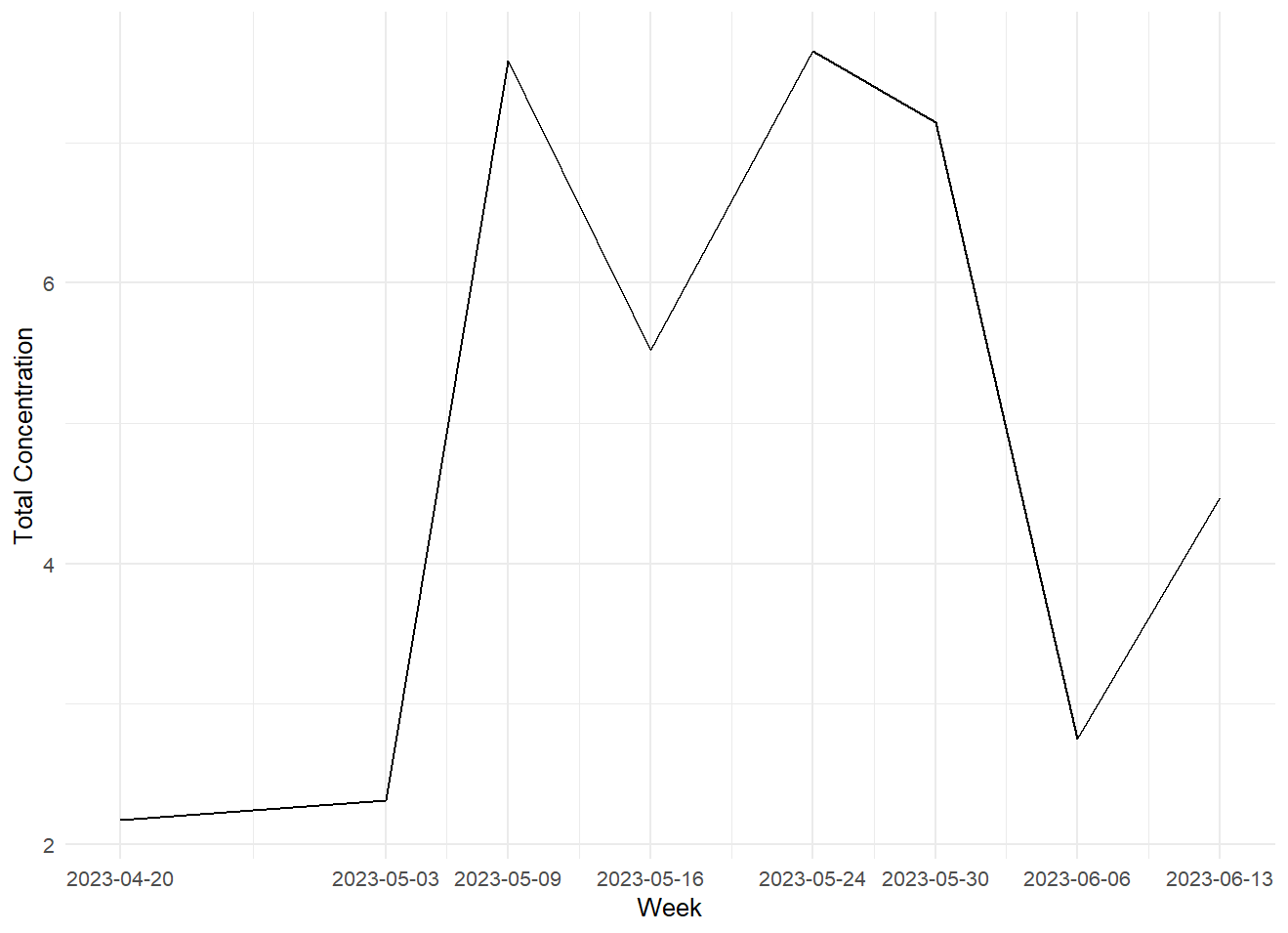
The graph now has the correct dates but it doesn't have any data in it.
When I try the data_df$Date <- as.Date(data_df$Date) it doesn't change anything, it shows the wrong dates still.
You see the dates in the plot are not the ones i have in my table. I'd like those on the x-axis and not some random ones in order to make the plot clearer. I think the reason why it changes the dates is that the time spans between my sampling dates are not the same but there has to be a solution right?
Yes, the data points in the line graph are correct, but when you look at the x-axis you see May 01, May 15 and so on and I want the exact dates from my table on the axis. The dates you see on the axis now are not the ones I have in my table.