Hi Rcomm
Say we have the walmart dataset from timetk library
i want a time series plot with:
- top 3 id based on weekly_sales
- all in 1 graph (meaning a total of 3 lines in a single gg line plot)
any help ?
Hi Rcomm
Say we have the walmart dataset from timetk library
i want a time series plot with:
any help ?
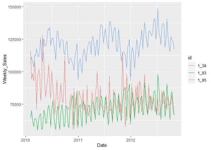
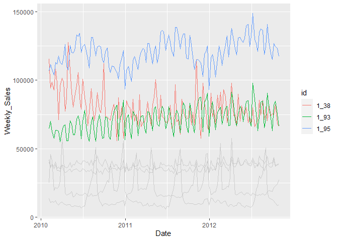
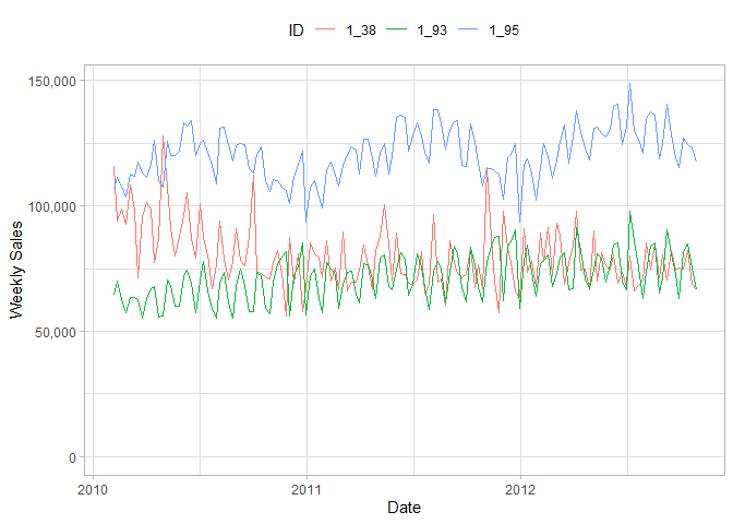
I believe the below analysis achieves what you're looking for. I wasn't sure how you'd define the "top 3" so I just used mean weekly sales.
Provided three plots - one with only the top 3, one with all IDs but only the top 3 highlighted, and finally the original plot of just the top 3 but finessed a bit to look a little nicer than the default.
library(tidyverse)
library(timetk)
#> Registered S3 method overwritten by 'tune':
#>   method                   from
#>   required_pkgs.model_spec parsnip

wm = walmart_sales_weekly

# Find top 3

top_ids = wm %>%
  group_by(id) %>% # group by id column
  summarise(avg_sales = mean(Weekly_Sales)) %>% # calculate average sales
  arrange(desc(avg_sales)) %>%  # arrange averages in descending order
  head(3) # get top three

# plot - only three

(plt = wm %>%
  semi_join(top_ids, by = "id") %>% # filter for top three (from above)
  ggplot(aes(x = Date, y = Weekly_Sales)) +
  geom_line(aes(color = id)))

# plot - highlight top three (using gghighlight)

wm %>%
  ggplot(aes(x = Date, y = Weekly_Sales)) +
  geom_line(aes(color = id)) +
  gghighlight::gghighlight(id %in% top_ids$id,
                           use_direct_label = F,
                           use_group_by = F)

# finesse plot a bit

plt +
  labs(y = "Weekly Sales", x = "Date", color = "ID") +
  theme_light() +
  theme(legend.position = "top") +
  expand_limits(y=0) +
  scale_y_continuous(labels = scales::comma_format())

Created on 2022-02-03 by the reprex package (v2.0.1)
This topic was automatically closed 7 days after the last reply. New replies are no longer allowed.
If you have a query related to it or one of the replies, start a new topic and refer back with a link.