I am new to R, so I suspect this is a common question. I am importing a data from an Excel file (neb_rail). One of the columns contains the month as a character (eg, January, February...etc.), and the other has a year column as double. The sample tibble is below.
# A tibble: 77 x 6
    year month      vol_m3 volume_m3d volume_bbl volume_bpd
   <dbl> <chr>       <dbl>      <dbl>      <dbl>      <dbl>
 1 2018. May       979274.     31589.   6162433.    198788.
 2 2018. April     922323.     30744.   5804048.    193468.
 3 2018. March     840522.     27114.   5289282.    170622.
 4 2018. February  596565.     21306.   3754096.    134075.
 5 2018. January   717726.     23152.   4516550.    145695.
 6 2017. December  748489.     24145.   4710133.    151940.
 7 2017. November  707046.     23568.   4449337.    148311.
 8 2017. October   675768.     21799.   4252509.    137178.
 9 2017. September 639449.     21315.   4023963.    134132.
10 2017. August    590833.     19059.   3718026.    119936.
# ... with 67 more rows
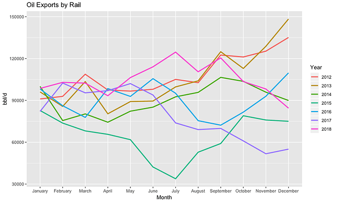
I am trying to graph the data using a multiple line graph, grouped by year with x-axis as month. The code is as follows:
ggplot(data=neb_rail) +
  geom_line(mapping=aes(x=month, y= volume_bpd, group = year,
                        color=year), size = 1) +
  labs(y="bbl/d", x="Month", title="Oil Exports by Rail")
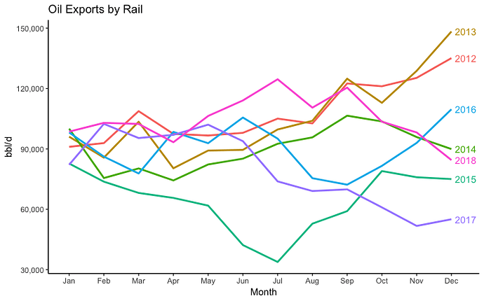
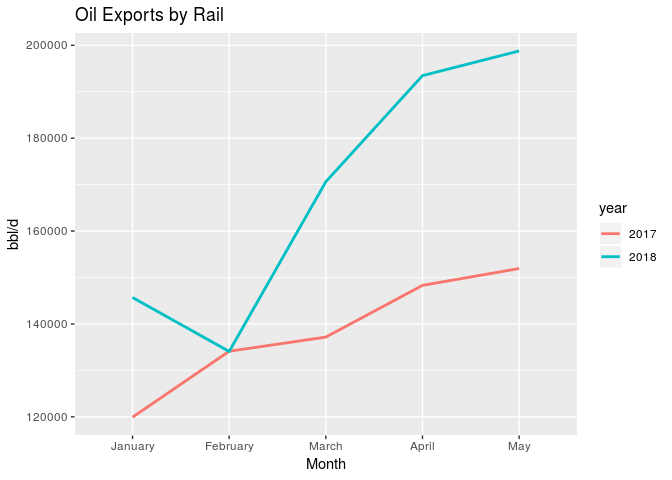
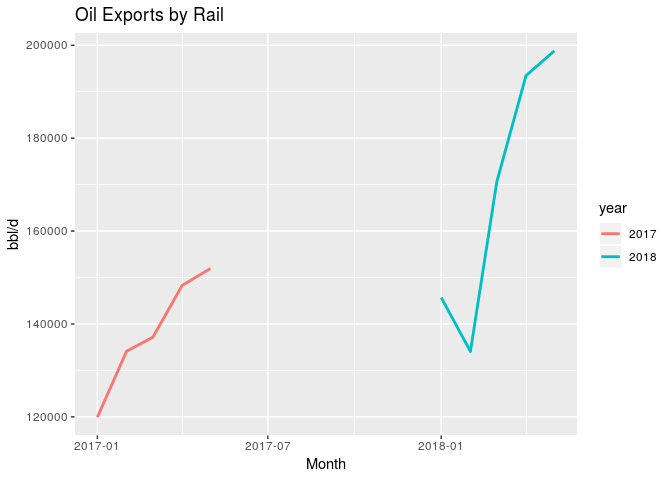
I am struggling with getting the x-axis to graph in the proper order (jan, feb, mar...etc), and getting the color on the line graph to be more contrasted rather than the current colors, which are shades of blue and black. A snapshot of the graph is as follows:
I tried converting month to factor, numeric...etc, and nothing works. Any suggestions on how to fix this would be greatly appreciated.
I apologize if this is not posted correctly. This is my first post.


