Hello,
I am trying to transfer a chart from Excel over to R. I have used that Excel chart for many years and am hoping to re-create it in R.
Here is some dummy data that I ave created for this example:
data <- structure(list(
  Month = structure(c(17167, 17198, 17226, 17257, 17287, 17318, 17348, 17379, 17410, 17440, 17471, 17501, 17532), class = "Date"),
  Sales_Dollars = c(0.21, 0.24, 0.33, 0.35, 0.38, 0.35, 0.31, 0.26, 0.21, 0.14, 0.18, 0.27, 0.28),
  Sales_Units = c(0.08, 0.12, 0.15, 0.15, 0.18, 0.18, 0.18, 0.18, 0.16, 0.17, 0.16, 0.24, 0.19),
  Price_per_Unit = c(0.14, 0.13, 0.18, 0.19, 0.19, 0.17, 0.14, 0.08, 0.06, 0, 0.04, 0.05, 0.1)),
  .Names = c("Month", "Sales_Dollars", "Sales_Units", "Price_per_Unit"), class = c("tbl_df", "tbl", "data.frame"), row.names = c(NA, -13L))

data

> data
# A tibble: 13 x 4
   Month      Sales_Dollars Sales_Units Price_per_Unit
   <date>             <dbl>       <dbl>          <dbl>
 1 2017-01-01         0.210      0.0800         0.140
 2 2017-02-01         0.240      0.120          0.130
 3 2017-03-01         0.330      0.150          0.180
 4 2017-04-01         0.350      0.150          0.190
 5 2017-05-01         0.380      0.180          0.190
 6 2017-06-01         0.350      0.180          0.170
 7 2017-07-01         0.310      0.180          0.140
 8 2017-08-01         0.260      0.180          0.0800
 9 2017-09-01         0.210      0.160          0.0600
10 2017-10-01         0.140      0.170          0
11 2017-11-01         0.180      0.160          0.0400
12 2017-12-01         0.270      0.240          0.0500
13 2018-01-01         0.280      0.190          0.100
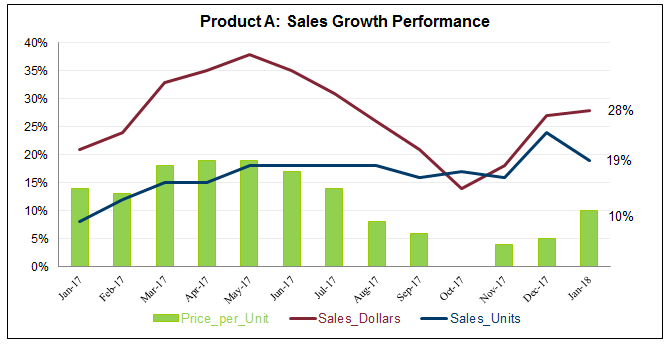
Here is the Excel based chart that I normally use:

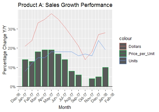
This is the closest that I could get with R:
data_chart <- data %>%
  ggplot(aes(x=Month))+
  geom_col(aes(y=Price_per_Unit, color="Price_per_Unit")) +
  geom_line(aes(y=Sales_Dollars, color="Dollars")) +
  geom_line(aes(y=Sales_Units, color="Units"))+
  scale_y_continuous(labels = scales::percent) +
  scale_x_date(date_breaks = "1 month", date_labels = "%b-%y") +
  geom_hline(aes(yintercept = 0)) +
  theme(axis.text.x = element_text(angle = 45, hjust = 1)) +
  ggtitle("Product A: Sales Growth Performance") +
  ylab("Percentage Change Y/Y")
data_chart

...But I am still trying to figure out a few things:
a) Adding data labels at the end of each variable (the last value of each variable)
b) The ability to customize the colors of each variable using RGB values
c) How do I get rid of the borders along geom_col?
d) The legend seems very odd, any suggestions on fixing it?
A few additional notes:
a) I am deliberately mixing a column (geom_col) with a line chart (geom_line). This is because I feel that the "Dollars" and "Units" variables are similar types of data, while the Price_per_Unit variable is conceptually different from the other two but still important to keep in the same chart.
b) The data frame is currently in a "wide" format. If there are suggested ways to build a mixed line and column plot using "tall" data, I am very keen to learn those ideas as well.
I hope that this makes sense. Any help would be hugely appreciated!


