Hi guys,
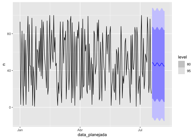
I was just wondering if there is some way to present animated forecast plots or more customized one to present for my business, I did not find some resource in this topic. I would like to produce a forecast plot I have tried to search ggdist + ggplot to do it, not very successfully here.
Below a quick example , if someone could help me would be really appreciated :
library(dplyr)
#> Warning: package 'dplyr' was built under R version 3.6.2
#>
#> Attaching package: 'dplyr'
#> The following objects are masked from 'package:stats':
#>
#>     filter, lag
#> The following objects are masked from 'package:base':
#>
#>     intersect, setdiff, setequal, union
library(tsibble)
#> Warning: package 'tsibble' was built under R version 3.6.2
library(fable)
#> Warning: package 'fable' was built under R version 3.6.2
#> Carregando pacotes exigidos: fabletools


iniciativa <- tibble(
    data_planejada = seq(as.Date("2020-01-01"), length = 200, by = "1 day"),
    n = sample(seq(100), size = 200, replace = TRUE)
) %>%
    as_tsibble(index = data_planejada)

train <- iniciativa %>%
    filter_index("2020-01-01" ~ "2020-05-29")


fc <- iniciativa %>%
    model(tslm1 = TSLM(n ~ trend() + fourier(K = 1)))  %>%
    forecast(h=20)

fc %>% autoplot(iniciativa)

Created on 2021-02-01 by the reprex package (v0.3.0)