Hi,
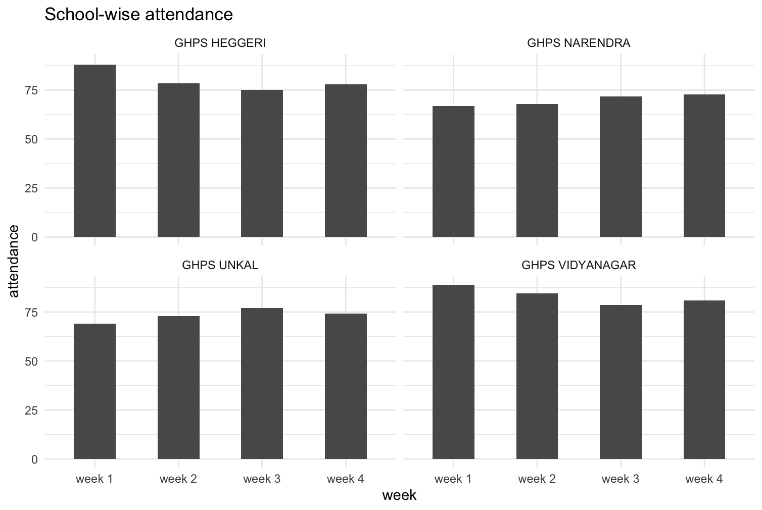
I have a data where I have to track attendance of students school-wise. The tracking happens week-wise. So for each school, on an average, what are the attendance figures is what I need. But the graph that I made shows the wrong numbers. I calculated the cumulative average. In the Y-axis, I gave cumulative average. How can I solve this so that I can see a particular school X's attendance in a particular week?
library(tidyverse)


data<-tibble::tribble(
                  ~school,    ~week, ~student_attendance,
             "GHPS UNKAL", "week 1",                 69L,
        "GHPS VIDYANAGAR", "week 1",                 89L,
          "GHPS NARENDRA", "week 1",                 67L,
           "GHPS HEGGERI", "week 1",                 88L,
             "GHPS UNKAL", "week 2",                 77L,
        "GHPS VIDYANAGAR", "week 2",                 80L,
          "GHPS NARENDRA", "week 2",                 69L,
           "GHPS HEGGERI", "week 2",                 69L,
             "GHPS UNKAL", "week 3",                 85L,
        "GHPS VIDYANAGAR", "week 3",                 67L,
          "GHPS NARENDRA", "week 3",                 79L,
           "GHPS HEGGERI", "week 3",                 68L,
             "GHPS UNKAL", "week 4",                 66L,
        "GHPS VIDYANAGAR", "week 4",                 88L,
          "GHPS NARENDRA", "week 4",                 76L,
           "GHPS HEGGERI", "week 4",                 87L
        )


graph1<-data %>%
      mutate(week=as.character(week)) %>%
      group_by(school,week) %>%
      summarise(avg_attend=mean(student_attendance)) %>%
      mutate(cum_avg=cummean(avg_attend))
#> `summarise()` has grouped output by 'school'. You can override using the `.groups` argument.
ggplot(graph1,aes(week,cum_avg))+
      geom_bar(width = 0.5,stat = "identity")+
      theme_minimal()+
      labs(title = "School-wise attendance",
           x="week",
           y="attendance")


Created on 2022-10-18 by the reprex package (v2.0.1)