Hello everybody,
I have this tiny dataset and I want to create a pie chart for every participant. They should contain the values from "Anteil Therapie" and "Anteil Freizeit". Can somebody may help me? I already tried it on my own but my abilities are limited.
Best wishes
Hi @SebosstianTae , welcome to the forum!
What have you tried already? What language are you using?
Best,
library (tidyverse)
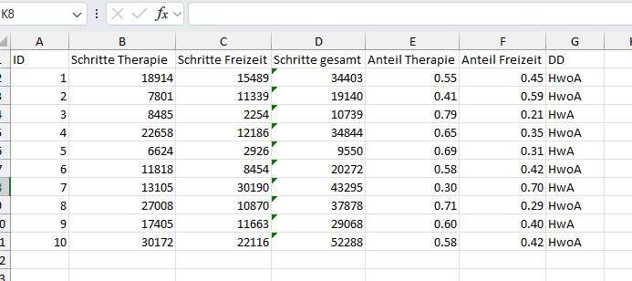
df <- tribble(
~ID, ~Therapie, ~Freizeit,
1, 18914, 15489,
2, 7801, 11339,
3, 8485, 2254,
4, 22658, 12186,
5, 6624, 2926,
6, 11818, 8454,
7, 13105, 30190,
8, 27008, 10870,
9, 17405, 11663,
10, 30172, 22116
)
df %>%
mutate(
Gesamt = Therapie + Freizeit,
pct_therapie = Therapie / Gesamt,
pct_freizeit = Freizeit / Gesamt) %>%
pivot_longer(cols = c(pct_therapie, pct_freizeit), names_to = "name", values_to = "value") %>%
ggplot(aes(x = 1, y = value, fill = name)) +
geom_col()+
facet_wrap(~ID) +
coord_polar(theta = "y")+
theme_void()
system
October 14, 2024, 1:39pm
4
This topic was automatically closed 90 days after the last reply. New replies are no longer allowed.