Hello,
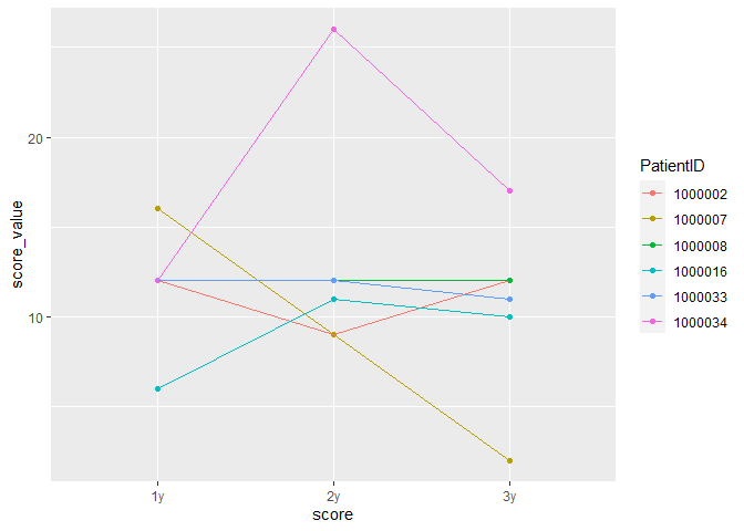
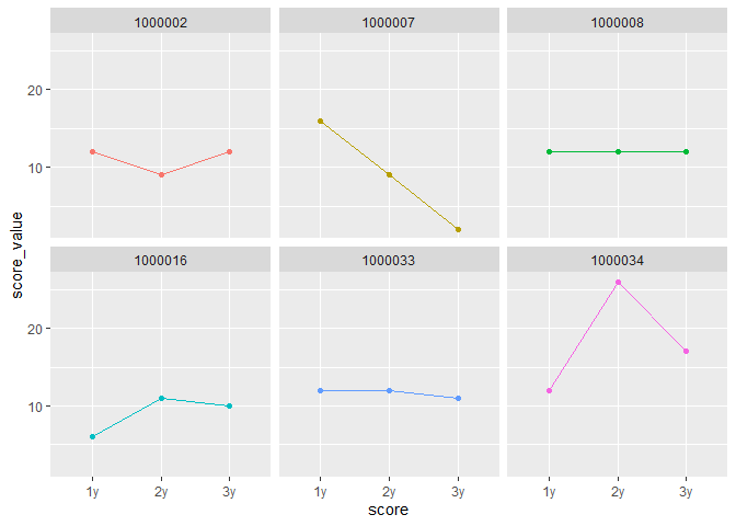
I have a little trouble with visualising my data. I have receptive measurements and want to display them in 1 graph. I figured for this I need the columns Year 1, Year 2 and Year2.
a cut down version of my current dataset looks like this:
PatientID | Score Year1| Score Year 2 | Score Year 3
1 | 99 | 55 | 11
2 | 52 | 22 | 1
3 | 23 | 75 | 89
4 | 22 | 84 | 51
...
and I want to convert it to:
Patient ID | Year | Score
1 | 1 | 99
1 | 2 | 55
1 | 3 | 11
2 | 1 | 52
2 | 2 | 22
2 | 3 | 1
3 | 1 | 23
3 | 2 | 75
3 | 3 | 89
4 | 1 | 22
4 | 2 | 81
4 | 3 | 54
I feel like there is a knot in my head on how to do this. Maybe someone can help with a little advise how to do this best with rstudio
Thank you for any kind of help here