Creating meteorological maps in R

Hello,
I need some help creating maps showing the fluxuation of some climate indices in the country of Greece.
For example, I have a data frame containing the dtr of 6000 gridpoints in Greece with their coordinates
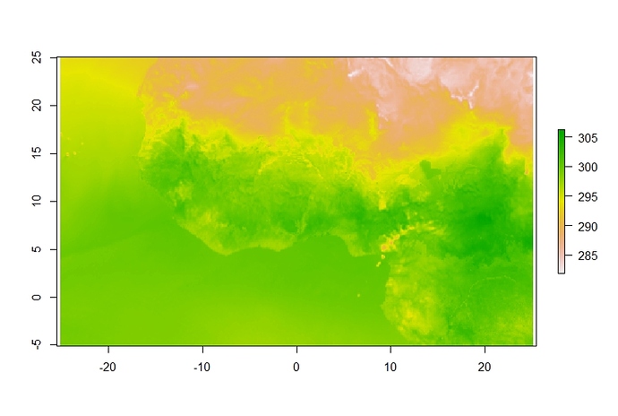
and I want to make a map like this one

747cdd41ca831ddca86af30738f4676929622682_2_690x464

I followed the tutorial about the sp and sf packages however they dont seem to work.
Any help or thought on how I can do it, is appreciated

What format as the data you want to plot?
I have made similar plots to the one shown using raster

There are formats to facilitate this; NetCdf comes to mind.

On the other hand for an existing coordinate / value dataset ggplot2::geom_tile() might be easier.

Have a look at code in this older question; the use case is similar...

My original data (containing surface temperature) were NetCdf files. However, in order to calculate those indices I had to modify those files into .xts and then the final data frame containing the dtr, the longitude and the latitude is numerical.
I tried using raster but if I'm not mistaken it requaries .nc files so unless there is a way to save the final data frame as .nc, I cant use it

Thank you, I tried that approach and got some results as shown in the picture


Although I have doubts about the data cause of the really low dtr in the southern part, but I assume that has to do more with quality control and less with programming

The code I used was the following (dtr_15_19 is the data frame with dtr values and coordinates and dtr15_19 only the dtr values) :

my_year <- theme_bw() + theme(panel.ontop=TRUE, panel.background=element_blank())

my_fill <- scale_fill_distiller('',palette='Spectral',
limits = c(1,13),breaks=c(1,5,9,13))

fig = ggplot(dtr_15_19 , aes(y=lat, x=lon, fill=dtr15_19 )) + geom_tile() + my_year + my_fill+
coord_quickmap(xlim=c(19, 30), ylim=c(34, 42))+
borders('world', xlim=c(19, 30), ylim=c(34, 42), colour='black')+
xlab('Longitude (°E)')+ ylab('Latitude (°N)')+
theme(panel.grid=element_blank(),
panel.border = element_rect(colour = "black", fill=NA,size=.7))+
labs(title = "Mean DTR in period 2015-2019")

print(fig)

EDIT:
I did the quality control and I got my results! Thanks a million!! :smiley:

This topic was automatically closed 7 days after the last reply. New replies are no longer allowed.