sarah.g
September 1, 2021, 7:41am
1
Hello,
I am creating a shiny app where the data is being retrieved from an xlsx sheet.
In the excel worksheet, I have the name of the countries to map. Each country is divided into 50*50 grids.
Each grid has 2 coordinates (lat and long) which point to the centroid of the cubic grid.
I would like to create a shiny app where I can filter by country, month, and year and obtain the cubic grids for each country mapped over the base map.
I haven't succeeded in that yet.
I have tried using leaflet, ggplot2, and highcharter but I haven't been successful at finding a solution yet
Any help is highly appreciated
Thanks
What have you done so far?
Would it be better to join to the polygons of the country rather than the centroid?
sarah.g
September 1, 2021, 8:16am
3
if so? how would i be able to visualize the grids as cubes of certain dimensions?
sarah.g
September 1, 2021, 8:17am
4
so far i haven't been able to visualize anything, i only added the buttons for filtering etc...
sarah.g
September 1, 2021, 8:23am
5
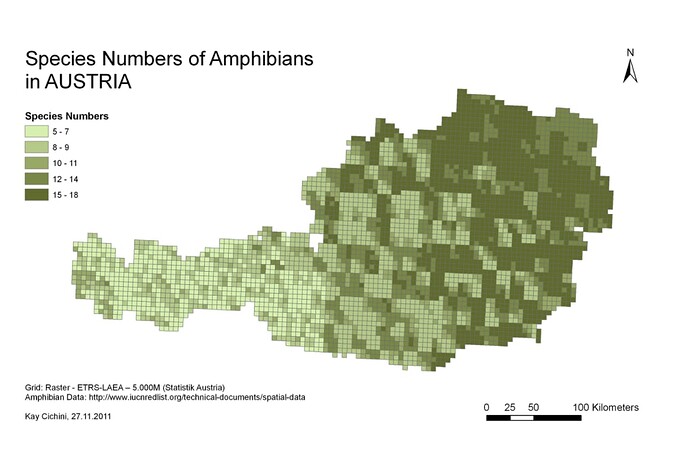
I am hoping to be able to do something like this
sarah.g:
I haven't succeeded in that yet.
I have tried using leaflet, ggplot2, and highcharter but I haven't been successful at finding a solution yet
What works? What doesn't? Share some code.
Here's a discussion on setting up data for a reprex
make it run - include the minimal code required to reproduce your error on the data…
sarah.g
September 1, 2021, 8:54am
7
  dashboardHeader(title="Title"),
  dashboardSidebar(sidebarMenu(
    menuItem(" Data",tabName=" Data",icon =icon("dashboard"))
  )),
  dashboardBody(
    tabItem(tabName="Data",
            fluidRow(
              box(title="Please choose a country,month and year (Selecting Multiple countries is possible)", width=12,status="warning",solidHeader=TRUE,
                  selectInput("Country","Country",choices=countries_list, multiple=FALSE),
                  selectInput("Month","Month",choices=month_list,multiple=FALSE),
                  selectInput("Year","Year",choices=year_list,multiple=FALSE),
                  downloadButton("DownloadData","Download Data as csv"))
                    ),

            fluidRow(
              ##box(title = "Grids",width=12,leafletOutput("Leafplot", height = 250),status = "primary",solidHeader = TRUE)

              box(title="Grids",width=12,highchartOutput("Map",height=450),status="primary",solidHeader=TRUE)
            )
            )
  )
)```

```server<-function(input,output){

#Interactive filters & download button tab
  data1<-reactive(
    {
      req(input$Country)
      req(input$Month)
      req(input$Year)
      data_filtered<-df_Main%>%filter(country %in% input$County)%>%filter(month_name %in% input$Month)%>%filter(year %in% input$Year)
    }

  )

  #head(df_Main)
  #browser()
  output$Map <- renderHighchart({
    req(input$Country)
    req(input$Month)
    req(input$Year)

    data_filtered<-df_Main%>%filter(country %in% input$County)%>%filter(month_name %in% input$Month)%>%filter(year %in% input$Year)

    highchart(type="map")%>%hc_add_series_map(worldgeojson,df=data_filtered,value="Value",joinBy=c("name","country"))

    }
  )
df_Main is the data frame that reads from excel where I have the coordinates for the grids
It is not reproducible because we don't have your data.
What is wrong with it? What error messages do you get?
sarah.g
September 1, 2021, 9:06am
9
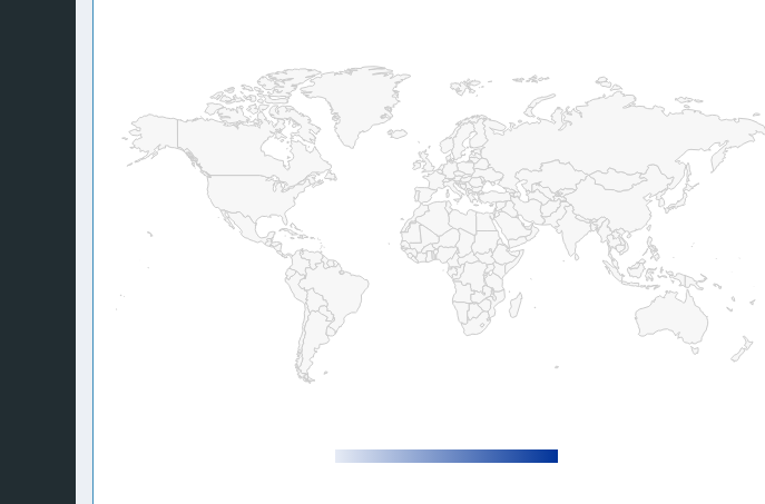
I do not get any error, I just get the world map blank empty and it does not change if I choose a certain country
Change this to Country (missing 'r').
sarah.g
September 1, 2021, 9:08am
11
sarah.g
September 1, 2021, 9:10am
12
Ow! okay now what i am getting is the country selected in blue
sarah.g:
data_filtered
This should be a reactive value. See:
Edit: Actually maybe not. It isn't in the example here, but it normally would be. highcharter-shiny/06-maps-performance/app.R at master · jbkunst/highcharter-shiny · GitHub
sarah.g
September 1, 2021, 9:14am
15
Big thanks, will keep u posted
1 Like
system
October 25, 2021, 1:15pm
16
This topic was automatically closed 54 days after the last reply. New replies are no longer allowed.

