Hi,
I was wondering if anyone knows how to output dot charts with names on both axis's, dotchart() then unsure what to I need to enter in here,
Thanks
Hi Daniel, and welcome to the community!
You can specify the labels on x- and y axis with the arguments xlab="your x label" and ylab="your y label" in the dotchart function. It would look similar to this:
dotchart(yourData,
         xlab="your x label",
         ylab="your y label")
Just a little hint: When you enter ?dotchart, R will open the documentation for the functions, and there you can see all the arguments you can use with it. The same works for any other function too.
Does that answer your question?
Hi jms, thanks for the help! I will try this, when you say 'Your label', is this the top title? As I have imported my data from Excel, I am a little confuse by this,
Thanks
The text inside the quotation marks is the text that will appear as axis labels on the plot .
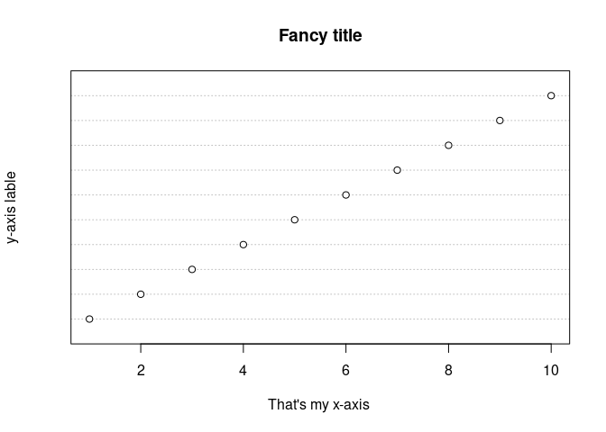
It will look like this:
dotchart(1:10,
         main = "Fancy title",
         xlab="That's my x-axis ",
         ylab = "y-axis lable")

Created on 2021-01-09 by the reprex package (v0.3.0)
Is that what you where asking for?
Ah this looks great thankyou! I am looking to list names of Celebrities on the Y axis and other celebrities on the X axis, then linking them via marriage etc. Thanks for the help!
My only other question is how to add data to this X and Y axis? Both characters too,
If your input data (I suppose a matrix) has row names and column names, the dotchart function will automatically use those names to label the plot.
You can specify them like this:
rownams(yourData)<-c("One","name","per","row")
colnames(yourData)<-c("One","name","per","column")
Hi, I have used the above code to create the dot chart and is successful, however, the data is not appearing. Could this be something within my excel file?
That's something nobody can tell without knowing your data and your code. So it would be good if you could share a bit of your data and the code you have been trying to use.
You can have a look at this guide which explains very well how to do so.
Hi,
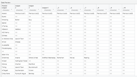
I've been reading over this today and still can't seem to make it work. Here is the data, I am trying to link previous clubs with players using DOT charts. This is my data
Sharing a screenshot is usually not a good way to share data, we are all notoriously lazy and prefer copy & paste over typing long lists of data 
A better way would be to run dput(head(yourData)) and post the output here.
However, in your case I can see that you are trying to plot character data. If you look at the documentation of the dotchart function you will see that it needs numeric values as input, so it won't work with the data you are showing.
I also don't quite understand how you'd like to plot the data you are showing. So you'd need to explain that more explicitly so that the people here can help with the implementation.
structure(list(Premier League = c("Arsenal", "B.Leno", "R.Holding",
"Gabriel", "K.Tierney", "H.Bellerin"), League 2 = c("Previous club(1)",
NA, "Bolton", NA, NA, "Watford"), League 3 = c("Previous club(2)",
NA, "Bury", NA, NA, NA), League 4 = c("Previous club(3)", NA,
NA, NA, NA, NA), ...5 = c("Previous club(4)", NA, NA, NA, NA,
NA), ...6 = c("Previous club(5)", NA, NA, NA, NA, NA), ...7 = c("Previous club(6)",
NA, NA, NA, NA, NA), ...8 = c("Previous club(7)", NA, NA, NA,
NA, NA), ...9 = c("Previous club(8)", NA, NA, NA, NA, NA), ...10 = c("Previous club(9)",
NA, NA, NA, NA, NA)), row.names = c(NA, -6L), class = c("tbl_df",
"tbl", "data.frame"))
This is the output from that, sorry I am new to this, I want to link players with their previous clubs so for example the bottom axis have team and upwards the names. Then plot what former clubs these individuals played for if that makes sense,
Thanks!
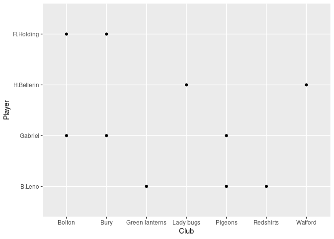
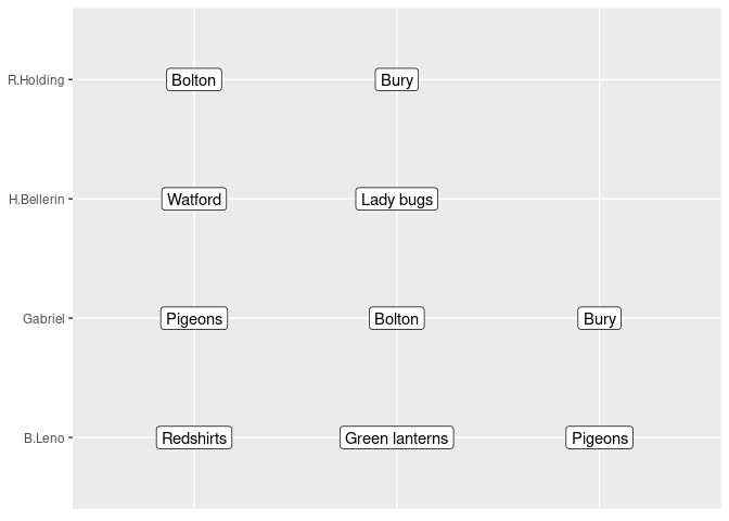
Here is a suggestion how you could approach this. I am using the ggplot2 package from the tidyverse which is very useful and popular for visualizations in R. I am also using some other functions that are collected in the tidyverse package collection to reshape your data since it comes in quite a messy format (For example your first row is the actual header of the table). Note that I also added some fictitious teams to your data, so that there is a little bit more to lock at in the plot.
library(tidyverse)

structure(list("Premier League" = c("Arsenal", "B.Leno", "R.Holding",
                                  "Gabriel", "K.Tierney", "H.Bellerin"),
               "League 2" = c("Previous club(1)","Redshirts", "Bolton", "Pigeons", NA, "Watford"),
               "League 3" = c("Previous club(2)","Green lanterns", "Bury", "Bolton", NA, "Lady bugs"),
               "League 4" = c("Previous club(3)", "Pigeons",NA, "Bury", NA, NA),
               "...5" = c("Previous club(4)", NA, NA, NA, NA,NA),
               "...6" = c("Previous club(5)", NA, NA, NA, NA, NA),
               "...7" = c("Previous club(6)",NA, NA, NA, NA, NA),
               "...8" = c("Previous club(7)", NA, NA, NA,NA, NA),
               "...9" = c("Previous club(8)", NA, NA, NA, NA, NA),
               "...10" = c("Previous club(9)",NA, NA, NA, NA, NA)),
          row.names = c(NA, -6L),
          class = c("tbl_df","tbl", "data.frame"))->yourData


# clean up the data
yourDataClean<-yourData[-1,]
colnames(yourDataClean)<-c("Player",yourData[1,-1])
yourDataClean
#> # A tibble: 5 x 10
#>   Player `Previous club(… `Previous club(… `Previous club(… `Previous club(…
#>   <chr>  <chr>            <chr>            <chr>            <chr>
#> 1 B.Leno Redshirts        Green lanterns   Pigeons          <NA>
#> 2 R.Hol… Bolton           Bury             <NA>             <NA>
#> 3 Gabri… Pigeons          Bolton           Bury             <NA>
#> 4 K.Tie… <NA>             <NA>             <NA>             <NA>
#> 5 H.Bel… Watford          Lady bugs        <NA>             <NA>
#> # … with 5 more variables: `Previous club(5)` <chr>, `Previous club(6)` <chr>,
#> #   `Previous club(7)` <chr>, `Previous club(8)` <chr>, `Previous
#> #   club(9)` <chr>

# Bring into long format

yourDataLong<-yourDataClean%>%pivot_longer(cols =! 1,names_to=c("PrevClubNr"), values_to="Club")
yourDataLong
#> # A tibble: 45 x 3
#>    Player    PrevClubNr       Club
#>    <chr>     <chr>            <chr>
#>  1 B.Leno    Previous club(1) Redshirts
#>  2 B.Leno    Previous club(2) Green lanterns
#>  3 B.Leno    Previous club(3) Pigeons
#>  4 B.Leno    Previous club(4) <NA>
#>  5 B.Leno    Previous club(5) <NA>
#>  6 B.Leno    Previous club(6) <NA>
#>  7 B.Leno    Previous club(7) <NA>
#>  8 B.Leno    Previous club(8) <NA>
#>  9 B.Leno    Previous club(9) <NA>
#> 10 R.Holding Previous club(1) Bolton
#> # … with 35 more rows

# Simple dotplot

yourDataLong%>%na.omit()%>%
  ggplot(aes(x=Club,y=Player))+
  geom_point()

# alternative way of plotting
yourDataLong%>%na.omit()%>%
  ggplot(aes(x=PrevClubNr,y=Player,label=Club))+
  geom_label()+
  theme(axis.text.x = element_blank(),
        axis.ticks.x = element_blank(),
        axis.title = element_blank())

Created on 2021-01-10 by the reprex package (v0.3.0)
Explanation:
At first I remove the first row from the data and use it as column names instead. I also change Arsenal to Player since that seems to be a bit more meaningful to me.
Then I convert the datafeame from the wide into the long format (pivot_longer) which is the preferred format for many applications within the tidyverse.
At the end I create the plots. I use na.omit() before piping the data into the plot so that the plot looks bit cleaner.
You see that creating the plots is actually the smallest part of my code. When working with data, you often face the issue that it comes in messy formats (such as the one you have), and a large part of your time you actually spent on cleaning up and reshaping your data. There are many great resources online, that can help you getting into R, tidyverse and ggplot2, The book R for data science is a very good place to start, but there are also tons of other tutorials and videos available online.
Hi jms, I can't thankyou enough for this! Ill try this soon and get back to you soon, thankyou so much!
This topic was automatically closed 21 days after the last reply. New replies are no longer allowed.
If you have a query related to it or one of the replies, start a new topic and refer back with a link.