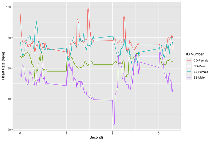
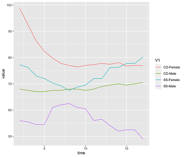
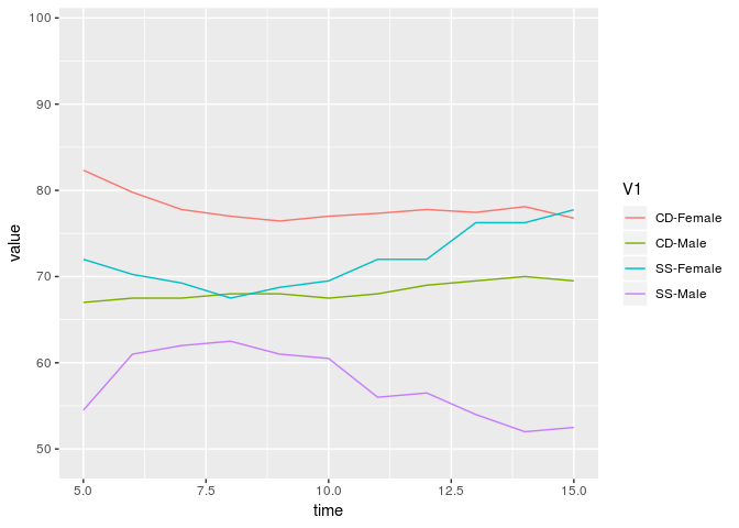
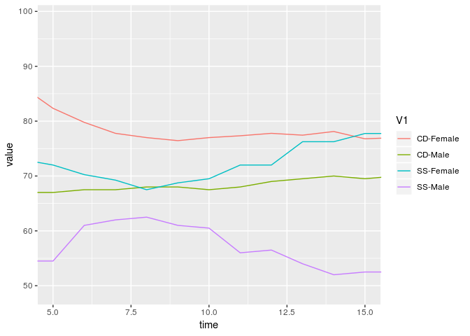
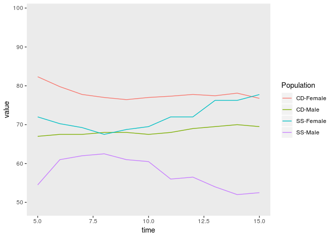
Hi, I'm trying to restrict my x axis to cut off points so the graph it is within 0.5 to 3. So to cut off everything that is not in the range. So for example, the x axis would end at 3 sec and the lines after that in the plot would be cut down.
Also, how would I remove the grid lines?
Any other tips to improve this plot to make it publish worthy?
Thanks
Code Below:
library(tidyverse)
RCom <-heartrateR
aggregates and creates mean across all
RCom %>%
group_by(ID Number) %>%
summarize_if(is.numeric, mean) -> RCom
View(RCom)
data2 <- RCom
pivots
data2%>%
pivot_longer(!"ID Number", names_to = "time", values_to = "HR")%>%
mutate(time = as.numeric(time)) -> data3
plot (could use "linetype here" )
data3 %>%
ggplot(aes(x = time, y = HR, color = ID Number)) +
geom_line() + labs(x = "Seconds", y = " Heart Rate (bpm)")
heartrateR <- tibble::tribble(
                       ~V1,  ~V2,  ~V3,  ~V4,  ~V5,  ~V6,  ~V7,  ~V8,  ~V9, ~V10, ~V11, ~V12,
               "ID Number",   0L,   1L,   2L,   3L,   4L,   5L,   6L,   7L,   8L,   9L,  10L,
                   "CD",  66L,  66L,  64L,  64L,  58L,  58L,  58L,  57L,  56L,  56L,  57L,
                   "SS",  85L,  84L,  83L,  81L,  80L,  79L,  78L,  78L,  79L,  80L,  80L,
                   "CD", 103L, 103L, 103L, 103L, 103L, 103L, 103L, 103L, 103L, 103L, 103L,
                   "CD", 115L, 115L, 114L, 114L, 114L, 114L, 112L, 111L, 110L, 109L, 109L,
                  "SS",  63L,  63L,  63L,  63L,  77L,  78L,  80L,  77L,  76L,  67L,  67L,
                   "CD",  84L,  63L,  62L,  62L,  63L,  58L,  58L,  54L,  62L,  66L,  66L,
                  "SS",  49L,  48L,  46L,  46L,  45L,  46L,  45L,  45L,  45L,  45L,  46L,
                  "CD",  70L,  69L,  68L,  68L,  69L,  69L,  69L,  69L,  68L,  69L,  70L,
                   "CD",  83L,  84L,  84L,  84L,  84L,  84L,  82L,  82L,  82L,  82L,  81L,
                   "SS",  79L,  78L,  67L,  67L,  68L,  62L,  62L,  62L,  63L,  72L,  72L,
                   "CD", 240L, 202L, 141L, 106L,  89L,  74L,  71L,  71L,  71L,  72L,  74L,
                   "SS",  78L,  78L,  77L,  76L,  75L,  75L,  75L,  75L,  76L,  76L,  76L,
                  "CD",  66L,  66L,  66L,  66L,  66L,  66L,  67L,  67L,  67L,  67L,  68L,
                   "CD",  66L,  66L,  76L,  76L,  76L,  77L,  75L,  75L,  75L,  75L,  76L
               )
