Hello experts,
I need to create a custom visualisation using rstudio packages,
I cobbled this example from online sources but it still doesn't work perfectly.
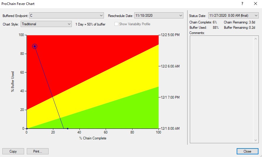
The table needs to calculate X and Y coordinates in their axis, and also draw a line by the dates these points were created, I added examples to the image of the table created through ProChain, note that the line goes backwards, something the regular PBI scatter is unable to do.
Here's the code I have so far, it's almost true, but I can not find any example of a scatter lined chart and I would love to hear advice, I'm not an expert on R \ PY, it's combinations of things I found online.
library(ggplot2)
library(dplyr)

dataset <- dataset[order(dataset$StatusDate),]

dataset %>% ggplot(aes(x=PercentChainDoneTrimmed, y=PercentBufferConsumedTrimmed, colour=RescheduleDate)) +
geom_point() +
geom_segment(aes(
    xend=c(tail(PercentChainDoneTrimmed, n=-1), NA),
    yend=c(tail(PercentBufferConsumedTrimmed, n=-1), NA)
)
)