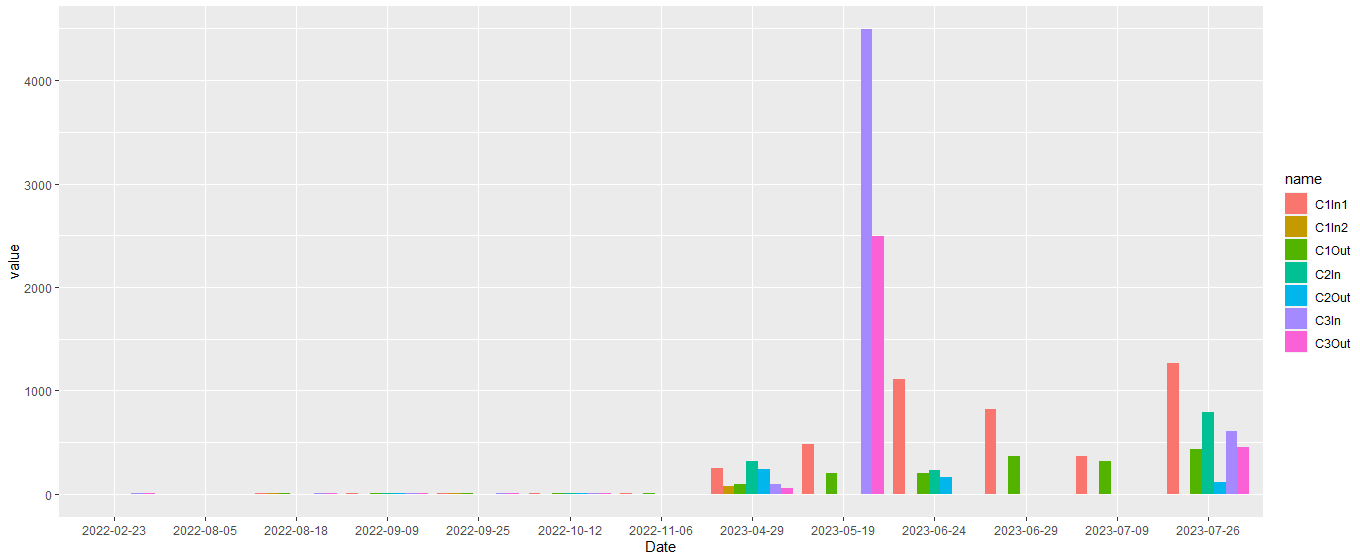
Creating Bar Chart with Multiple Lines in R Studio

I have created the following line graph, showing suspended solids concentrations of six sample locations over time.

However, as many of the points in the time series are near the 0 mg/L range, the plots are overlapping each other. I was thinking that I could represent the data using a bar chart, sort of like the image below:

image

For each date, I would then have a cluster of bars including a bar for each of my six sample locations. Does anyone have any advice on how to code this?

TIA

Hi @brant. Assuming you are using ggplot2, you could check out position_dodge().

Hi @brant , for get a good help of the community try to put a reproducible example of his data:

Reproducible example guide

# if you data is DATA, paste the result of:
dput(head(DATA,30))

Thanks @ M_AcostaCH, I am still trying to get used to the customs of positing on Posit Community. Here is a reproducible example of my data.

structure(list(Date = c("2022-08-05", "2022-08-18", "2022-02-23", 
"2022-09-09", "2022-09-25", "2022-10-12", "2022-11-06", "2023-04-29", 
"2023-05-19", "2023-06-24", "2023-06-29", "2023-07-09", "2023-07-26"
), C1In1 = c(0, 8.794, 0, 9.38, 8.86, 4.866, 5.124, 250, 484.63, 
1107.53, 821.92, 367.5, 1265.6), C1In2 = c(NA, 8.794, NA, NA, 
8.66, NA, NA, 70.59, NA, NA, NA, NA, NA), C1Out = c(NA, 8.898, 
NA, 8.9, 7.98, 4.28, 4.88, 91.95, 197.91, 196.26, 367.92, 317.3, 
433.3), C2In = c(NA, NA, NA, 8.64, NA, 4.38, NA, 313.87, NA, 
233.01, NA, NA, 788.6), C2Out = c(NA, NA, NA, 8.5, NA, 4.21, 
NA, 237.7, NA, 162.16, NA, NA, 117.2), C3In = c(NA, 8.52, 9.1, 
8.5, 4.21, 4.46, NA, 98.16, 4494.04, NA, NA, NA, 606.6), C3Out = c(NA, 
8.96, 8.85, 4.23, 4.48, 4.54, NA, 57.43, 2487.91, NA, NA, NA, 
447.6)), row.names = c(NA, 13L), class = "data.frame")

I am trying to create a cluster of bars for each date (i.e., "2022-08-05", "2022-08-18", "2022-02-23", "2022-09-09", "2022-09-25", "2022-10-12", "2022-11-06", "2023-04-29", "2023-05-19", "2023-06-24", "2023-06-29", "2023-07-09", "2023-07-26") and within each cluster there will be a bar for each sample location (i.e., C1In1, C1In2, C1Out, C2In, C2Out, C3In, and C3Out).

Hi @brant, thanks for the example data. Below is one way to arrive at the cluster of bars you describe. The first thing I did was reshape your data (mydata in the example) into a long format using pivot_longer(), then specified position = 'dodge' in the ggplot.

df = mydata |>
  pivot_longer(cols = -'Date')

ggplot() +
  geom_bar(data = df, aes(x = Date, y = value, fill = name), 
           stat = 'identity', 
           position = 'dodge')

Created on 2023-09-20 with reprex v2.0.2

Thanks, I am having trouble getting my plot to look like yours. Could you provide me with all of the code that you used to produce this plot?

Please see below.

library(tidyverse)

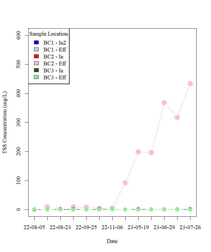
mydata = structure(list(Date = c("2022-08-05", "2022-08-18", "2022-02-23", 
                                 "2022-09-09", "2022-09-25", "2022-10-12", "2022-11-06", "2023-04-29", 
                                 "2023-05-19", "2023-06-24", "2023-06-29", "2023-07-09", "2023-07-26"), 
                        C1In1 = c(0, 8.794, 0, 9.38, 8.86, 4.866, 5.124, 250, 484.63, 
                                  1107.53, 821.92, 367.5, 1265.6), 
                        C1In2 = c(NA, 8.794, NA, NA, 8.66, NA, NA, 70.59, 
                                  NA, NA, NA, NA, NA), 
                        C1Out = c(NA, 8.898, NA, 8.9, 7.98, 4.28, 4.88, 
                                  91.95, 197.91, 196.26, 367.92, 317.3, 433.3), 
                        C2In = c(NA, NA, NA, 8.64, NA, 4.38, NA, 313.87, NA, 
                                 233.01, NA, NA, 788.6), 
                        C2Out = c(NA, NA, NA, 8.5, NA, 4.21, NA, 237.7, NA, 
                                  162.16, NA, NA, 117.2), 
                        C3In = c(NA, 8.52, 9.1, 8.5, 4.21, 4.46, NA, 98.16, 
                                 4494.04, NA, NA, NA, 606.6), 
                        C3Out = c(NA, 8.96, 8.85, 4.23, 4.48, 4.54, NA, 
                                  57.43, 2487.91, NA, NA, NA, 447.6)), 
                   row.names = c(NA, 13L), 
                   class = "data.frame")

df = mydata |>
  pivot_longer(cols = -'Date')

ggplot() +
  geom_bar(data = df, aes(x = Date, y = value, fill = name), 
           stat = 'identity', 
           position = 'dodge')

Great, thank you. That worked.

This topic was automatically closed 21 days after the last reply. New replies are no longer allowed.

If you have a query related to it or one of the replies, start a new topic and refer back with a link.