Hi,
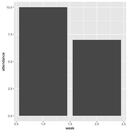
I have a data of teacher attendance. The attendance appears as categorical variable (either "present" or "absent"). I have to show a bar plot where on the X-axis, weeks will appear and on the Y-axis, the proportion of teachers present will be shown. How can I do this?
library(tidyverse)

data<-tibble::tribble(
  ~teacher, ~week, ~attendance,
       "A",    1L,   "Present",
       "B",    1L,   "Present",
       "C",    1L,   "Present",
       "D",    1L,   "Present",
       "E",    1L,   "Present",
       "F",    1L,   "Present",
       "G",    1L,   "Present",
       "H",    1L,    "Absent",
       "K",    1L,    "Absent",
       "I",    1L,    "Absent",
       "L",    1L,   "Present",
       "M",    1L,   "Present",
       "N",    1L,   "Present",
       "A",    2L,   "Present",
       "B",    2L,   "Present",
       "C",    2L,   "Present",
       "D",    2L,   "Present",
       "E",    2L,    "Absent",
       "F",    2L,    "Absent",
       "G",    2L,    "Absent",
       "H",    2L,    "Absent",
       "K",    2L,   "Present",
       "I",    2L,   "Present",
       "L",    2L,   "Present",
       "M",    2L,    "Absent",
       "N",    2L,    "Absent"
  )

data<-data %>%
  mutate(week=as.character(week))
Created on 2022-09-21 by the reprex package (v2.0.1)