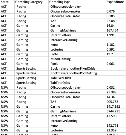
I've included a photo of the data I'm using, what I want to do is create a plot (hopefully a bar graph) that plots the average expenditure for each gambling category per state, I don't even mind doing 3 graphs, one for each gambling category and then have the states along the x-axis, could anyone guide me as to what I should be coding in (I'm very lost haha)
Thanks in advance ![]()

Hi, and welcome!
Please see the FAQ: What's a reproducible example (`reprex`) and how do I create one? Using a reprex, complete with representative data will attract quicker and more answers. If applicable, please see homework policy, as well.
Screen shots are seldom helpful in answering coding questions. Even if there is no coding logic, representative data is essential.
So, all I can offer is a sketch. For convenience, I'll illustrate with the built-in iris data frame, which has one category, Species and a number of numeric observations. I'm going to transform it into a data frame with similar names to yours.
The I will use the dplyr library to group and summarize the data to produce a mean to get the equivalent of st/cat/mean, which can then be plotted with ggplot2.
suppressPackageStartupMessages(library(dplyr))
suppressPackageStartupMessages(library(ggplot2))

# create data frame
iris %>%
  select(Species,Sepal.Length) %>%
  rename(st = Species, expend = Sepal.Length) -> gambling
games <- rep(c("racing","gaming","sports"),50)
cbind(games,gambling) -> gambling
gambling %>%
    group_by(st,games) %>%
    summarize(avg = mean(expend)) -> totes

# create base plot
p <- ggplot(totes, aes(st,avg, fill = games))
# create bar graph with grouped bars
p + geom_col(position = "dodge")

Created on 2020-03-27 by the reprex package (v0.3.0)
This topic was automatically closed 21 days after the last reply. New replies are no longer allowed.